Designing a Touch Mechanic
The iOS platform has a lot of options for designing touch mechanics. Use of the accelerometer, touch screen, microphone can all be used to create a compelling mechanic. Each control option has pros and cons, and it is important to be aware of them as you design your mechanics.
Tap the screen anywhere
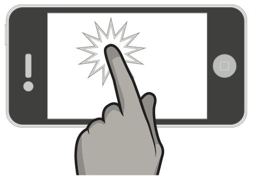
Without any tutorial, the player can discover this. The touch mechanic asks the player to naturally tap on the screen to continue, to prod the game to see what happens.
This mechanic also keeps the player’s fingers off the screen. Fingers leave the screen as soon as they came, making it easy for players to stay involved in the game.
Use this mechanic as much as possible, but only if it makes sense with the style of game. Just tapping alone does not give much to work with in terms of game mechanics, you only have the aspect of timing to play with. When a little more depth is required in a tap mechanic, it is more useful to use a tap and hold mechanic.
Tap and Hold
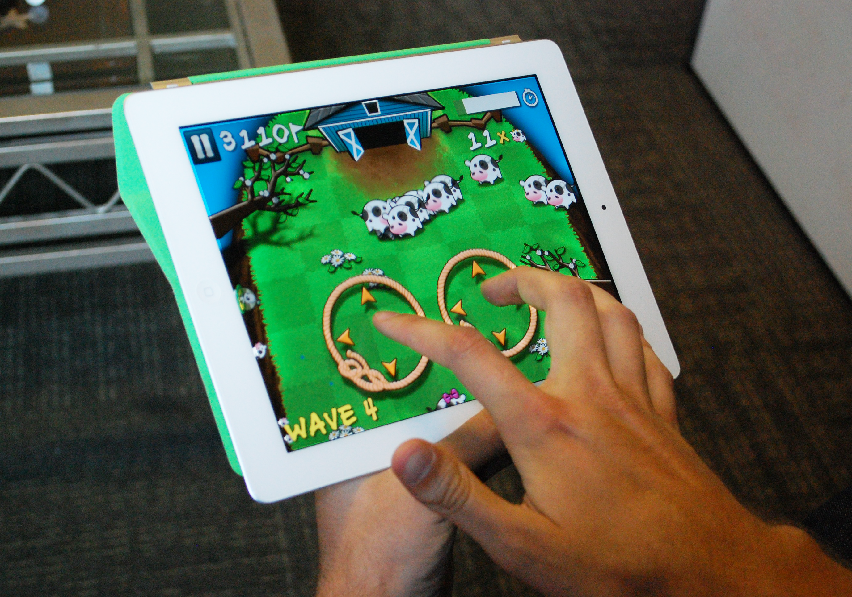
When you design touch mechanics, always design so that fingers are on the screen as little as possible.
Keeping in mind that fingers cover up the screen, it becomes important when deciding between Tap and Hold mechanics. Keeping these mechanics to the lower portion of the screen is always better, depending on what play orientation you’re in. Note that with most one button runners on the AppStore (Canabalt, Monster Dash, etc.) the player learns to position their finger in the least obtrusive place so that it does not cover up upcoming obstacles.
Tap and hold can be just as discoverable as a tapping mechanic. Ensuring there is an animation for the “hold” part is very important, otherwise the player can’t discern between a tap mechanic vs. a tap and hold. Make sure it’s very obvious from a quick tap that the player can hold the button a bit longer for a different result.
Tap and Drag

Tap and Drag controls, especially those that require precision (like line drawing games) are difficult to manage. The player is drawing with their finger, and covering up half the screen. With arcade mechanics (such as Flight Control) advanced players will soon learn to make their drawings quickly so that they aren’t caught drawing when the crash is about to happen.
Don’t expect the user to draw intricate drawings with their finger AND require them to monitor what’s going on on the screen.
As with all control mechanics, they expect immediate positive feedback that the device has accepted their input. Make sure to draw a line, mark their start and end points, and confirm when the user has drawn “correctly”. Note in Flight control it is immediately obvious where you started and finished a path, how far the unit has moved along the path, and when the path is drawn to a correct location. The path fills in, giving immediate feedback that the path is “accepted”.
With this mechanic you have to balance precision with speed. Players will either rush to draw, or be precise. Choose one, or ease the player into speed or precision. Fruit Ninja (Halfbrick) does this very well. Immediate feedback is shown when your swipe is on the screen. Their mechanic mixes the timing and precision. Not a lot of precision is necessary until later rounds, in the beginning the gameplay is just fun to slice fruit around the screen. As bombs come in, precision is required for more advanced players. Precision is difficult with touch screen devices, as players fingers are commonly covering up where they are drawing. Sometimes using a zoomed in view to show the exact location the mechanic is pointing to just above where they’re finger is will allow players to tap and drag to the exact precision point they need to be. If players are required to be this precise however, don’t assume they will be fast.
Swipe Controls
Many games want to use the touch screen for what its great for: it is a 2D plane with multi dimensional control. Swipe is excellent for quick 2D control. It re-creates the feeling of flicking and swiping in the real world, so it’s excellent for creating feelings of hitting a ball, slicing a sword, or rotating an object, petting an animal.
Swipe for timing events is difficult. It’s very difficult for the player to time their swipes. For example, if you are swiping to hit a baseball thrown at the player, when is the moment that the ball hits the bat? Is it at the beginning of the swipe? Is it at the end of the swipe? Is it somewhere in the middle? Fruit Ninja does this impeccably well – but is only one of the few games that have given the player enough feedback and direction to build the player up enough to use the swipe mechanic properly for timing and tracking events.
Don’t force the player to constantly swipe for long periods of time. Fatigue will set in, and the player will give up on your game. It’s usually best that the swipe mechanic is intermittent and at the player’s own pace (they choose when to swipe next). To combat fatigue, influence the user to use their index finger rather than their thumb. Have the swipe mechanic in the center of the screen, this area is harder to reach by thumb, and the player will swap to an index finger. Just remember that using an index finger means that there can only be 1 touch mechanic operating at once. If you expect the player to use both hands, they will have to use their thumbs.
Constant swipe mechanics can become tiring for the player after a long time. Especially if you force the player to use the entire screen.
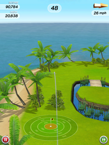
Flick golf influences the player to use their index finger for swiping by placing the golf ball in the center of the screen. While in mid air, the player constantly swipes the ball to add spin. This sets in fatigue, but the gameplay adds a pause as the ball lands, allowing some time for the player to rest in between shots. This uses the swipe mechanic for what it’s best at, and gives the player a chance to rest.
Accelerometer and Gyroscope
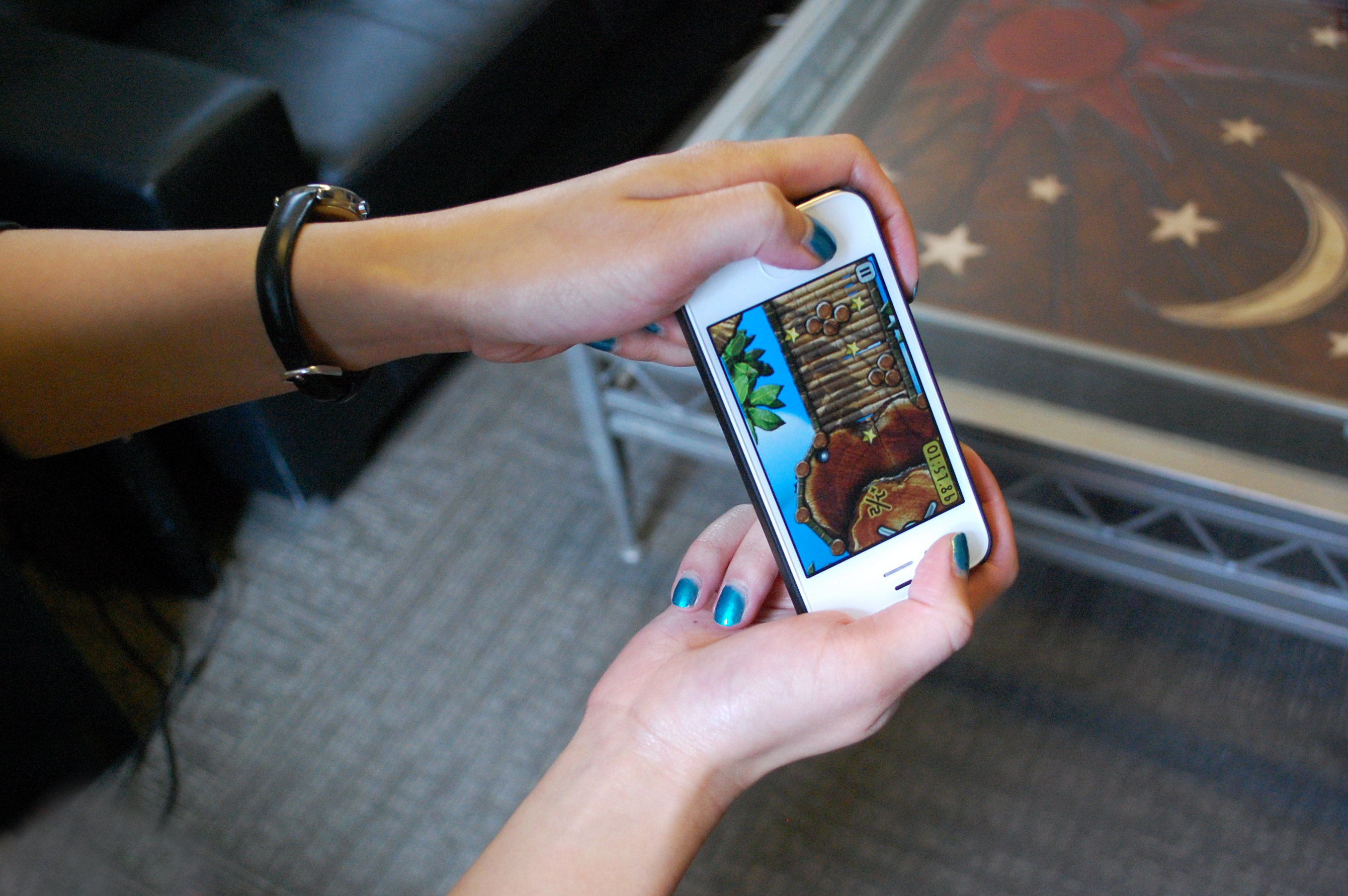
Ball Rolling style control for accelerometer. Requires two hands, but is intuitive and mimics real life.
Augmented Reality Control can be accomplished with a Gyroscope. This allows the player to hold out the device and move around the real space. This way of control can only be done in specific areas : they can only play in open places which they won’t be embarrassed to be moving around ridiculously.
Accelerometer control keeps fingers off the screen. The player can control the game without the use of fingers, and it allows for the player to play the game with 1 hand (excellent for keeping in the “Subway Thumb” orientation from the previous section).
Easily Discoverable. Players will naturally pick up the device and subtly move the device. you will have to balance easy discoverability with making sure the player can easily control the game. Too sensitive and the game is frustrating, too unsensitive can make the game feel unresponsive and the player will end up tilting their device madly to get the app to do what they want.
Accelerometer as the primary mechanic makes it easy to add a tap mechanic on top for secondary features.
However, precise 2D control is difficult with Accelerometer devices. Playing with the sensitivity will help, but players will still prefer a tap and hold mechanic for precise control over an accelerometer control.
Accelerometer controls suffer from calibration issues. Players won’t always play your game in the same orientation, they want your game to adapt to how they want to play. Even if your game is a ball rolling game, you can’t assume that a user will always play the game looking down on the device. Players will play it in various settings and will want the game to adapt and work in these settings else they won’t play the game. Players can play in bed, on the go, or sitting in a chair, and the default orientation of the device won’t support each of these situations.
Keep the accelerometer movements small. Fatigue along the wrist can occur if the player is controlling the game with one hand and is asked to move constantly side to side. Asking the player to shake constantly in the game play can result in fatigue, avoid continuous shakes. The further and more often the player has to move the device, the less of the screen they see.
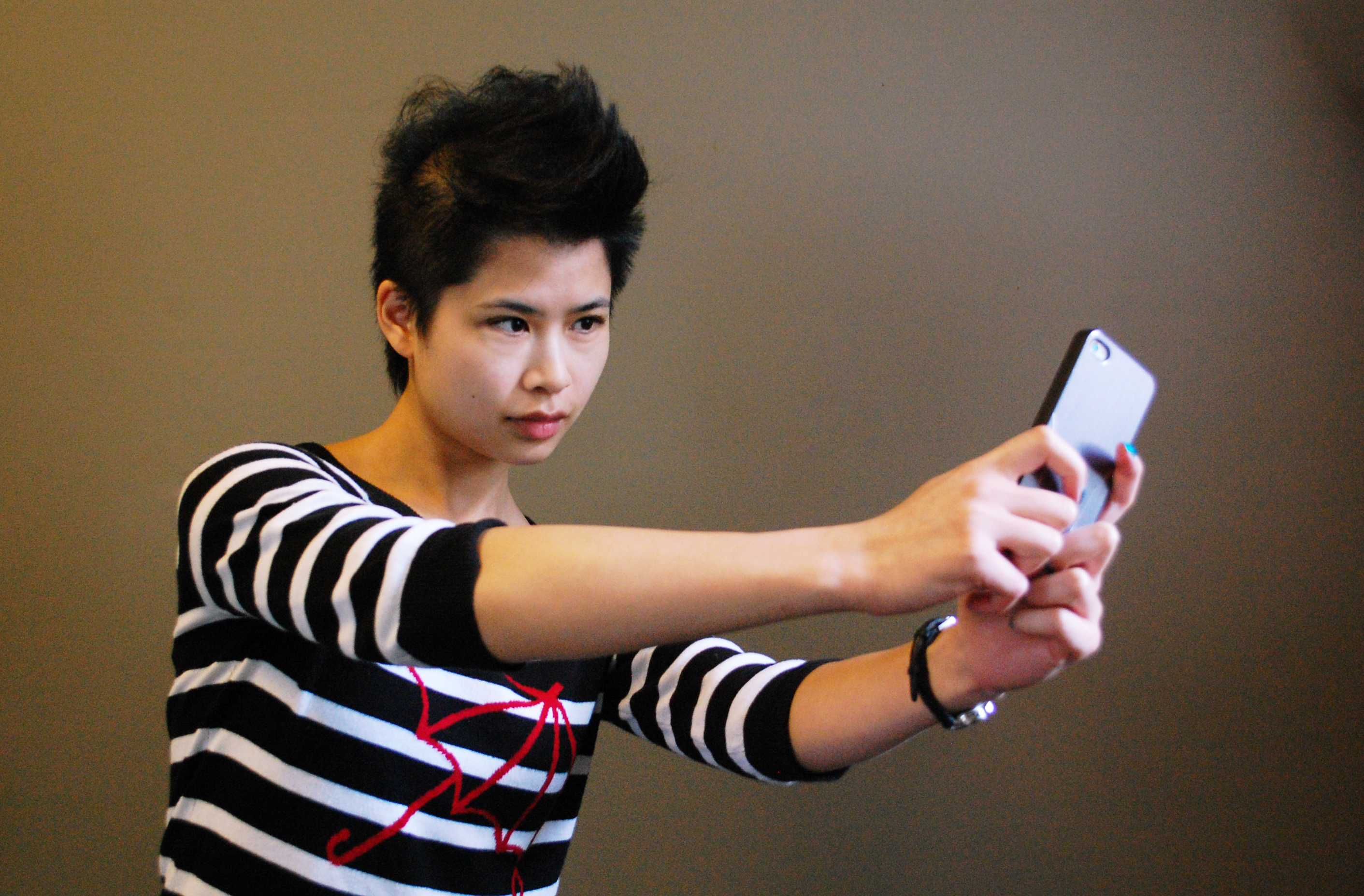
Using the gyroscope control at arms reach can create fatigue after prolonged use. Make sure gameplay is short and doesn’t require huge movements.
On Screen Buttons
It’s inevitable. Eventually you’re going to have to put an on screen button somewhere in your game. The pause button, the power buttons, an advertisement.
It’s important to be vigilant and simplify this as much as possible. On-screen buttons should always be seen as a last resort.
Follow these steps before you commit to an on screen button :
Step 1 : Make the button Adaptable
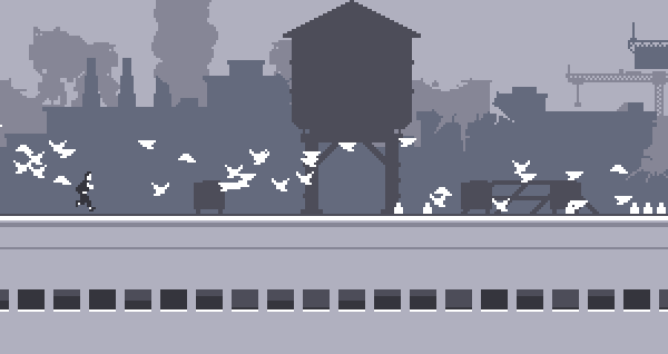
Canabalt is the ideal : a one button jump technique that allowed the player to use any area on the screen. This allows the mechanic to adapt to the player’s preferences.
Whenever possible, allow the game to adapt to the player’s preference. Instead of having a button for the player to press, allow the player to press wherever they want. Players will press on the screen wherever is most comfortable for them. Making sure this is discoverable is important, but will make your game more accessible.
Instead of a dpad to control the player’s movements left and right, allow the player to tap on the left side of the screen or right hand side of the screen for movement. This translates very well between iPad and iPhones.
Instead of joystick controls stuck in the corner of the screen, allow the player to press down and slide their finger to define the location of the joystick control.
Step 2 : Make them Context Sensitive
Only display a button when the player needs it. This removes/hides elements whenever possible, and will push your players to use these features more often.
For example, if you want the player to use powerups of buffs during the head of gameplay, they can be presented with large buttons for using these powers during opportune times in the game. This will increase usage.
This will also effect the gameplay, if the player is focused on deciding whether or not to press this button, the gameplay around them should not be trying to take their focus away. Make sure the player isn’t required to control another mechanic while a context sensitive button is displayed.
Step 3 : Make them Deliberate
Placing an onscreen button in a awkward area of the screen can prevent accidental clicks and make sure that the player is deliberate when picking this button. Buttons as a requirement should be minimum 45px wide on a standard definition phone, 90px wide on a retina phone. The closer two buttons are together, the easier it is to accidentally tap. So make sure buttons are deliberately placed, appropriately sized for the device, and placed far enough a part that accidental clicks do not happen.
Make it Visceral
The most important part about building a touch mechanic is making it fun. Being visceral is the key to this.
Make the mechanic responsive. Nothing kills a games control mechanics like a poor technical performance in a game.
Make sure the touch mechanics respond at 60 FPS. This will minimize input lag and make the controls feel very responsive. The quicker the feedback and the smoother this feedback is, the more visceral the mechanic will feel.
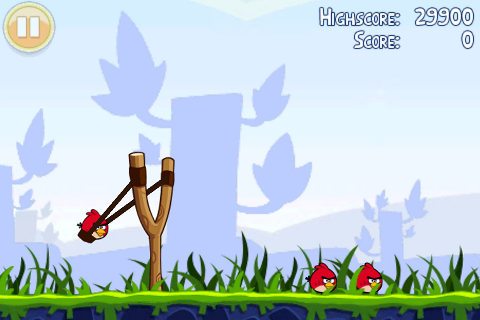
Give plenty of feedback in the control.
Use animations, trails, sounds and vibration to give your game feel direct feedback to the player. It will make it more intuitive and make the game more enjoyable.
Make it fun to play around with.
All of the great successful games on the AppStore have a touch mechanic that’s a pleasure to play around with, regardless if the levels, puzzles and obstacles were around. If you’re not having fun just by playing with your mechanic, then it won’t be fun when you add all the other stuff.
Take influence from real tactile systems in the real world.
Angry Birds used the feeling of pulling a slingshot for their intuitive, fun and visceral firing mechanic.
Cows vs Aliens used to feeling of pressing down on soft foam as the inspiration of the touch mechanic.
Fruit Ninja used the feeling of slicing to make the player feel like a real ninja.
Take influence from real world objects when designing touch mechanics. It will make them more intuitive, and make them more appealing to your audience.


