Designer Diary – Trailer Park Boys: Greasy Money
Trailer Park Boys: Greasy Money is an unusual idle game. The game features a very niche license and very unconventional gameplay. It defies many of the genre’s conventions, adding elements like an episodic linear narrative, very rigid ascension requirements, and an extensive gacha system that is woven deep into the game’s core. Yet the game has managed to be both a commercial and critical success, averaging at least a 4.5 star rating on every version and setting revenue records for the idle game genre. This is an insider’s view of how this unconventional design was born, and how and why it works.
Origin Story for Trailer Park Boys
My name is Dave Rohrl, and I’ve been producing and design games for almost 25 years. I currently run a small game design consulting company that helps mobile game studios all over the world solve challenging design problems. I was approached by East Side Games in early 2016 about mentoring some of their development teams and helping out on their new products.
The company was in development on a Trailer Park Boys-based idle game. The game made a number of critical design errors. The game had three main screens, each with a different activity, in honor of the franchise’s three main characters. All three screens were of critical importance to play the game. This made it difficult to articulate and focus on the creative center of the game.
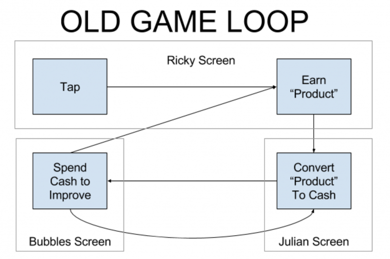
The first module screen required constant tapping to prime the pump of the economy. This is a common design mistake made by newcomers to the idle genre, who often assume that clicker games are about…well…clicking. As ample research has shown, this is not at all their core. Rather, players enjoy letting the game passively generate resources between sessions so they can spend those resources improving their economies.
Newcomers to the idle genre, who often assume that clicker games are about…well…clicking… this is not at all their core.
The second module was an odd one. It again required tapping to convert the currency earned on the first screen into the game’s main soft currency – money. The user then navigated to a third screen, which allowed the player to spend money to upgrade the operations on the other two screens – possibly with some element of automation.
East Side brought me in to evaluate the game. And my feedback was quick, direct, and unequivocal. The game’s core design was not working, and needed a significant streamlining or a full reboot.
The team decided to restart the game using familiar core mechanics from idle games like Adventure Capitalist or Doomsday Clicker with a few enhancements supporting the IP. The player would build up businesses in the eponymous trailer park to earn money, to level up the businesses (which we referred to as acquiring customers), and occasionally fight the antagonist law enforcement officers that bedevil the boys. The existing team struggled to take the design further than this, so East Side asked me to partner with the game’s producer to lead the game’s design.
Extra Requirements
In addition to the usual requirements that come with any mobile game project, like building a fun game with good retention and monetization, the game came with some unusual requirements that we needed to accommodate in the design.
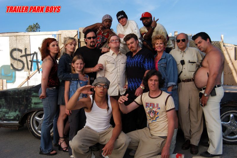
The game was, of course, based on a license. Trailer Park Boys is a faux documentary series, originally broadcast in Canada and now distributed by Netflix. It features the antics of petty felons who live in a trailer park in Nova Scotia, constantly trying to earn easy money through scams that the trailer park supervisors and local cops try to thwart. The show is a cult hit, with a small but very passionate following.
As with any licensed game, we wanted to make sure that we used the license to strongly shape not only the presentation, but also the core gameplay. We wanted the player to feel like they were running their own scams and getting their own a$$#s thrown in jail. And because the game was based on a strong character franchise, we wanted to feature the characters prominently in gameplay and to tell their stories in the show’s cheeky, hilarious tone.
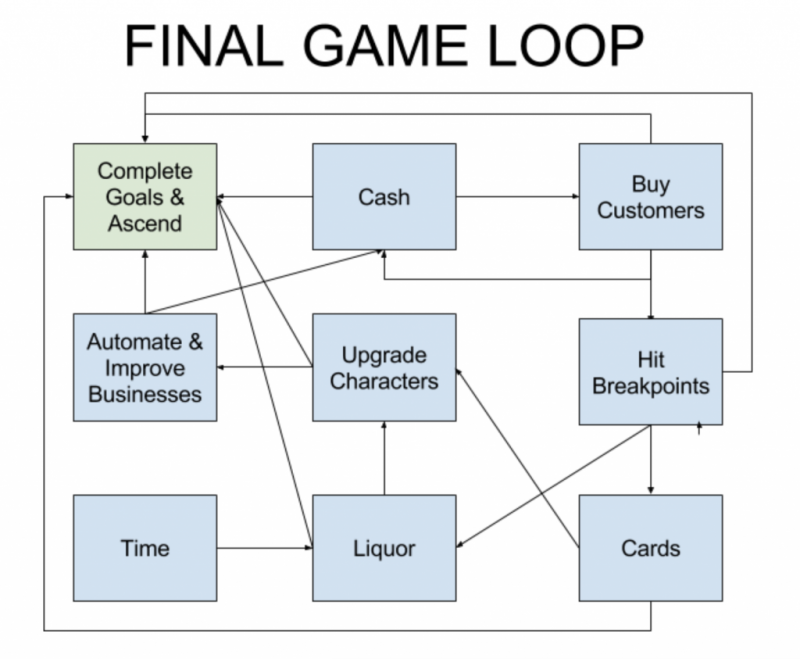
In addition, the game was looking expensive on its original course, and rebooting the design certainly didn’t make it any cheaper. As a result, there was a lot of concern about the game monetizing well – particularly given that idle games are generally not high ARPDAU products. The team and East Side’s management looked around for ways to monetize the game better, and – given the fact that we were all playing quite a bit of Clash Royale at the time – it’s not too surprising that we settled in on the notion of adding a card upgrade system backed by a gacha (random reward) system to the game, supported by a secondary, non-inflationary currency – Liquor.
Stories, Seasons, and Ascension
The original design for integrating stories into the game was to make short cutscenes and associate them with selected achievements, much like Adventure Capitalist associates its event rewards with reaching certain business levels.
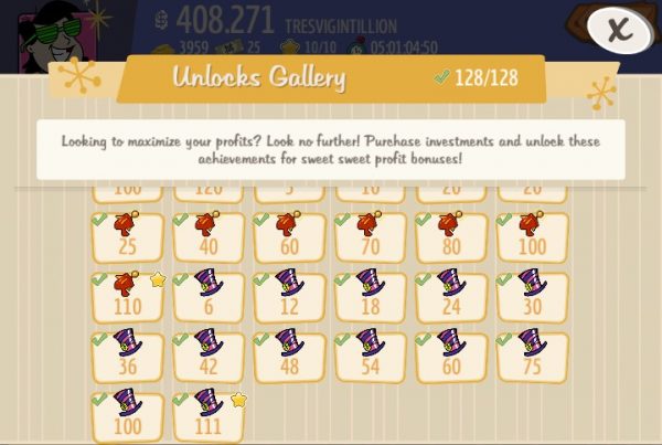
Unfortunately, I saw a number of issues with this approach. Players would enjoy lots of cutscenes early in the game, but as they became more established, cutscenes would inevitably drift further and further apart. As these rewarding plot interludes became less and less frequent, players could grow bored with the game and churn out.
We also couldn’t guarantee the sequence in which players would see cutscenes, so it would be impossible for us to tell real stories – just to offer one-off vignettes. This was a deal-breaker, as the franchise is heavily focused on episodic comedy storytelling.
Instead, I proposed a different approach to dispensing the story. We would break the game up into seasons, where each season would tell a single TPB story. Of course, the player moved from season to season by ascending.
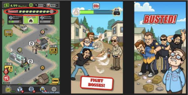
We showed an intro scene at the beginning of each season, continuation scenes throughout based on the number of goals completed, and a finale scene just before the season’s final boss fight. This allowed us to implement a classic three act structure to build the kind of narrative arc that fans of the series love. It kept players playing for the concrete reward of seeing the next cutscene. Players got addicted to the end-of-season experience where they would experience a burst of fun activities – see a cutscene, play a boss fight, collect a bunch of rewards, and roll right into the next season’s intro cutscene and the fast early portion of the next season.
Goals

Of course, having decided to implement seasons, we needed a way to define for players to complete a season. We looked at other idle games that had implemented ascension requirements, like the cash requirements in Doomsday Clicker or the progress requirements in Tap Titans, but we found them pretty uninteresting. So we decided to lift a page from typical casual games and give the player a series of goals to complete. Once the player had complete enough of the goals we set before them, they could end the season, fight a boss, and ascend.
As soon as we added this feature to the game, the gameplay started to feel much more interesting. Rather than always buying the cheapest or highest yield business available to you, having player specific goals forces the player to focus on different aspects of the game at different times. This made the game feel more structured and gave players more opportunities to feel smart and strategic.
Our original system gave the player only one goal at a time. Although this was still fun, it led to real problems when the player was making slow progress toward their one and only goal. 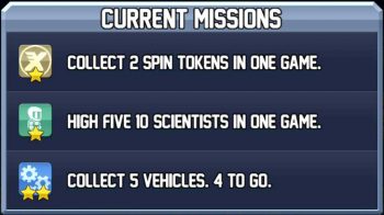 This was especially painful when the goal required some random rewards or other random elements. Jason Bailey, East Side’s Chairman, came up with the idea of having 3 goals available at all times, similar to Halfbrick’s Jetpack Joyride. After a bit of experimentation, we settled into the final structure, giving the player three tracks of goals – one linked to earning and spending soft currency, one linked to earning secondary currency and gacha items, and the third related to spending secondary currency and gacha. This led to a robust system that allowed non-payers to progress at their own pace while giving payers an obvious way to accelerate.
Making Gacha Central
As I mentioned earlier, East Side Games’ management asked us to include a gacha system in the game to increase monetization. Since we all wanted characters to be central to the game, it was an easy decision to use the gacha system as a way to upgrade characters. And since we had businesses playing a central role in the game, it seemed to make sense to use the gacha system there as well. This gave us a critical mass of valuable items to create drops for.
Once we reached this decision, we needed to figure out how to integrate the gacha-leveled items into the game. We quickly decided to associate two characters with each business, and to have the level of the business and associated characters make each business faster or more profitable.
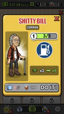
Unfortunately, this made the system completely optional. The player could engage with it and gain marginal benefits or ignore it and progress almost as quickly. A major turning point in the design came when we decided to require certain character levels to automate businesses. Automation is a critical part of any idle game design, and forcing players to interact with the gacha system to use automation meant that every single player would be chasing cards and Liquor to be able to advance. This had a huge impact on the game’s monetization, which is much higher than most other idle games.
The Trouble With Ascension
Ascension systems are core to idle game design. After the player has played for a while, their progress slows down a crawl because of the structure of the underlying math. The player then decides to restart the game (often called ascending, prestiging, restarting, or a variety of other names). When they restart, they earn a special currency that tweaks the game math in some way, generally allowing them to progress faster.
This well-worn system has a number of issues. Deciding when to ascend can be very awkward for casual players, as it requires a good understanding of the game’s math and ascension system. And ascension currencies tend to be a bit abstract and weird. And the story behind why the player is restarting the game from the beginning is thin or altogether missing.
In TPB, our season and gacha systems solved major problems with the ascension system. Because the player cannot ascend until they complete enough goals, the game gives them a clear signal on when they should ascend. Of course some of our more engaged players play on long after we let them move on to the next season, but at least our most casual players don’t have to sweat the decision.
Likewise, rather than having an ascension currency, we simply carry the player’s character and business levels forward. Since the player has built up those bonuses during gameplay, it’s only natural that those levels should be maintained and carried forward.
And the story of ascension fits the license like a glove. On the TV show, the boys are constantly getting thrown into jail for one reason or another, usually for their ridiculous scams and petty crimes. In Trailer Park Boys: Greasy Money, we used that trope from the show to explain our ascension mechanic. When the player resets the game, it’s because the boys lost their fight with the police and got thrown in jail once again. And with the boys gone, their business empire falls apart and needs to be rebuilt. This perfect alignment of mechanic and narrative has been one of the most beloved features of the game.
Content Challenges
Although all these design elements helped make the game into a success, they all created significant challenges on the design and production side – each in their own special way.
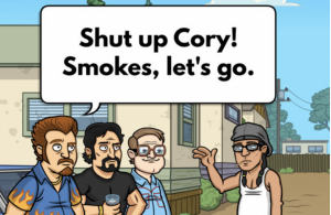
The stories themselves are a central element of the design, and they were surprisingly hard to get right. The TV show’s stories have a very particular flavor, and getting the humor, pacing, and character relationships in good shape required many iterations. In addition to going through a number of contract writers looking for folks who really got the IP, the team put in many nights and weekends working to get the narrative on point. But because we knew that the game’s core audience would be super-fans of the show, it was critical that we kept going until we got it right.
The use of goals and seasons made the gameplay sing, but that came at a price. Instead of just needing to create a fun progression with inflection points for each business, we needed to carefully hand-craft a set of goals that could be completed at exactly the right cadence to keep the player engaged while dragging just enough to create real incentives for monetization. This is an incredibly ticklish balance that requires significant playtesting and iteration for every single season, and we sometimes get it wrong. We are constantly looking at player data and re-adjusting existing seasons.
The gacha system added great monetization, but also added a lot of randomness to the player’s state. It would be very possible for two players who have progressed equally quickly to suddenly diverge over the course of a season because one had the right characters upgraded for that season while the other did not. This meant that accurately forecasting how long players would take to complete seasons and goals was very tricky and our estimates were often off by a good bit.
We also did very well at engaging players with the character upgrade gacha system, but never found the right mechanic to generate similar levels of engagement with building upgrades. We had a few ideas, but none of them have made their way into the game yet.
Final Outcomes
Trailer Park Boys: Greasy Money release on April 20th (4/20 – get it?) and shot up the download and grossing charts. It set records for daily gross revenues for a mobile idle game and drew rave reviews from critics and users (still over 4.5 stars on the Apple and Google app stores). Now nearly six months old, the game continues to generate great revenue and goodwill as we continue to roll out linear content, new events, new features, and new platforms.
There were a number of critical design decisions that contributed to this success, but in my view the three most critical were:
- Gacha: Building a strong gacha system and baking it firmly into the game’s core loop helped the game monetize far better than competitors and opened up interesting new vectors of gameplay.
- Celebrating the IP: Letting the Trailer Park Boys IP guide chunks of the gameplay, and not just the game’s presentation, led us to fun, novel places, and guaranteed the game would be a hit with the show’s fans.
- Challenging genre conventions: We were not afraid to challenge some entrenched idle game design tropes, like leaving the ascension decision entirely to the player or avoiding linear content. Our willingness to break these rules let us build something that was not just unique but also fun and fresh for players, and high performing for East Side Games.
About the Author
Dave Rohrl is the Owner of Mobile Game Doctor, a boutique game design consultancy that works with game developers worldwide to improve their games, teams, and processes. Dave is an industry veteran with nearly 25 years of experience who has held senior roles at Pogo, PopCap, and Playdom, among others. He lives in the San Francisco Bay Area with his two daughters and 600 board games.
Deconstructing Nimblebit Bit City
The latest release from Nimblebit features the Bitizens and this time they’ve used an idle/clicker/tapper crossed with a city builder in their new release of Bit City (iOS / Android). I’ve been a long time fan of the Nimblebit team, started by the brothers Dave and Ian Marsh back in 2007 but expanded to a number of other key staff. My personal favourite game of theirs was Tiny Tower, but I’ve also played and churned out from most of their newest releases. Pocket Frogs deserves a design mention as it still has one of the best collection/rarity mechanics of any game that I’ve played on mobile. Nimblebit specialises in creating a collecting or simulation experience around common everyday objects.
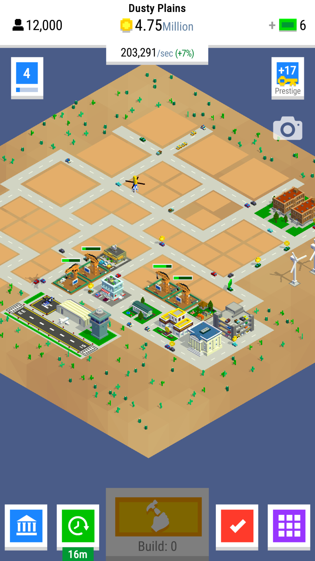
Bit City’s core mechanic is an endless economic growth game and the aim of the game is to progress through the 8 increasingly sprawling cities to generate the most income per second.
Clickers in General
The clicker or idle genre is one of the more recent but extremely popular free to play mechanics that we’ve seen on mobile. There are some great reasons why the mechanic itself has been present in many large successes such as Adventure Capitalist, Tap Titans or Egg Inc. At it’s core, the loop for a clicker is very simplistic. You’re trying to improve your rate of earning, in order to buy items to increase your rate of earning.
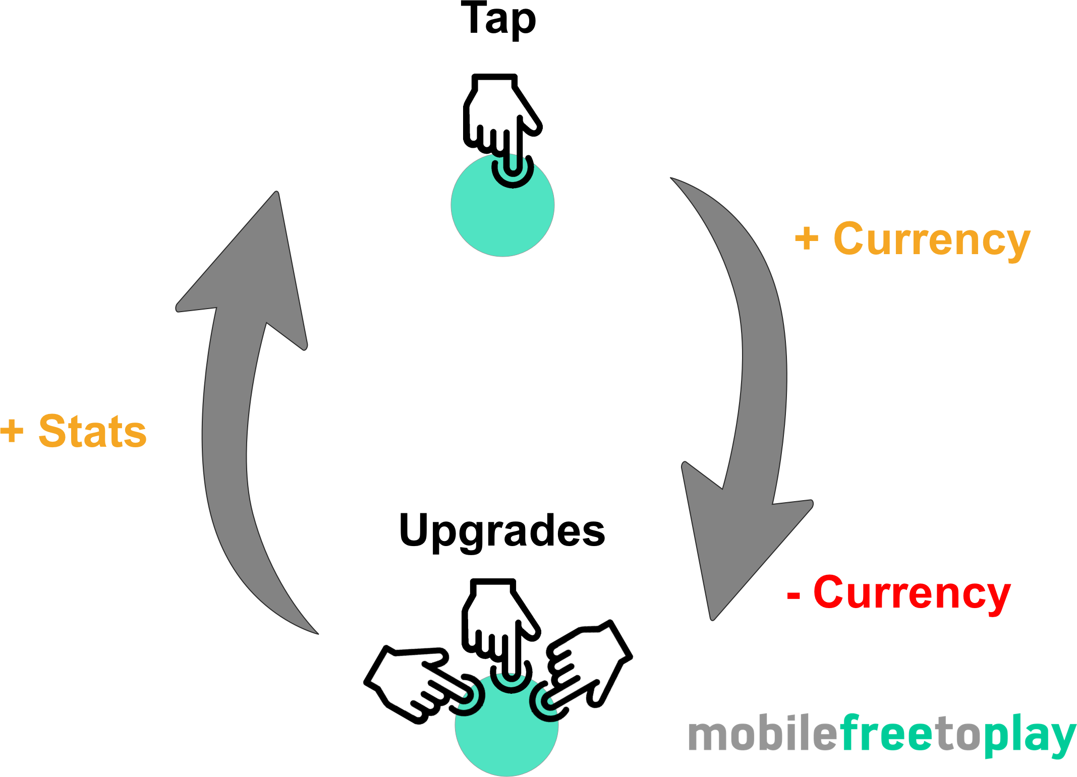
The simplicity of the core loop is both a blessing and a hindrance. The fact that everything you do in the game contributes to making you better at what you do (earning currency) feels very rewarding.
Every action is a positive action.
The hindrance comes when you eventually find the core interaction (tapping as fast as you can) repetitive and boring. In some clicker games, this can happen very fast. So, as a game designer, you eventually shift the player’s motivation from tapping to something that will last much longer. The clicker game genre eventually shifts into a strategy of choosing what to upgrade next. In Tap Titans 2 a player is strategically shifted from upgrading characters to gathering gear, pets or items. All of these have random drops and XP to give much more strategic depth. Upgrading anything feels good, but timing and choice matter.
No one can be expected to be active in a game forever which is where the idle aspect of most clickers come in. While you’re away your game is playing itself, constantly growing your earnings. That way when you come back, a stockpile of cash for you to quickly spend and improve to feel powerful. This happens every time you come back, whether it’s 10 minutes or 10 hours, the size of the stack changes but the feeling of reward stays the same.
The genre itself appeals to a certain type of gamer. Those obsessed with finding the most efficient and time-effective way to improve their progress (in the form of earning rate). Sometimes referred to as min/maxers finding 1-2% efficiency in upgrade choice is rewarding as you are progressing. Yet even the casual player feels good, you’re constantly making progress but at a lower rate. If you’re more interested in story and context then you will often not feel as excited about idle games. It is a game for fans of stats and numbers.
Bit City – Context provides content
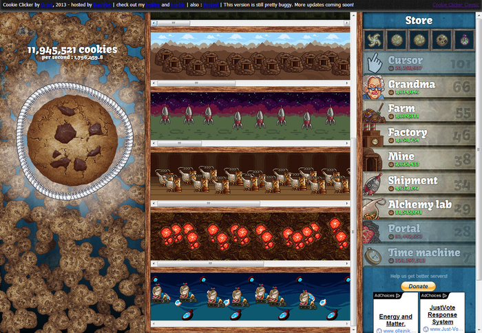
Idle games began on the web with titles such as Cookie Clicker or Cow Clicker released around 2012-2014. 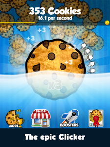 These games were incredibly simple. They drew huge numbers of returning users every day as the objective of “having the highest number” is so clear and powerful for players.
In more recent times games such as Adventure Capitalist, Tap Titans, Farm Away, Make it Rain have re-skinned the mechanic and given a context to the clicking. Context helps with design decisions as you immediately add more depth. Depth provides you with content and that content can better mask the simple stat progression. Player’s decide their goal is to “build the greatest city” rather than to “get the highest number” and this creates a better sales pitch if and when they tell their friends about your game. Context helps you design and it helps you sell, use it to your advantage and don’t neglect it by slapping it on at the end of development.
Bit City provides much more context to the clicking experience by using a city and it’s buildings to provide more visual substance and reference to the core loop. The City Context is a good one, used in multiple genres it’s easy to reference, has great depth and is applicable to people from all countries. Bit City uses this to great effect, but adding Building Zones, Cars, Planes, City Hall and Windmills each contributing to your currency earning.
Clicking = Building

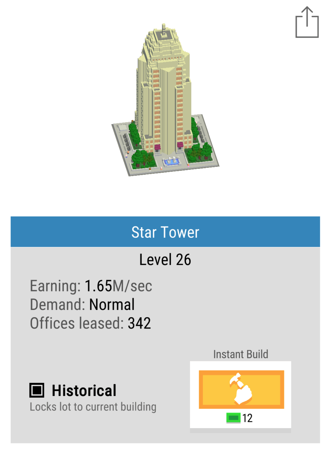
The core mechanic of tapping furiously on the screen has been removed in favour of the idea of building. One must purchase and classify lots so that buildings of specific type are built. Buildings then fill each lot and the large Build button upgrades and refreshes the building on each lot for a small increase in coins per second earning power. The upgrading of buildings is endless and rather than getting stuck in a content farm black hole, the buildings are upgraded at random. Every upgrade levels up the block and each subsequent upgrade adds 1 second to the total time required to build the next block, leading in the later game to upgrades take minutes. Choice of which block to upgrade is removed from the player through randomisation and the player is taught very quickly that every upgrade is beneficial.
This is a very strong mechanic for a number of reasons:
- Thematically it makes sense. Your city changes with time and you can position blocks in certain areas to make your city look beautiful
- You may also lock in place any buildings you particularly like allowing the creatives build beautiful masterpieces of a modern renaissance!
- Choice paralysis is removed because you don’t need to choose what to upgrade and all upgrades are beneficial.
- Build timers slow down sessions giving people incentive to leave.
As a pacing mechanic, it continues to engage at all stages of the game. This is often one area that other clickers loose me on as in the mid-late game, I simply stop clicking…
City Planning
Simplicity and clarity are always key design decisions for mobile game developers. People spend a few minutes at a time with your game and so everything needs to be clear and make sense in an instant. The choices available to a player in Bit City always relate to upgrades. The most profitable upgrade you can do is buying a new building for your city as each building provides a larger base earning rate. A really nice design feature is the idea of city zoning. There are 3 zones, Residential, Industrial and Commercial. Within this feature is a lot of shallow depth, that is there are a very large number of options and possibilities but as a player, the way they affect the game is incredibly minor. They do not affect the core in any way, they simply provide a route to micro-optimisation, reinforcing the fun of clickers.
Each building zone is balanced by providing a 10% bonus or 10% deficit depending on the overall % of zones, this promotes people to build in an ordered manner. At certain times you may want to opt for larger investments in certain zones because both the Mission system and the City Bonus system provide bonus’ specifically based on type of building built. This is a good use of shallow depth again. Most people would not obsess over the minutiae of which building to build, but to really get the most optimisation at each minute of gameplay it might be valuable to invest in specific zones at specific times.
Missions with increasing reward
Another clever design decision is to reward ever increasing premium currency (Bux) by completing missions. Missions usually revolve around building, improving or owning some upgrade or building.
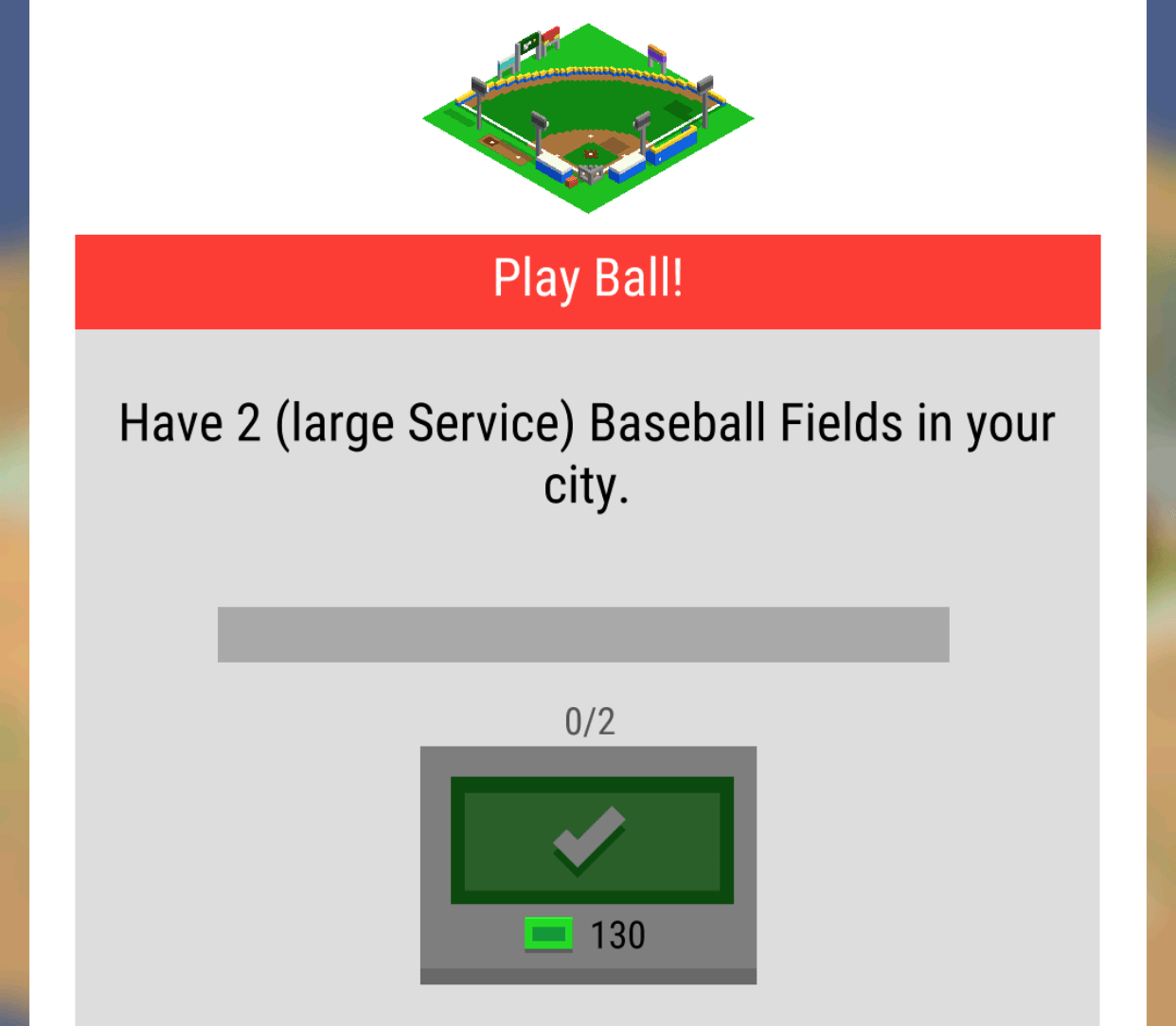
There is only one mission available at a time and they seem to be structured to appear in a specific order. Rather than having a small payout with lots of quick missions to teach people the mechanics, Nimblebit have used missions to give players a longer term goal. The cleverest of these is the ownership of 2 of the same building types i.e (2 Baseball Fields).
Mission systems are one of the classic mid-term progression systems. They provide a steadying hand and a focus for players when options of what to do open up. The best mission systems are usually curated or at least missions are grouped and then provided based on XP level.
The Premium Currency (Bux) are gifted in 10 bux increasing increments. This is risky, as it becomes a significant source of Bux in the mid game. I think the progression is a nice touch but the size of the progression is too high, it would have worked just as well say, 10,12,14 etc. At mission 13 I’m on 130 Bux which is equivalent to $0.13. Each mission can take an hour or more, but sometimes you might complete 2 or 3 in a few minutes. Although it might not seem a lot it lessens the requirement to spend. In the mid-game, it’s most profitable to focus on and perform the mission at hand. Balancing the rewards and spend of the premium currency is definitely one area that Bit City could improve on.
Progress, Profits, Prestige
Modern clickers increase the gameplay depth over time in a number of ways. These usually either increase the speed of clicks (Faster), the value of a click (More) or automating the clicking process entirely (auto). Each of these upgrades has a clear and tangible benefit, they help you gain more currency quicker, give your players a choice: do you invest in yourself being active in the game, or invest in the time you’re inactive?
Each city comes with a set number of plots. 4 for a level 1 city, 8 for a level 2 city etc. As you build more buildings you start to max out your plots. As soon as you have maxed your plots a new city unlocks and you sacrifice all of your upgrades and buildings to start again. This creates a clear goal for gamers and eases gamers into the game via small cities. As you progress the cost of each new building starts to become prohibitively expensive which encourages you to want to sacrifice everything in order to prestige to obtain Keys which will speed up everything in your game for the entirety of your play time.

System diagram of Nimblebit Bit City
What’s very pleasing compared to other clicker games is that the speed of progress is managed by a multiple limiting factors. Limits by multiple sources feel elegant rather than a strong single limiting factor. First, the coins themselves slow progress as you can’t build enough buildings, then the plots limit progress on one city as you max them out and finally the cities themselves become prohibitively expensive unless the global tap multiplier is improved by prestiging.
Prestige is very important as it adds ebbs and flows to an otherwise linear progression. Every time you do prestige you suddenly feel incredibly powerful as you race through early content, this is important as rather than having to create more complexity players are re-engaging with the game and reinforcing the simple systems of the game and progressing incredibly quickly. Bit City has created “mini- prestige’s” every time you upgrade to a new city once you have maxed out your plots. With every reset there is a sense of loss but also a sense of growth, getting your players used to this feeling helps them engage with the main Prestige mode.

In the mid to late game idle games, prestige currencies become the main goal in Bit City these are Keys. It’s very important to get the balance and the feel of Keys right. In Bit City, Keys feel underpowered as the quantity of keys provided when you prestige is too small. A user wants to feel progress at close to double the previous rate when they sacrifice all of their upgrades. Doubling up whilst keeping a logarithmic increase in the power curve of costs equates to half the time spent getting back to where you previously were. One you reach your old position the logarithmic power curve kicks back in and really winds back a player’s progress to a snail’s pace forcing them to prestige again.
A player chooses when to jump to the next prestige level and effectively picking at the right time can jump you onto a much more powerful curve. Great game design in this area wouldn’t use perfect logarithmic numbers but would add some randomness and inconsistencies to make it a guessing game for the player to find out if they are maxed out at an inefficient area of the curve.

Time taken to reach a city in bit city. Prestige levels and number of hours are representative and not factually correct.
UI / UX
It’s not mentioned in mobile how important the user interface is for a game. Especially in these management style games with large amounts of details, getting information across clearly and concisely is a challenge on a small screen. Nimblebit do a number of great reinforcements.

- Your key measure of progress is represented as a large central number of coins per second present on every screen.
- The build button (the button you click the most) is larger, more centralised and stands out from the rest.
- The subtle nuances of the game such as plot size, or building type are reiterated to you when you need the information, such as the quest system (large service)
- Before you make a large choice there is always a confirmation screen ensuring you are happy with your decision.
This attention to detail of the user’s journey removes frustration from the game. It allows you to choose where to focus your attention on to complete one or two of the tasks at a time and speed up your progress. A nice font and simple language make it enjoyable to read.
Monetising – Keep a tight grip
I’ve spent $10 so far in Bit City. For that, I got 10,000 bux. Bux are the only premium currency and are used to speedup progress, buy city upgrades that persist through prestige mode as well as unlocking certain famous buildings that provide enhanced bonus’. I feel that this was the point where the game design suffered.
- Bux are not a rare currency within the game. You can get 10s if not 100s of bux by completing missions or taping on vehicles that randomly drop bux, as a free player you can often buy a few persistent upgrades. When purchasing these upgrades there is no delight, magic or drama and as a player, all you see is your bux amount slowly draining. Purchasing the unlock of rare buildings was also much the same with a simple UI transition from locked to unlocked within the building card screen.
- No early conversion purchase. The Builder in Clash of Clans or World Multipliers in Adventure Capitalist, which immediately are the best bang for your bux! *pun intended…
- Gauging the value of upgrades is difficult. For instance, Market Gains for 1000+ bux increases your Bank Savings rate by 1%. This feels minor but would have a huge effect on the earning power itself. Rather than so clearly affecting such a powerful rate, investing in 20% cheaper bank upgrades would have had a similar effect to the player but would be immediately noticeable.
- No sense of mystery or delight when spending bux at any point. All bux are spent with a simple click and a UI change.
- No random drops. With it’s huge array of buildings creating a clear building rarity scale and then having a random drop element would make every bux much more exciting to spend. Random rewards have spikes of joy, rather than a focussed
I suspect the number of people purchasing bux will be low, simply because the number given out in-game is very high and people can immediately get a sense of what it would be like to have 1000s of them by spending a few hundred that they got for free. Games with great conversion rates keep the pressure on players to want to spend by constantly showing the value of having premium currency to progress. Bit City treats bux too loosely and as such the pressure to get my wallet out is low.
Video Ads – Double Time
I suspect that the game’s primary monetization route would be video ads. There is currently only one method to engage with a video ad through the opt-in button called “Double Time”. The value proposition here is strong, for a short period of time, double everything. Directly doubling the speed of progression is the best feeling for a player because it directly contributes to that core loop. Things that feel great in-game are strongest when they contribute to your progression directly. Clickers, by their very nature, are all about progress and so the reward is clear and easy to feel.
Unlocks happen more regularly I can build more buildings and progress shows a real gain. The upgrade itself is time limited to 10 minutes but with bux can be upgraded to 15 or more minutes. This again is a clever gamble as by getting people to potentially invest in an IAP they then encourage more video views, which if you remember is a key KPI for increasing monetization from video ads.
The major issue here is that there are not more ways to engage with video to improve those views per DAU that lead to more revenue. The 10-minute bonus is strong, but what about a 4h increase in the Bank Savings rate? Watch a video ad to upgrade a building directly would provide so many more places that a user could click the Watch button, increasing its adoption. The classic Double Up bonus for all returning players could be run once every 24 hours in order to highly incentivize at least one valuable video view per day. There is huge scope for expanding video ads integration.
Conclusion – Great Core, Monetization need Tightening
Bit City is a great example of expanding clicker mechanics into new genres. City Building and Clickers make a great match because of the depth in buildings and environment that are available to the team. Nimblebit have done a really good job of pacing the game across multiple cities causing you to have clear evolutions in your progress as well as allowing you to prestige at any time, making it your own decision. The type of upgrades and the thematic choice of upgrades fit nicely, all contributing to a busy and bustling city experience. The UI and UX of the game itself is also neat, simple and clear making playing the game an enjoyable experience.
The game’s biggest weakness will be its monetization. It’s very loose usage of Bux as a reward currency and the fact that players can only interact with video once per session without enough cues from the UI. The value of that video view is high so it should see good usage, but providing your most engaged and active players with more ways to watch would see many more views per DAU.
The games a great addition for the Bitizens and well worth a play!
Why you should care about Idle Games
Idle games are an exciting new genre that I expect to expand greatly in the coming years on mobile. Idle games, Clicker games, or “games that play themselves” is a baffling genre. Inexplicably these games are dominating many of the popular flash portals and shooting up the charts on mobile. Make it Rain by 337 Games, Tap Titans by Game Hive and now AdVenture Capitalist by Kongregate have all shown that this genre has a rightful place on the AppStore.
But why is this genre so popular? Why does this genre even exist? Why even discuss games that people don’t really play?
Idle games have risen on mobile because this is a genre that is perfect for modern mobile free-to-play design. The mechanics of idle games create perfect mobile sessions and drive strong long term retention.
What is an Idle Game?
Idle games, sometimes called Clicker or Incremental games, are games which are all about management of revenue streams. Similar to simulation games, their main differentiator is the focus on revenue growth decisions.
For some examples:
Cookie Clicker is the best example of an idle game. Each time you tap the cookie, you gain 1 cookie. You use cookies to purchase upgrades. Upgrades increase either the rate of tapping the cookie (now you get 2 cookies per click!) or increases the rate of cookies generated automatically (Grandmas will make 1 cookie per second). These automatic cookies are generated whether you are tapping or not. They are generated even if you’re away from the game.
On paper this sounds too simple to be fun. But try for yourself. The simple act of purchasing an upgrade always feels great. The growth curve is so fast it gets very addictive, very quickly.
Progress just for the sake of progress is fun. Even if it only means a virtual number increases faster.
Rate of resource generation is the core of the game. But an economy that inflates so quickly with a single currency has flaws. Very quickly, the game’s upgrade costs skyrocket. Starting off with nice low numbers the game quickly skyrockets into costs of trillions just a few sessions in. Most designers would cringe at this type of growth curve. What kind of player wants to worry about numbers in the trillions? In AdVenture Capitalist, your costs will eventually reach more than 1 Tretrigintillion (10 to the power of 102). Yet, players love this. Progress always feels good. Players playing for long enough to reach these ridiculous numbers feel like it is a real accomplishment.
As a result, Idle games have claimed 3 of the top 10 most played games on Kongregate (source: here). There are even Twitch channels dedicated to watching a computer play a game itself. Inexplicably, this genre has seen incredible growth.
Regardless of your stance of whether or not this is a “real” game genre, the mechanics in Idle games are perfectly realized for mobile. Idle games can teach mobile game designers a lot about creating a game that has strong session design. Idle games are so strong because:
- It always feels good to come back.
- Sessions naturally ease the player to leave
- The mechanics ease the player from micro to macro gameplay
#1: It always feels good to come back
Many mobile games suffer gameplay mechanics that feel punishing on returning to the game after leaving for a few days.
In FarmVille: crops wither. If you do not come back to the game in time, your crops are worthless. In Clash of Clans: resources are stolen. The longer you are away from the game, the more likely a majority of your precious resources are stolen. Your rank on the leaderboard could be lowered. Your Clan becomes upset that you haven’t donated enough troops. These mechanics are all strong at driving reasons to come back, but also creates reasons for players to quit.
Idle games don’t suffer from this problem. Each time the player returns to the game, they are left with a massive stockpile of cash. It always feels like a bonus that they left the game. If a player leaves for a day, a week, or a month it only increases the amount of currency in their stockpile. In most economies this would be troublesome. Not in Idle games. Because the growth curves are exponential, leaving a game to infinitely generate a low income rate is absolutely fine.

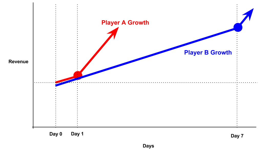
Player A grows faster from Day 1. Player B waits until Day 7, but gains a massive stockpile.
For example, lets take 2 players. Player A comes back every day. Player B skips a week of play. Both players are generating 1 million cookies per day at this point in time. Player A, the active player, returns day 2 and receives 1 million cookies. Player B, who skipped the week, returns to have 7 million cookies. Player B can clearly purchase far more upgrades than Player A. Player B actually feels very rewarded for leaving for so long — they are rewarded with a very long session which they can purchase many things. However, comparing the growth curves Player A purchased many upgrades on that second day. So Player A by day 2 is already at a new growth rate of 10 million cookies a day. Player A is clearly growing far faster than Player B, but both players (because its a single player game) feel they made a smart choice. Player A is rewarded with faster progression. Player B is rewarded for waiting so long. It always feels good to return, but returning more often gives you faster progression.
Mobile games should strive to create this feeling. It should never feel like a punishment to come back to the game.
Players should be reminded that coming back often is a benefit, but coming back at all is always a bonus.
For this reason most farming games have shifted away from FarmVille’s model. Instead of withered crops, there’s low storage limits. In Clash of Clans, they incorporate shields and enforce looting limits to make sure players dont feel that not coming back feel too badly.
#2: Sessions ease the player away
Coming from my previous post on Flexible Sessions, the perfect mobile session finds a way to naturally push players out of the game. This is necessary for pacing and long term retention. Strong mobile games give strong reasons to come back (see above!) and strong reasons to leave the game. Idle games have mastered this natural prod of players out of the game.

Offering lots of purchasing options creates the session design. There is always something to purchase, but eventually the smart choice is the one where the player must wait.
As Idle games push players to invest in automatic revenue generators (ex. Grandmas in Cookie Clicker) over manual revenue generators (manually tapping on the cookie), players inevitably will reach a point in the game when they just have to wait. The player can purchase small upgrades fairly rapidly, but they know to make the next big leap of progression its smarter to purchase the more expensive upgrades. So, they leave the game feeling smart about their decision.
This is the exact point which the player, themselves, have opted-in to leaving the game. Naturally, the game has prodded the player to leave. Mobile games must strive for this. Create a situation which the player feels smart about leaving your game. Idle games have even managed to do this without timers, without social appointments or any other tacked on system as discussed in Player Commitments.
Create a situation which the player feels smart about leaving your game.
#3: It eases the player from core to meta gameplay
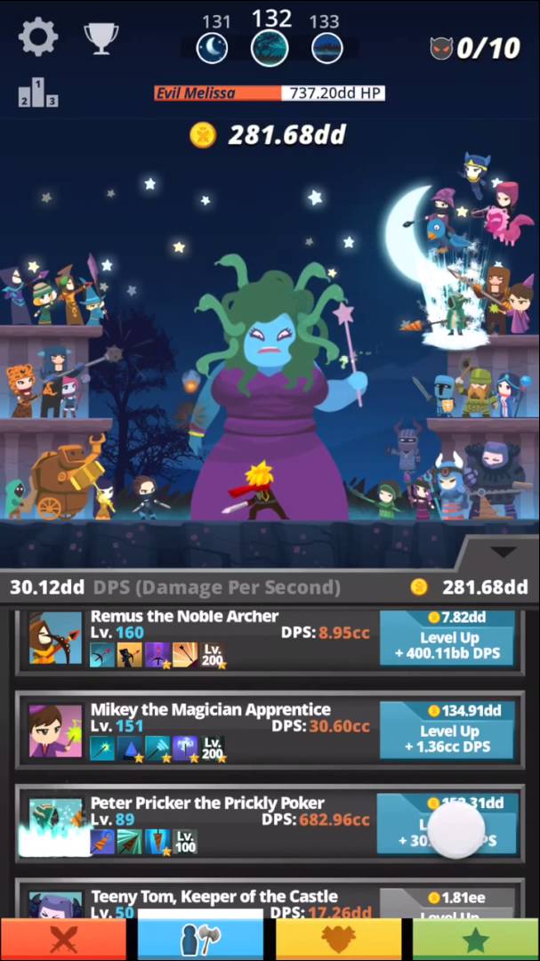
The first experience of a new player is very simple. In Clicker Heroes: A player just madly taps an enemy monster. In Make it rain: A player flicks heaps of money into the air. The first experience is addictive and immediately fun. Its obvious how to get better – tap or swipe faster. Players quickly master this mechanic and it feels natural. However, this mechanic’s interest quickly burns out. After the first few sessions, players are quickly tired of having to manually collect.
This is when the game offers a bait and switch. You came for the simplicty of tapping, but what you’ve been given is a game that is all about managing resources and upgrades. Players shift from tapping to managing which upgrade to purchase next. This clever switch means players that would have been burnt out from the simple mechanic are now thinking about long term decisions in the game. Which upgrade is the best value? How do I optimize my growth?
Mobile games must master this bait and switch. Players expecting to come into any mobile game will expect some core gameplay that mimics what they’ve played in the past. Playing bejeweled for Candy Crush, playing command and conquer for Clash of Clans, or platforming for King of Thieves. However, as a free-to-play designer your job isn’t to just hook these players with fun intial mechanics. You need to find ways to retain these players for years. The best way to do this is to switch the player from focusing on second-to-second core gameplay (tapping cookies) into longer term decisions (optimizing progression). Idle games clearly show a blueprint of how to accomplish this, regardless of the core gameplay.
Looking to the Future
Idle games are big and going to get bigger.
Anthony Pecorella gave an excellent talk at GDC 2015 on Idle Games summarized here. Clearly with the success of AdVenture Capitalist, Tap Titans and Make it Rain, more developers are taking notice.
The genre is ripe for innovation. Recently CivCrafter came out. A take on the idle genre with multiple resources and battles. Tap Titans has shown that the genre can apply to the auto-rpg genre. I believe that the progression systems in these games can really be applied to any genre. Replacing the core game play with a puzzle mechanic, an RPG battle mechanic, a Simulation theme, Arcade gameplay are all possible angles.
The key is to design the bait and switch: give the players the game play that is addictive and fun in the beginning, but eventually nudge them into purchasing the automatic resource generators. Players can then make the choice between grinding the core gameplay, or leaving and gaining the benefit just by waiting.
Get ready: the future will be all about games you don’t play.
Mobile Free to Play: Games that don’t want you to play them
More and more games now are adding modes where players no longer even need to play.
Players can simply open up the app, start a round, flip a switch, then put their phone down. The AI will make all their decisions. The AI will have all the fun while the player waits for the virtual reward at the end of the round.
At first glance, this is worrying. This turns the game into a Skinner box. Tap the button, wait, get a reward. Where is the fun in that?
Instead of making the core battle so boring that auto-mode is necessary, shouldn’t designers seek to add more depth to the battle?
No.
Focusing design on in-depth core game mechanics is a losing battle.
Focusing on making long-term decisions more interesting is a much better strategy for free to play games.
Battles are the Hook
In the RPG Genre, having an interesting battle mechanic provides the hook for the game. This is what draws players in and immerses them in the world. If I have no option of control, then this isn’t really a game.

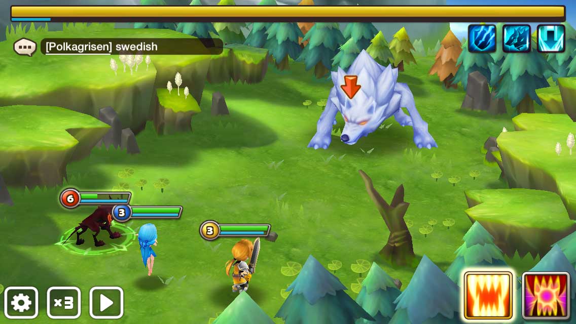
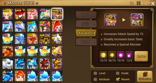
When a player starts a battle, they expect to make choices and see their impact. Having novel mechanics in the battle provides early players with a new experience that they have never had before. As seen above, in Summoner’s War, in the beginning, you have choices for each of your players of where they need to attack. This is engaging at first, but quickly goes stale. This isn’t the focus of the game.
Secondly, it really showcases the artwork. Your artwork sets the expectations right from the beginning. A player is only willing to invest in games that feel polished, exciting and professional. Making sure that players experience as much exciting battles in the beginning is important.
However, as they play many battles, inevitably the mechanic will get boring. Inevitably the artwork will get repetitive. There are few games in the history of game design that have ever managed to keep a core game mechanic interesting thousands of times repeatedly (ex. Tetris, Chess, Collectable Card Games). Especially in a non-multiplayer context, in a casual game, and even more in a mobile context where the interaction complexity possible is limited. In theory this could be done, but it would be incredibly difficult.
So how do you keep the gameplay interesting for the long haul while still allowing for a great initial experience?
Bitcoin Billionaire

Bitcoin Billionaire is in a weird genre. I’m not really sure how to label it… It’s part simulation, but mostly an “Endless Progression” style game. Your goal is to try to collect as many Bitcoins as possible by tapping the screen.
Initially there is the appeal of just madly tapping on the screen. Each tap gets you 1 Bitcoin. You strum your fingers across your ipad watching your money go up. You’re so good at this!
But after about 30 seconds this starts to become a bore (also your fingers are getting tired!). So now the game starts to push you into making investments: earn Bitcoins while you’re not tapping.
What this does is ease the player away from a newly-boring core mechanic into something much more interesting: managing investments and optimizing the rate of progression. Bitcoin Billionaire has done an excellent bait and switch: you came for the tapping, but now you are addicted to buying income sources. Cookie Clicker, Make it Rain, Clicker Heroes and Bitcoin Billionaire are four excellent examples of games that have managed to ease a player from a boring core mechanic into something that is much more interesting in the long haul.
This transition is exactly what all games need to deliver for successful long term retention. So how do we add this to other genres?
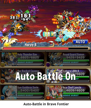
Auto-battle is how its been added to the RPG genre. Eventually the game recognizes that making choices in the battle is no longer interesting. The bait and switch becomes making the choices outside the battle more interesting than the battle itself.
But Auto-Battle isn’t a trivial system to add. Like all design decisions it comes with benefits and consequences.
There are 2 questions to ask if an Auto-battle system will work with your game:
Session Design: Auto-Battle or Job system?

Auto-Battle as a system essentially means that a player will make a choice about which “dungeon” to enter, then leave their phone on and come back to it after a few minutes.
Is this valuable to your session design? Players just opening your app for long periods of time? It will effect your KPIs — your session length will go up. But is that really what you want in the design? Successful games push players to return to the game often throughout the day and focus on meaningful choices. So why demand that they keep the app open during the battle?
Job Systems in games have been around for quite awhile. They reached a peak with games like MafiaWars in the early days of Facebook. A player would send their units on Jobs. Tap a button, and the unit would be disabled for a limited time. When the time was up, the rewards for the action were given. This was a nice appointment mechanic that allowed players to opt-in to coming back to the game. If the game was only job systems however, the game grew stale. But what if a Job System replaced the need for auto-battle?
What may be more interesting is asking the player to make a choice: Do I send my fighters out without my control for 5 minutes, then return with the loot? Or do I think the AI will mess up this battle, so I should do it manually for the next 10 minutes? This way players can make a choice whether to end their session and come back later, or improve their chances of winning by playing the actual battles manually.
Is there enough depth outside of the battle?
If the game is really distilled down to a few taps each day this can get boring quickly.
Grinding for rewards and items is only fun when there is significant complexity and depth to collecting items.
By adding auto-battle in the game, this will put much more stress on your long-term meta mechanics. Do your players have enough interesting decisions outside the battle that will last for months?

Summoner’s War has Relics to provide interesting decisions in how you upgrade your players. Brave Frontier has the boosting and fusing mechanic which provides years of collection and interesting long-term trade-offs. Many games have a very in-depth loot system which makes for interesting decisions choosing which gear to keep.
However, even with a strong loot system with collection, players need an indicator of progress. They need to be immersed in your setting, story and game. Having an auto-mode is great, as long as eventually players will be pushed to an epic boss battle. A battle that surprises them, challenges them, and maybe even progresses the story. This will be necessary wrapper around the grinding that makes it all worth it. These auto-battles end up building anticipation to something new and exciting for the player.
In the end auto-battle lets players focus on the choices and decisions that matter to them, no matter what stage of the game they are in.


 This was especially painful when the goal required some random rewards or other random elements. Jason Bailey, East Side’s Chairman, came up with the idea of having 3 goals available at all times, similar to Halfbrick’s Jetpack Joyride. After a bit of experimentation, we settled into the final structure, giving the player three tracks of goals – one linked to earning and spending soft currency, one linked to earning secondary currency and gacha items, and the third related to spending secondary currency and gacha. This led to a robust system that allowed non-payers to progress at their own pace while giving payers an obvious way to accelerate.


 These games were incredibly simple. They drew huge numbers of returning users every day as the objective of “having the highest number” is so clear and powerful for players.

