Deconstructing King of Thieves
Let’s take a deep dive into ZeptoLab’s latest game King of Thieves. Launched in February 2015, this game has piqued my interest. While not on the top spot yet, the game’s bold design deserves a look.
In my opinion, this is a game that deserves to be successful. It feels unique and has all the elements that make up a top grossing game. ZeptoLab has taken what works in simulation and strategy games, and applies this to a totally new genre and a completely new target audience.
This approach is what I feel more new game designs should do to be successful on the AppStore.
The Pitch
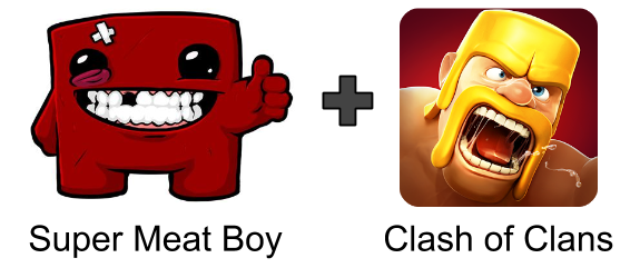
The pitch for King of Thieves is “Super Meat Boy” combined with “Clash of Clans”.

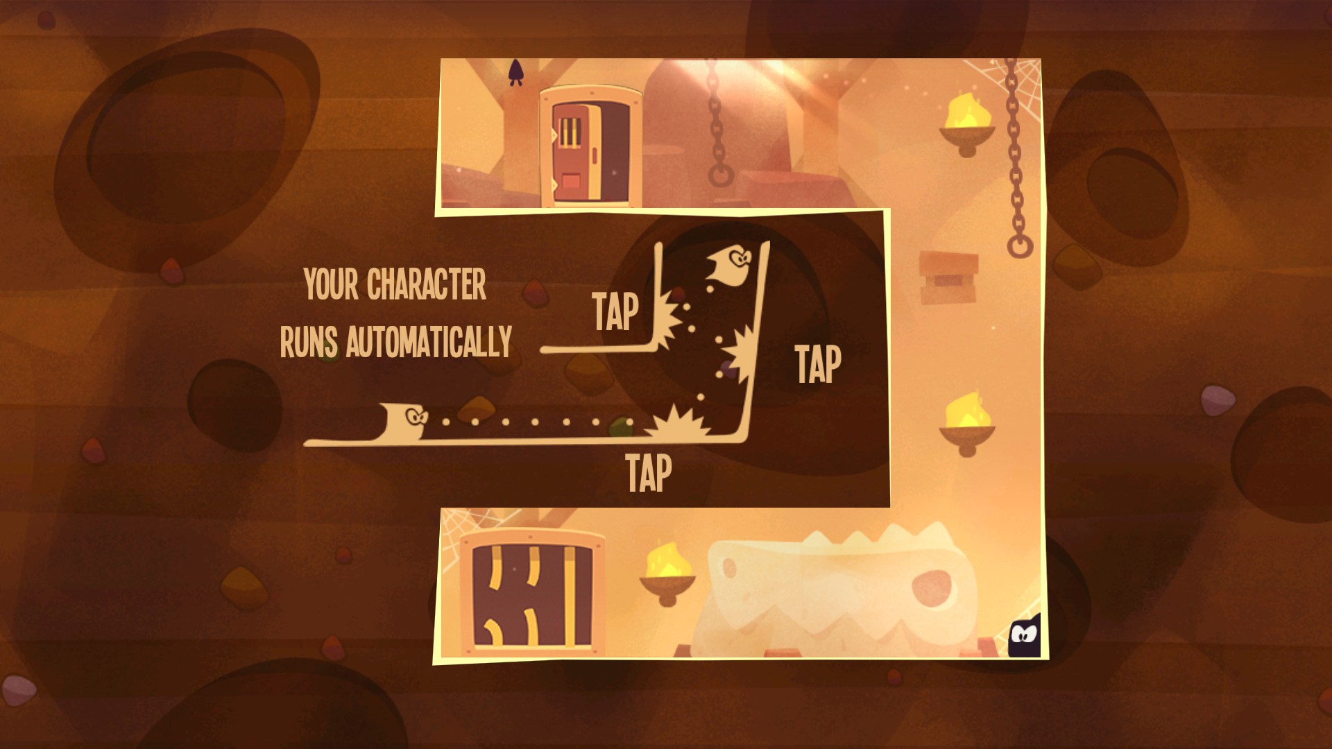
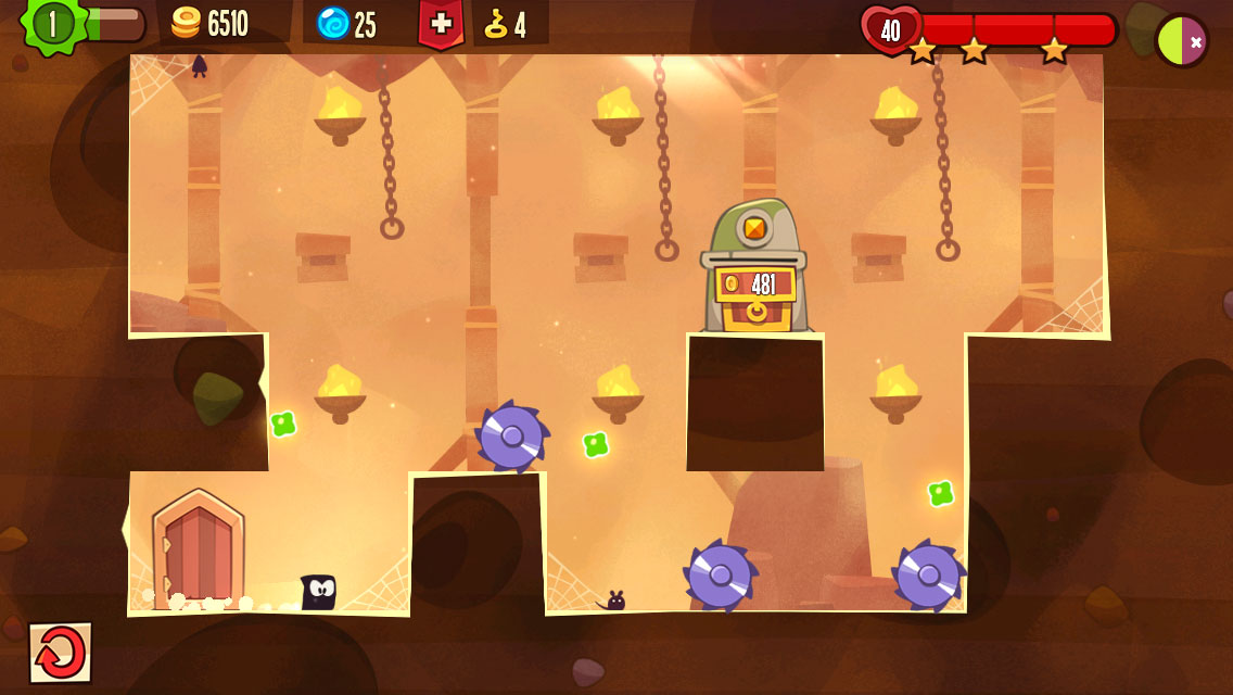
The core gameplay is a one-button platformer. Your Thief (the little cute black shadow) automatically runs left or right. You can tap to trigger a jump in the current direction. You can also jump off walls to reverse the players direction. ZeptoLab has managed to give classic platformers a mobile makeover. With one-touch controls it feels native on mobile. With simple rules, it feels expressive and gives players plenty of options. The gameplay is simple and is very transparent about what you did wrong each time you die. This creates very addictive core gameplay.

The object of each level is to reach a treasure chest. Go from “point a” to “point b” by avoiding traps. Hitting a trap will reset your progress right to the beginning. This punishment gives the game the “Super Meat Boy feel”. Reasons for losing are always clear to the player, and there is very little friction to restarting. The player jumps back into the action as soon as they are killed, making it extremely addictive to just keep trying to beat a level.
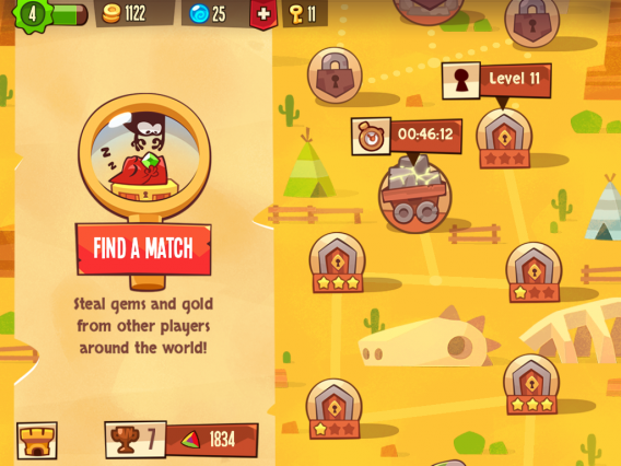
The meta (the progression systems outside of the core platformer gameplay) is a re-hash of Clash of Clans. They’ve managed to modify the standard Clash of Clans formula into something that works very well with the core platformer gameplay. Just like Clash of Clans, King of Thieves asks the players to manage two layers of gameplay: attacking and defence. On attack, the player plays platformer style levels to steal gold and gems (more on this later). On defense, the player must design a base that defends against other players’ attacks. Players sessions are focused on stealing as much loot from players around the world to upgrade their own abilities.
The Session Loop
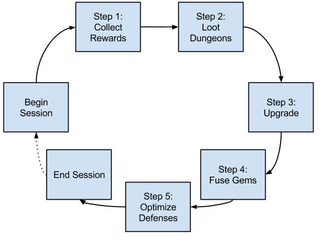
To deconstruct, I’d like to focus on session design. To do this, we need to break down the game into its daily action loop: the repetitive actions the player takes to progress in the game. Let’s evaluate each step in regards to how it impacts the way the sessions feel.
Looking back at the post on Flexible Sessions, the key principle of designing sessions is about creating a diminishing curve of value for sessions per day and for session length. Just to reiterate: The first rule is that the first session of the day should feel more impactful than the 2nd, 3rd, or 4th time the player returns. By the 5th+ session, this should give minimal value to the player. The second rule is that session length should also have a diminishing curve of value. Eventually a player should naturally feel that returning at a later point in the day would be more beneficial. These two rules make up strong session design.
So how does King of Thieves execute this?

Step 1: Collect Base Rewards
Each day the player begins their session with collecting the rewards from their dungeon:
- Collect gold from their stash. (Optional Short Timer)
This is a bucket-filling mechanic. Allowing players to collect from the stash as many times as they wish throughout the day.
- Collect gold from successful defences. (Short Timer)
Making sure players feel good about their defences, players collect gold for every failed attempt by other players in their dungeon. While not a lot of gold, this certainly feels good when you’ve come back after a long absence
- Collect generated gems (Long Timer)
Gems generate on the map on a longer cycle (multiple hours).
You can see here that these three reward cycles each have varied timer length, which allows for strong session design. Short timers to value coming back more per day, but longer timers to reward daily play. Using rewards of varying length, the player has a clear diminishing value for returning multiple times throughout the day.
Step 2: Loot Dungeons with Keys
After the player has collected all their rewards, they want to maximize their cash for their current session. There is always the threat that other players in the world will steal any resources they have when they leave the game.

Players can choose between the PvP (left) or the PvE (right)
To do this, players loot other player’s dungeons (PvP levels) or designer-created levels in a map (PvE levels). Player-created levels hold high value gems. Whereas the PvE levels have higher gold rewards (sometimes), unlock new gem generating mines and new dungeons which the player can move to. This system works because both PvE and PvP benefit the player in different ways.
King of Thieves innovates with their pacing mechanics. Instead of using energy or lives like in most games, they use “Keys”. Keys refill like in most games with time. The key difference is that the amount of energy (or keys) the player needs to spend to enter a level is randomized.

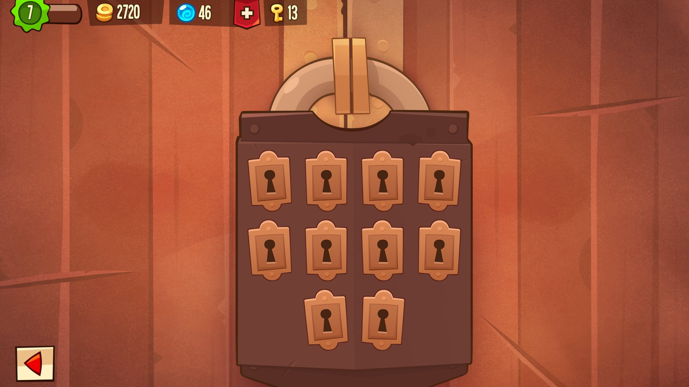
Players can choose a lock. Each attempt costs a key. Only one of them gains entry. Randomized Energy.
The player chooses locks on a screen with their keys. If they get the right key, they enter the level. If they choose the wrong one, they must spend another key. The game supplies the player with more than the usual amount of energy (10+). However, some levels can use 1 key to enter, others up to 15 keys to enter. Why would ZeptoLab design a system like this?
This system doesn’t please all player types. I’m convinced ZeptoLab benefits more from this system than the player experience. Not an easy choice I’m sure as a designer, but these sacrifices are sometimes necessary in a free to play game.
From the onset, this system feels arbitrary, just like an energy system. The player’s ability to loot is capped by some tacked on economy. Compared to Clash of Clans, Clash’s pacing mechanics make sense: you will eventually run out of troops to loot opponents. King of Thieves just says you run out of “keys”. Could this be fixed if the player had to “craft” keys in their base? Could this be fixed if the player had to build clones of their shadow player to start looting? Maybe. Overall I’m not a fan of the system, but I understand the benefits for ZeptoLab.
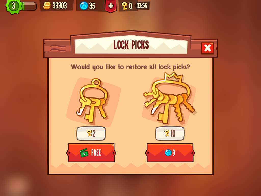
Because the system is randomized, players can try for one more level even if the player only has 1 or 2 more keys left. If they get lucky, this feels great. They get to play the level with little cost. If they fail, they are presented with this screen:

This screen is a high conversion screen for their video ads. Want to keep trying? Watch a video ad. Video ad revenue is becoming more and more interesting in the mobile free to play space, and I completely understand why ZeptoLab wanted to create a pinch point for this type of system. Players then binge watch some videos to get in that “just one more play” feeling.
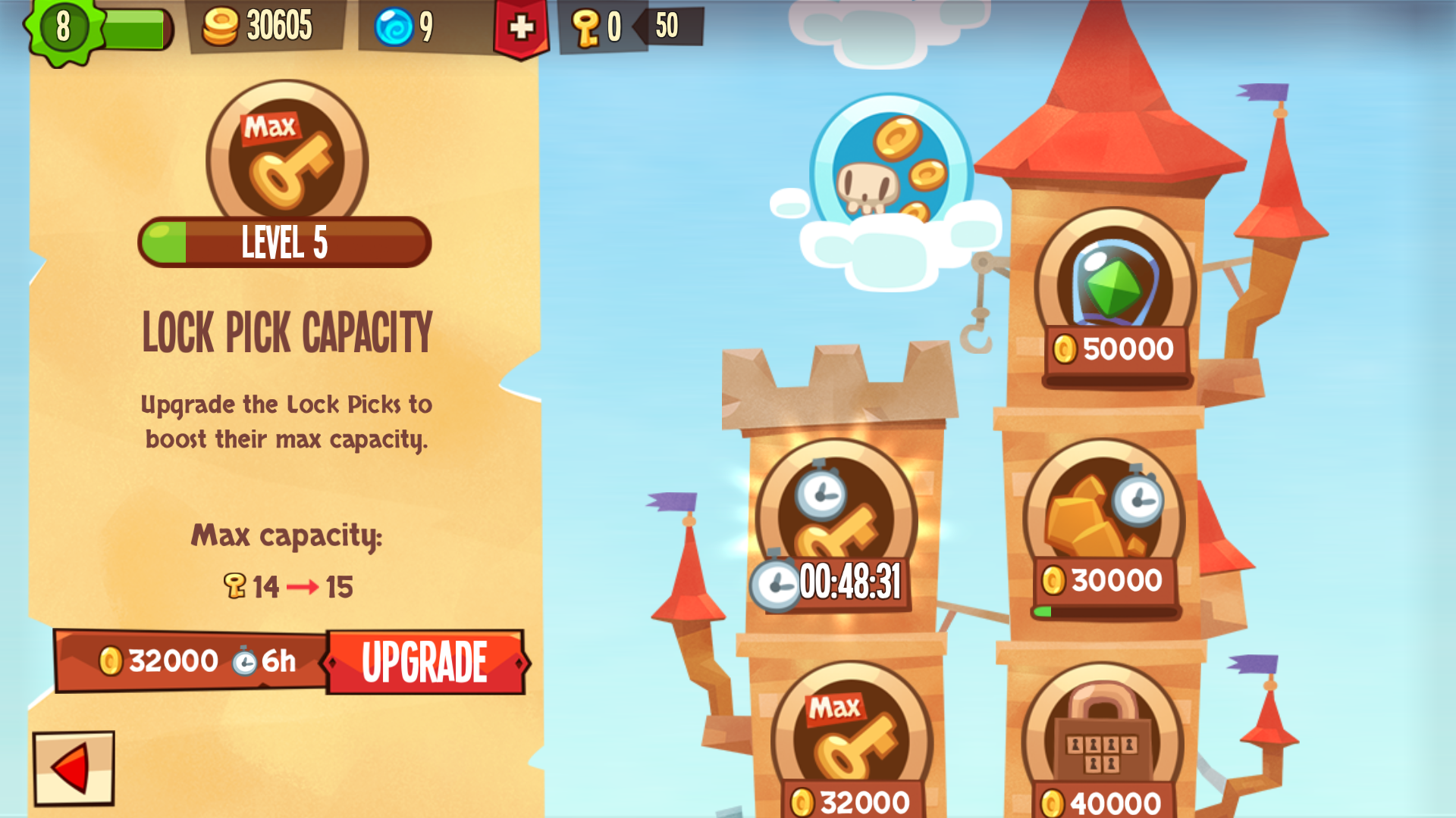
On top of converting players with video ads, this type of randomized energy system also creates a nice way to balance harder and harder levels. Players can upgrade their key storage limit to be able to reach higher and higher levels. The higher the level, the more locks that the player must attempt. Also, this can create an interesting session per day value curve. ZeptoLab can use metrics like sessions per day and session length in their decision about how lucky the player is. This may be dubious, but this type of “invisible hand” to guide the session design can be very powerful.
In the end, I’m unsure if this system of randomized keys was the best choice for King of Thieves. The system is a unique design and I’m excited to see what the market thinks of it. Just based on the conversion to video ads, I think this could be something to try for other genres.
Step 3: Upgrade Your Base (or Else!)
After the player has looted as many dungeons as they could in that session, they may use their found coins to upgrade their dungeon and resource generation. Any coins left over will most likely be stolen, so players attempt to spend every coin they looted. This promotes going for one more looting session, or extending the session to purchase more gold.

Step 4: Fuse Gems
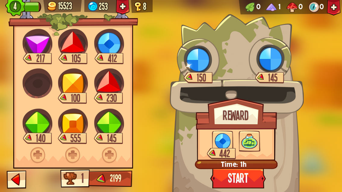
The key to the meta and progression of the game is fusing of gems. Players collect gems from mines on the world map and by looting other players in the world. The player then takes the gems collected and fuses them in their base.
Fusing usually takes many hours (3+ hours for a usual gem). During this time the gems in this fusing ritual are open for stealing by other players. This is the most anxiety-inducing timer in the game. A gem will be stolen unless they keep the game open or have amazing defences. I spent about two hours on a weekend keeping the game open while watching movies because I was too afraid to close the app and lose my gems.
So why would players opt-in to this nerve wrecking timer?

Increasing gem value is the goal of King of Thieves. The total value of your gems is how you rank in the game. Players are looking to retain only the highest quality gems (which is shown by a number). However, there are only limited slots the player can have to hold onto gems. So players quickly run out of slots and are forced to fuse gems together to make more slots for higher level gems.
This was a very, very smart design choice by ZeptoLab. This creates a natural cap for progression and creates a lot of very interesting choices for the player. It also creates an obvious high conversion item for monetization: the extra slots for gems. Similar to the builder in Clash of Clans, ZeptoLab has created a high conversion item out of these extra slots. I’m convinced that if they brought this to the forefront and made it cheaper for first time players, this could be a strong conversion item.
Step 5: Optimize Defences
After they’ve completed this loop: collect, attack, upgrade, fuse… what’s left?
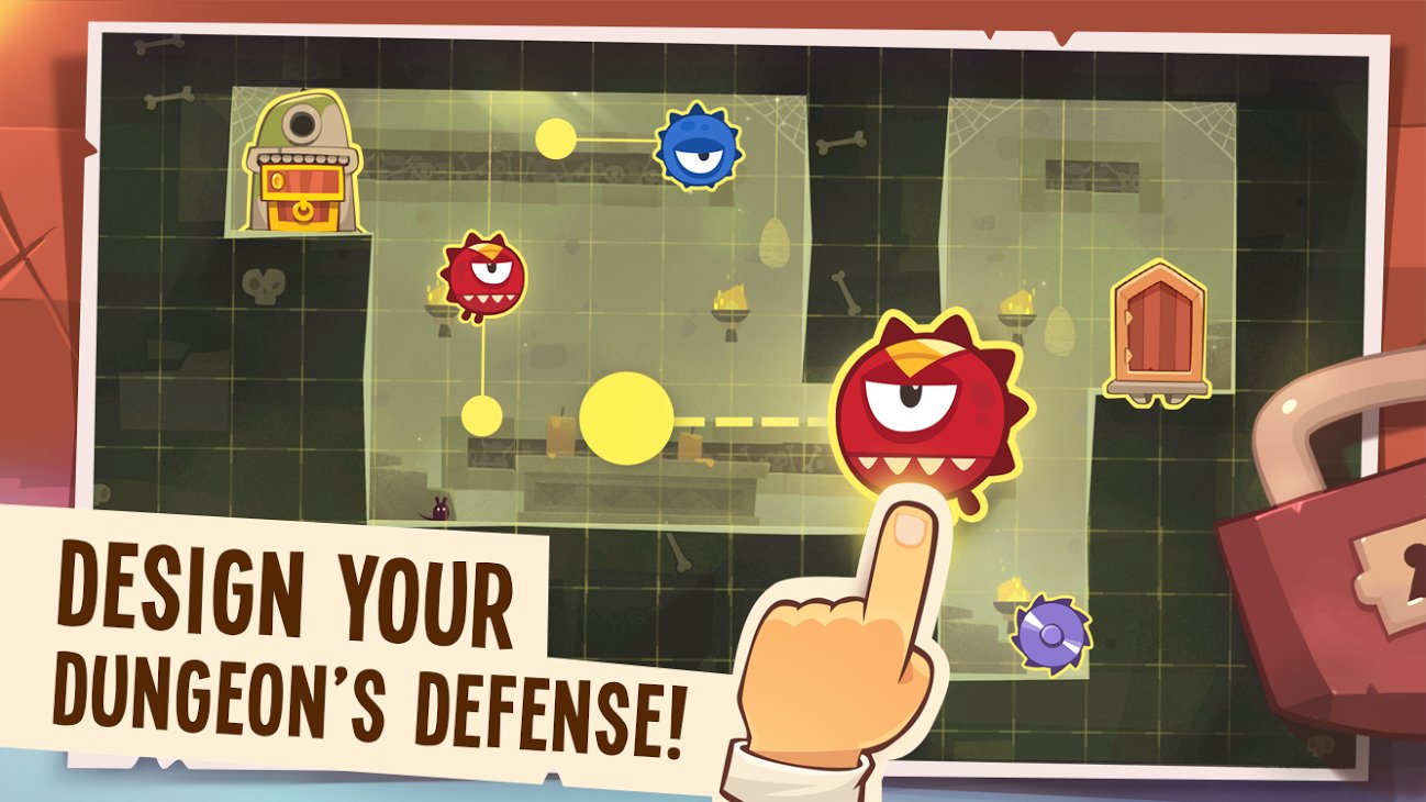
Just like in Clash of Clans, players can extend their sessions by optimizing their dungeons defence layout and adjust the positions of traps. This comes with one caveat: the player must be able to beat their own level twice… in a row.

This definitely creates a session extension. I’ve spent well over a half an hour trying to create the optimal dungeon design. All this time was not incentivized by the game, but I wanted the best layout possible. This is exactly what you want to create in your session design. A session extender that players can take as little or as much time with as they wish. The value diminishes over time.
What King of Thieves did right: Social Pressure Mechanics
ZeptoLab shows an excellent example of how to add effective social mechanics to a game. Asking players for help to retrieve lost gems creates social pressure. I feel good about helping my friends, I enjoy when my friends help me out when I’m less active. I rely on my friends to help me optimize my fusing timers. The value of having active friends is apparent.

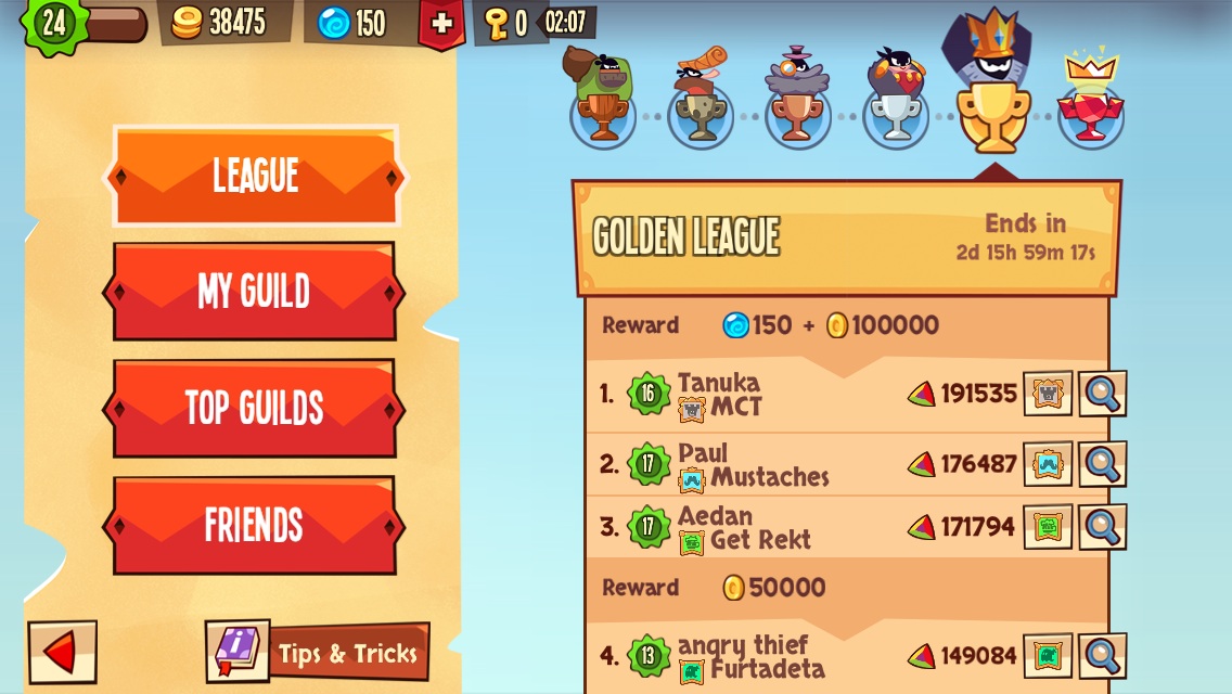
The league system creates a nice PvP environment with a clear reason to collect gems. Instead of feeling like I’m levelling up just based on some arbitrary number the designer has created for me (ex. collect 5000 gem value in 5 days), I’m competing against a living breathing opponent. I have to be engaged to compete, and the number is always growing so I never feel safe about my position. Sometimes I wish there were ways to specifically steal from other players on the leaderboard you were competing in. This would really drive up the competition.
King of Thieves also uses the same idea of clans in Clash of Clans. King of Thieves wants you to join a Guild. While the system is clearly in its infancy, it shows a commitment by ZeptoLab to the future of the game. Guilds are what will really drive the long term retention, and including it in the global launch was important. The mechanics at this point are still too early, but in the coming months I expect that ZeptoLab will build from this base and make very competitive play between Guilds stealing gems from each other. I hope they find a way that Guild members can work together on a dungeon or a raid. It would also be interesting to incentivize Guilds to put their most valuable gems in a vulnerable position. This will really drive competitive gameplay between the Guilds and give a collective goal.
What King of Thieves could improve: Hardcore Skill
In the translation of the Clash of Clans metagame to Super Meat Boy style mechanics, something fundamental was lost. Because platformer gameplay is inherently so skill-based, the translation still feels like a massive amount of skill is required to win.
Clash of Clans (as discussed before) although it requires some mix of stats and skill, the main determinate to win each fight is Stats. If you have an amazing army, you are going to win. If you have spent a ton of time (or money), you will be able to dominate against an opponent lower than you. As you defeat more of these easier players, you will be matched higher and higher in the leaderboards. This will demand more skill, but mostly more stats. This system allows players to “hover” around matchmade opponents that challenge their skill level, but still require high stats. Even if I’m terrible at selecting where my troops go, I’m still progressing, and I may be lower on the leaderboard compared to other players at my stat-level, but I still am progressing.

King of Thieves is never flexible over the amount of skill it requires from players. As you progress in the game, it keeps demanding more and more skill from its player base. As a result, the game feels very hardcore. The players that reach the end game are a smaller and smaller niche of highly skilled players. Why does this happen?
As the game progresses, players slowly get harder and harder obstacles they can place in their dungeon. In order to set up a dungeon that is difficult, the player has to beat it themselves. As a result of this system, unless a player is highly skilled, their dungeon, regardless of the defences, will remain at the same low level of skill-difficulty. There is no way for a player to increase their defence without actually being far better at the platforming game.
There are some stats that affect the game: the damage of the obstacles, your shadow’s equipment and armour, the amount of keys you have, etc. But these stats clearly take less of a precedence over the skill. In my opinion, there are some levels that you just need high skill. So as you progress in the game, no matter how much time or money you’ve put into the game, you will reach levels that it doesn’t have an impact if you don’t have the skill. There is no “hovering” in the matchmaking that allows players to feel progress regardless of skill. Players with low skill will feel it: they are punished by losing levels very often.
This is most likely an artifact of trying to combine a high-skill genre (Super Meat Boy) with Clash of Clans. While this pushes away players that are expecting a lower skill level, I think it also engages the highly skilled players even more. The tradeoff between a highly engaged niche target audience and a flexible broad audience appeal is incredibly difficult to get right.
The Results:
On launch, the app was featured by Apple. This drove hundreds of thousands of downloads, but has yet to crack the Top 100 US Grossing. Can it get there? This will be an extremely tough. After a featuring, the only way to drive the necessary volume to reach the Top Grossing Chart is to purchase installs. This is extremely costly.
However, the game supports very strong early day retention and with more work can improve their long term retention. With continual improvements, this game has a chance to reach a stable position in the Top 250 Grossing.
Personally, I’m cheering for ZeptoLab. This design is refreshing. I had the feeling that the mobile free to play space is even more risk-averse than the console/pc space. This feels like a step in the right direction. This is a game ZeptoLab should be proud to have worked on. I hope other game developers can look at this example on how to innovate in new genres
Touch Control Design: Less (Control) is More
The most common fault in touch control design: trying to incorporate too many concurrent mechanics at the same time.
If your game is a real time game (arcade games, action games) which requires the players to make quick decisions based on a real-time clock, having too many game mechanics operating concurrently will only confuse and frustrate your player. So you have to be vigilant with how many mechanics you as a designer ask the player to keep track of at the same time.
Choose the main priority of what you want your user to be focused on, and remove as many of the other mechanics as you can. If other mechanics are necessary, allow the player to switch between modes, so their focus can be on one mechanic at a time.
Commonly when porting a design from a previous platform, there are common design flaws that can be simplified to reduce the number of concurrent actions.
A Mindless button
If your game involves the player constantly holding down a button or tapping on a button mindlessly, then you have to rethink whether this mechanic is really required for mobile.

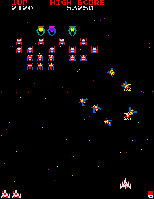
Galaga(c) — Credit Namco
In a standard arcade shooter game, the player is responsible for two mechanics : Choosing when to fire, and avoiding obstacles. The player is constantly tapping on the fire button, while controlling their fighter with the control stick.
What is the core mechanic you are trying to focus on? When to fire, or avoiding obstacles? Choose one, and get rid of the other unless you’re willing to sacrifice users.
If choosing when to fire is the most important part, then remove obstacle avoidance. The player gets hurt if an opponent reaches the bottom of the screen.
If avoiding obstacles is the most important, then remove choosing when to fire. The ship auto fires and the player balances between attacking enemies and avoiding obstacles.
Mindless buttons show up in many traditional arcade designs. Rapidly tapping on the screen can be good design: this is a great way to change up the pace and get the game intensity up. But if you switch to a tap as fast as you can mechanic, then consider removing all other mechanics during this time.
Case Study : Drag Racer


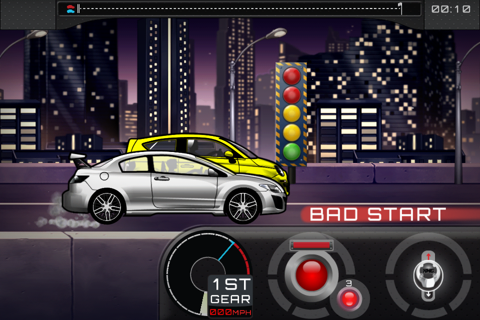
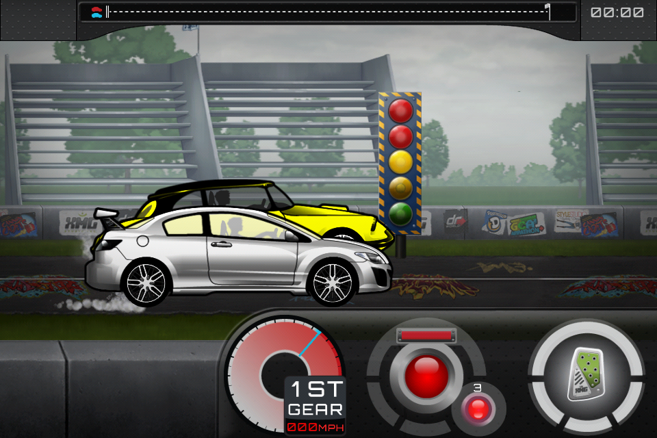
Why the gas button while racing? Players don’t need to control their speed, they just need to go forward!
Drag Racer was a game I designed back in 2001. It was a hugely popular flash game through 2004-2008 on all the top flash sites. It involved upgrading your drag racing car and competing for best time.
The game consists of upgrading and customizing your car, then competing against increasingly challenging drag racers. The race mode consists of the player tapping gas at the beginning, getting the best start possible, then shifting gears in the most optimal position. Its a game of timing.
The core mechanic is timing your gas and gear shifts. But why does the user have to hold down the gas pedal? That’s just a mindless button.
In Drag Racer World, we moved the gas pedal and gear shifter to the same side of the screen. This removed the need for players to just mindlessly hold down the gas button, wasting a finger and forcing two handed control.
In the latest installment of Drag Racer, Drag Racer World (2012), the player first taps on the gas, then taps on each gear shift. The player can leave their finger on the gas pedal if they wish, but play can be accomplished with just 1 finger, allowing more casual play of the game.
Too much control
Usually porting a game from another platform can create issues of “too much control”. Other platforms have more buttons, more controls, and the audience is prepared to use them. On mobile there is no way to accomplish this control without adding more buttons or controls.
This platform is mobile. The phone is jostling around, the player doesn’t have an accurate mouse to track and click exactly where they need to be. On screen buttons have no tactile feedback so if the user moves off of your hit area, they aren’t going to notice until time passes by and they lose the game because they didn’t realize fast enough. I don’t think anyone wants to play a game that the best users are the ones that can stay on a on-screen button the longest.
Ask yourself whether this much control over the game is really required for the game mechanic.
Case Study : Designing for a Puzzle Arcade game

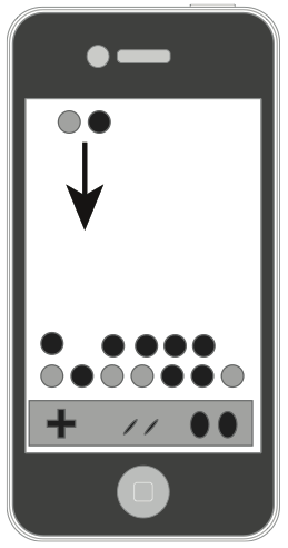
Arcade Puzzle games suffer from too much control. Imagine trying to port a game like Tetris, Dr. Mario, Puzzle Fighter or any of the games which require the player to control a falling puzzle piece and place exactly where they intended in the game world.
A Puzzle Arcade game : Slide or on-screen buttons to control the falling pieces?
These are notoriously hard to control on the touch screen device.
How do you control a falling piece? How do you rotate it?
Gestures? slide your finger left or right? That’s alright, but doing the left swipe over and over again is hard on the player.
Buttons? the player can lose track of them fairly quickly.
Do we really need to control the piece as it falls? Is that really the most important mechanic?

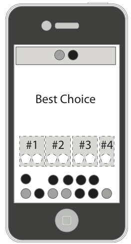
The most important mechanic is choosing where to place your piece in the limited time it has to fall. That’s the core of the game, and that’s the mechanic we should be using.
Tetris(tm) by EA Mobile uses tap to choose the location. Hardcore fans won’t have the flexibility of directing the pieces, but the mechanic simplifies the controls so that the player is focused on placing the pieces. Instead of dealing with the control mechanic.
You can instead design your game about deciding on where to place your piece in a limited amount of time. The game can guess all the best places to place the piece, and allow the user to choose where to place with just a simple tap.
Now immediately the player is not restricted by their ability to control on screen buttons. They can make moves quickly and without fighting against the controls. The player that wins is the one that can make the best split-second decisions, which is what the game design intended. In the end I consider this a great design decision by the team. However, the core audience most likely was turned off this because of the departure from the traditional mechanic — but if you’re serious about making a design work on mobile, you’re going to have to break some rules.
One at a time…
Too many mechanics at the same time will confuse players and frustrate them.
But sometimes multiple mechanics are necessary for depth in the game play. When this happens it’s always best to prototype and user test simplifications of this. Try to keep this down to one type of touch mechanic at a time. Don’t mix Tap and Hold mechanics with Line Drawing mechanics unless you really give the user a chance to change their thinking.
Allow advanced users to opt-in to multiple mechanics at the same time. But don’t force it on them. This is a great way for users to expand as they become better at the game. Add this feature in when Players are so used to controlling your game with the one mechanic they can easily adopt the second mechanic.
If your primary mechanic is intense, time based and twitchy, your user will most likely have no time for a secondary mechanic. But, if your primary touch mechanic is strategic and intermittent, then your advanced players can control this mechanic in their peripheral. This allows you to add depth in adding in another mechanic.

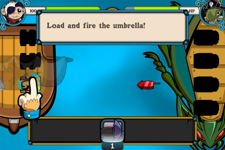
Powder Monkeys (2011 XMG Studio) Players primary mechanic is choosing which cannon to load the bullets. The Secondary mechanic is changing which type of bullet. This is only possible if the primary mechanic is strategic and intermittent. With Powder Monkeys when you are jumping between firing and choosing it can get really overwhelming. If the battles were paced a bit slower, we might have been able to fix this, but with the speeds of the battles we wanted, jumping between choosing cannons and choosing weapons felt overwhelming.
As always, user test your system to make sure it works and that users don’t feel overwhelmed managing the multiple systems.
Case Study : Cows vs Aliens Powerups


The original had players pausing the game to select their powerups.
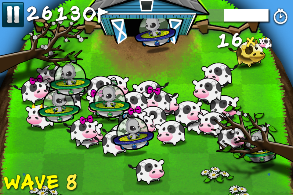
Cows vs Aliens has three concurrent game mechanics : Herd your cows, kill the aliens, and use your powerups.
The first two mechanics are complementary and require only the core game mechanic to control: touching your finger down and influencing where you want the cows/aliens to go: the barn, or the cliff.
Powerups was added after the first iteration of the gameplay. But how do you incorporate this without confusing the user?

Adding a button to trigger powerups. Too many controls at once!!
Our first attempt was to allow the player to trigger them on screen. The player can click a HUD button to trigger a powerup. This method crowded the interface, make the game look more complicated than we intended, and we found players accidently clicked the powerups when their fingers were flying around the screen.
These are powerups the player could have potentially pay real money for, so this wasn’t acceptable.
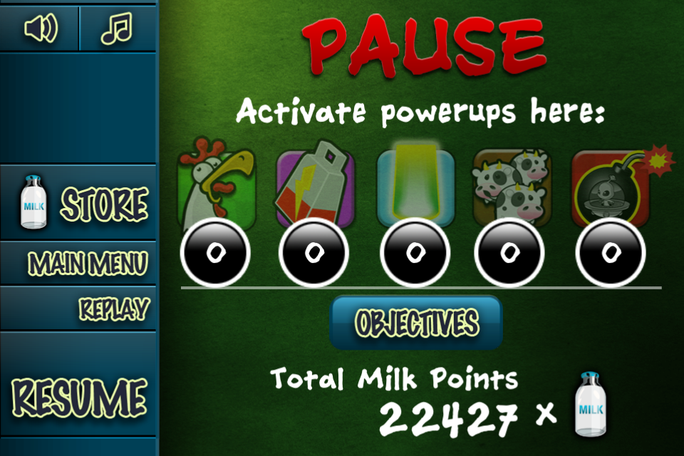
Our second attempt was to put the powerups in the pause menu. This was eventually launched since we couldn’t brainstorm a better solution. This method worked. Players were taken out of the game, they strategically chose their powerup, and it sent them back to the gameplay. No more accidental clicks. But this wasn’t optimal. Part of using powerups is being able to use them “in the fray”, right at that moment when they need it the most. Taking them out of the game isn’t great for that. The end result was that many users couldn’t find the powerups, they were hidden in the pause menu which didn’t scream “powerups are here” when the player needed them most.
Our final attempt was to have a draggable menu for selecting powerups. The player can press and hold the top right hand corner of the screen. This would bring out a menu, showing each of the powerups as a independent option. The player would then drag their finger to their selection. This isn’t that intuitive, this has only been done by a few apps on the AppStore, but allows for better flexibility, and less accidental clicks. It also keeps them in the gameplay.
Most importantly, when the player holds down on the powerups button, we slightly blur and slow down the gameplay, giving the player a bit more time, a breather to choose which powerup they wanted to use strategically. We find this works a lot better, and keeps the game intensity high.
But notice how we fixed the “3rd mechanic” problem : We found a way for the player focus on one at a time. When the player is choosing what powerup they want, the gameplay is slowed down and removed from focus. Having all 3 at once is too chaotic. This mechanic wasn’t complementary to the primary mechanic, so we had to shift the player from one “mode” to another to allow the player to utilize the mechanic without getting confused or frustrated.
Always aim to have 1 mechanic at time. It’s possible to have more then one mechanic, just allow the user to opt-in. Then make sure the player has time to acknowledge the context switch (slow down time, ease the difficulty) or else they will be confused and frustrated.
Designing a Touch Mechanic
The iOS platform has a lot of options for designing touch mechanics. Use of the accelerometer, touch screen, microphone can all be used to create a compelling mechanic. Each control option has pros and cons, and it is important to be aware of them as you design your mechanics.
Tap the screen anywhere

Without any tutorial, the player can discover this. The touch mechanic asks the player to naturally tap on the screen to continue, to prod the game to see what happens.
This mechanic also keeps the player’s fingers off the screen. Fingers leave the screen as soon as they came, making it easy for players to stay involved in the game.
Use this mechanic as much as possible, but only if it makes sense with the style of game. Just tapping alone does not give much to work with in terms of game mechanics, you only have the aspect of timing to play with. When a little more depth is required in a tap mechanic, it is more useful to use a tap and hold mechanic.
Tap and Hold

When you design touch mechanics, always design so that fingers are on the screen as little as possible.
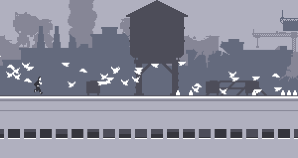
Keeping in mind that fingers cover up the screen, it becomes important when deciding between Tap and Hold mechanics. Keeping these mechanics to the lower portion of the screen is always better, depending on what play orientation you’re in. Note that with most one button runners on the AppStore (Canabalt, Monster Dash, etc.) the player learns to position their finger in the least obtrusive place so that it does not cover up upcoming obstacles.
Tap and hold can be just as discoverable as a tapping mechanic. Ensuring there is an animation for the “hold” part is very important, otherwise the player can’t discern between a tap mechanic vs. a tap and hold. Make sure it’s very obvious from a quick tap that the player can hold the button a bit longer for a different result.
Tap and Drag

Tap and Drag controls, especially those that require precision (like line drawing games) are difficult to manage. The player is drawing with their finger, and covering up half the screen. With arcade mechanics (such as Flight Control) advanced players will soon learn to make their drawings quickly so that they aren’t caught drawing when the crash is about to happen.
Don’t expect the user to draw intricate drawings with their finger AND require them to monitor what’s going on on the screen.
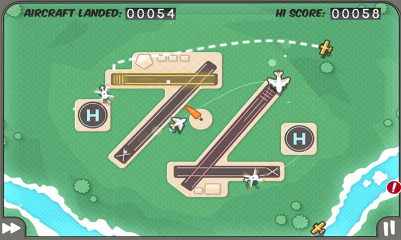
As with all control mechanics, they expect immediate positive feedback that the device has accepted their input. Make sure to draw a line, mark their start and end points, and confirm when the user has drawn “correctly”. Note in Flight control it is immediately obvious where you started and finished a path, how far the unit has moved along the path, and when the path is drawn to a correct location. The path fills in, giving immediate feedback that the path is “accepted”.
With this mechanic you have to balance precision with speed. Players will either rush to draw, or be precise. Choose one, or ease the player into speed or precision. Fruit Ninja (Halfbrick) does this very well. Immediate feedback is shown when your swipe is on the screen. Their mechanic mixes the timing and precision. Not a lot of precision is necessary until later rounds, in the beginning the gameplay is just fun to slice fruit around the screen. As bombs come in, precision is required for more advanced players. Precision is difficult with touch screen devices, as players fingers are commonly covering up where they are drawing. Sometimes using a zoomed in view to show the exact location the mechanic is pointing to just above where they’re finger is will allow players to tap and drag to the exact precision point they need to be. If players are required to be this precise however, don’t assume they will be fast.
Swipe Controls
Many games want to use the touch screen for what its great for: it is a 2D plane with multi dimensional control. Swipe is excellent for quick 2D control. It re-creates the feeling of flicking and swiping in the real world, so it’s excellent for creating feelings of hitting a ball, slicing a sword, or rotating an object, petting an animal.
Swipe for timing events is difficult. It’s very difficult for the player to time their swipes. For example, if you are swiping to hit a baseball thrown at the player, when is the moment that the ball hits the bat? Is it at the beginning of the swipe? Is it at the end of the swipe? Is it somewhere in the middle? Fruit Ninja does this impeccably well – but is only one of the few games that have given the player enough feedback and direction to build the player up enough to use the swipe mechanic properly for timing and tracking events.
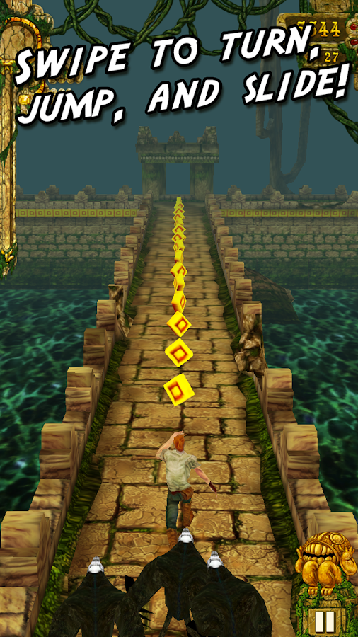
Don’t force the player to constantly swipe for long periods of time. Fatigue will set in, and the player will give up on your game. It’s usually best that the swipe mechanic is intermittent and at the player’s own pace (they choose when to swipe next). To combat fatigue, influence the user to use their index finger rather than their thumb. Have the swipe mechanic in the center of the screen, this area is harder to reach by thumb, and the player will swap to an index finger. Just remember that using an index finger means that there can only be 1 touch mechanic operating at once. If you expect the player to use both hands, they will have to use their thumbs.
Constant swipe mechanics can become tiring for the player after a long time. Especially if you force the player to use the entire screen.

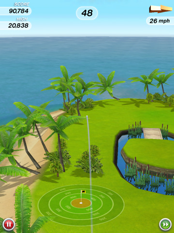
Flick golf influences the player to use their index finger for swiping by placing the golf ball in the center of the screen. While in mid air, the player constantly swipes the ball to add spin. This sets in fatigue, but the gameplay adds a pause as the ball lands, allowing some time for the player to rest in between shots. This uses the swipe mechanic for what it’s best at, and gives the player a chance to rest.
Accelerometer and Gyroscope

Ball Rolling style control for accelerometer. Requires two hands, but is intuitive and mimics real life.
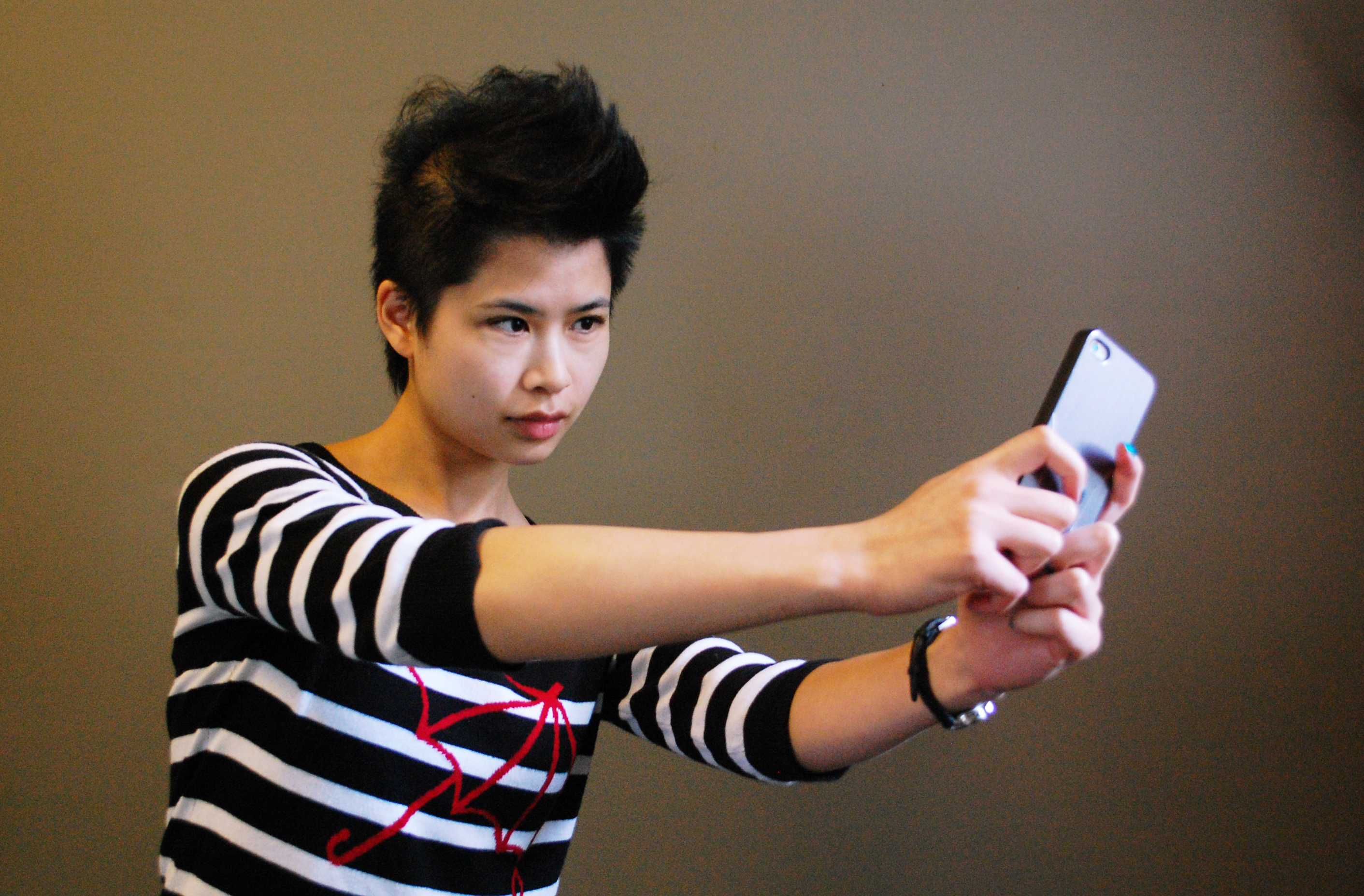
Augmented Reality Control can be accomplished with a Gyroscope. This allows the player to hold out the device and move around the real space. This way of control can only be done in specific areas : they can only play in open places which they won’t be embarrassed to be moving around ridiculously.
Accelerometer control keeps fingers off the screen. The player can control the game without the use of fingers, and it allows for the player to play the game with 1 hand (excellent for keeping in the “Subway Thumb” orientation from the previous section).
Easily Discoverable. Players will naturally pick up the device and subtly move the device. you will have to balance easy discoverability with making sure the player can easily control the game. Too sensitive and the game is frustrating, too unsensitive can make the game feel unresponsive and the player will end up tilting their device madly to get the app to do what they want.
Accelerometer as the primary mechanic makes it easy to add a tap mechanic on top for secondary features.
However, precise 2D control is difficult with Accelerometer devices. Playing with the sensitivity will help, but players will still prefer a tap and hold mechanic for precise control over an accelerometer control.
Accelerometer controls suffer from calibration issues. Players won’t always play your game in the same orientation, they want your game to adapt to how they want to play. Even if your game is a ball rolling game, you can’t assume that a user will always play the game looking down on the device. Players will play it in various settings and will want the game to adapt and work in these settings else they won’t play the game. Players can play in bed, on the go, or sitting in a chair, and the default orientation of the device won’t support each of these situations.
Keep the accelerometer movements small. Fatigue along the wrist can occur if the player is controlling the game with one hand and is asked to move constantly side to side. Asking the player to shake constantly in the game play can result in fatigue, avoid continuous shakes. The further and more often the player has to move the device, the less of the screen they see.

Using the gyroscope control at arms reach can create fatigue after prolonged use. Make sure gameplay is short and doesn’t require huge movements.
On Screen Buttons
It’s inevitable. Eventually you’re going to have to put an on screen button somewhere in your game. The pause button, the power buttons, an advertisement.
It’s important to be vigilant and simplify this as much as possible. On-screen buttons should always be seen as a last resort.
Follow these steps before you commit to an on screen button :
Step 1 : Make the button Adaptable

Canabalt is the ideal : a one button jump technique that allowed the player to use any area on the screen. This allows the mechanic to adapt to the player’s preferences.
Whenever possible, allow the game to adapt to the player’s preference. Instead of having a button for the player to press, allow the player to press wherever they want. Players will press on the screen wherever is most comfortable for them. Making sure this is discoverable is important, but will make your game more accessible.
Instead of a dpad to control the player’s movements left and right, allow the player to tap on the left side of the screen or right hand side of the screen for movement. This translates very well between iPad and iPhones.
Instead of joystick controls stuck in the corner of the screen, allow the player to press down and slide their finger to define the location of the joystick control.
Step 2 : Make them Context Sensitive
Only display a button when the player needs it. This removes/hides elements whenever possible, and will push your players to use these features more often.
For example, if you want the player to use powerups of buffs during the head of gameplay, they can be presented with large buttons for using these powers during opportune times in the game. This will increase usage.
This will also effect the gameplay, if the player is focused on deciding whether or not to press this button, the gameplay around them should not be trying to take their focus away. Make sure the player isn’t required to control another mechanic while a context sensitive button is displayed.
Step 3 : Make them Deliberate
Placing an onscreen button in a awkward area of the screen can prevent accidental clicks and make sure that the player is deliberate when picking this button. Buttons as a requirement should be minimum 45px wide on a standard definition phone, 90px wide on a retina phone. The closer two buttons are together, the easier it is to accidentally tap. So make sure buttons are deliberately placed, appropriately sized for the device, and placed far enough a part that accidental clicks do not happen.
Make it Visceral
The most important part about building a touch mechanic is making it fun. Being visceral is the key to this.
Make the mechanic responsive. Nothing kills a games control mechanics like a poor technical performance in a game.
Make sure the touch mechanics respond at 60 FPS. This will minimize input lag and make the controls feel very responsive. The quicker the feedback and the smoother this feedback is, the more visceral the mechanic will feel.

Give plenty of feedback in the control.
Use animations, trails, sounds and vibration to give your game feel direct feedback to the player. It will make it more intuitive and make the game more enjoyable.
Make it fun to play around with.
All of the great successful games on the AppStore have a touch mechanic that’s a pleasure to play around with, regardless if the levels, puzzles and obstacles were around. If you’re not having fun just by playing with your mechanic, then it won’t be fun when you add all the other stuff.
Take influence from real tactile systems in the real world.
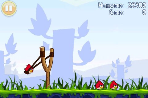
Angry Birds used the feeling of pulling a slingshot for their intuitive, fun and visceral firing mechanic.
Cows vs Aliens used to feeling of pressing down on soft foam as the inspiration of the touch mechanic.
Fruit Ninja used the feeling of slicing to make the player feel like a real ninja.
Take influence from real world objects when designing touch mechanics. It will make them more intuitive, and make them more appealing to your audience.
Touch Control Design: Ways of Playing on Mobile
Back in 2012, I was actually writing a book. I had a publisher lined up, but in the end the amount of time required became overwhelming and the publisher lost faith in the success of the book. Lucky for you, I can now give away this information for free!
While the content was written by myself, the photos and illustrations were done by Jackie Fong, Rocco Commisso, and Gabby DaRienzo. My old partners in crime at XMG. Many of the photos include games that are owned by XMG Studio.
Here is a first excerpt of my book which focuses on touch controls for games on mobile.
Ways of Playing on Mobile
The touch control, how the player uses the touch screen of the device, is always the hardest component to get right. The control mechanics will make or break your game on a mobile device.
If users are constantly fighting against the control mechanics or if users cannot understand what to do quickly or if users are required to do too many things with their fingers, it will kill your game. It is also impossible to make everyone happy with the control mechanics. Understanding your audience is key.
Using the common mechanics that your target audience is used to is extremely important. If your audience is core gamers, use common mechanics with which they are familiar. Don’t be afraid to borrow inspiration from your competitor’s games. That is what your core audience is used to! Always take risks and innovate; however, when it comes to controls, don’t fight what your users already know.
This chapter serves as reference for designing touch controls that work on mobile or small touch screen devices. Focus on designing touch controls that are as inclusive as possible. Allow the player to play your game whenever and wherever the player wishes. It is imperative to always user test.
The only way to see what is right for your game is to test with your target audience as often as possible right from the beginning. Take their feedback seriously. Prioritize fixing usability bugs over creating new features.
If you leave usability to the end of your production, you will never fix them. Adding more features on top of a poorly controlled game will not make the game any more successful. In fact, more often than not, it will cause your house of cards to come crashing down.
Control mechanics won’t figure themselves out. You have to fix the problem right from the beginning.
Know your Audience
The first step in designing a control mechanic is to determine where and how your audience will play your game. Head out into the real world. Find your target audience. Watch them play games. Watch gamers at play:
- Watch them play on the subway on their iPhone.
- Watch them play on the couch with an iPad.
- Watch them play at the coffee shop with their iPhone and iPad.
- Watch them play as they walk down the street (and walk into that sign post…)
Notice :
- Notice where their attention is.
- Notice how often they play.
- Notice how long they can play the game.
- Notice what common distractions are in their environment.
- Notice where they place their hands.
- Notice where their fingers can and can’t move.
- Notice what their fingers cover up when they move about the interface.
Did they notice your awkward stare yet? Good.
Playing on an iPhone
There are many common ways that people hold their iOS devices when playing games. People are inclined to operate them in similar ways. The mantra of this chapter is : Always know your audience
- Know how they play,
- Know where they play
- Know why they play.
Build your mechanics with that in mind. Here is a list of playing orientations that I have found most users follow on the iPhone :
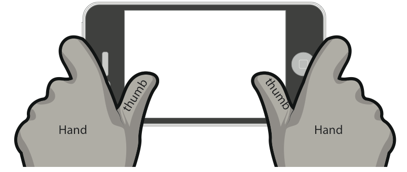
- The “Gamer Stance” is the bread and butter for most game-experienced players on the iPhone. It involves holding the gaming device with two hands and using both thumbs as controllers.
- The “Casual Prodder” is how the majority of the world plays on the iPhone. One hand holds the gaming device while the other hand (thumb or fingers) control the game play.
- The “Subway Thumb” comes up when the player is walking along the street or is holding on to a subway railing to support themselves. Both the holding of the gaming device and the control of the gaming action happen with the same hand.
Gamer Stance

In the “Gamer Stance”, players holds the gaming device with two hands using both thumbs as controllers.
Notice the placement of thumbs and where the player stabilizes the phone in the “Gamer Stance” as shown in Figure 2-2. This is how most hard core gamers hold their phone. They’ve grown up on GameBoys. They own a PSP. This is NOT the majority of players. Building a game specifically for this stance is not ideal for casual games. By designing for this orientation, you have made a choice that your game will be built for the niche of core gamers on the iPhone. This is entirely fine. Many great successful games have been built for this orientation. As the game developer, you just need to be aware that this orientation has its advantages and disadvantages.

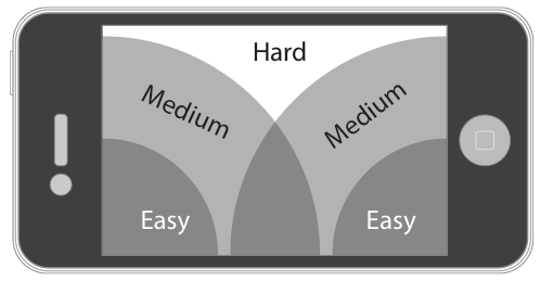
As shown in Figure 2-3, there are relative tracking area where players can press with ease and where they can press to reach.
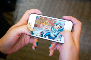
Thumbs at the side present some design inferences. Buttons placed along the sides of the screen are best to avoid the thumb covering up the screen. Notice in Figure 2-4 with Inspector Gadget, we kept most of the UI elements to the sides of the screen.

It is important to look at which area of the screen players cover up when they press down on the screen. Since the thumbs are at the sides, the farther the thumbs travel into the top center of the screen, the more they cover up the middle of the screen. Buttons, controls, etc. that require the player to press in the top center should have this consideration. The players’ thumbs are going to cover at least half of the screen. It will require them to reach with their thumbs, making it a very deliberate action. Players with smaller hands will have to let go of the phone to reach the top center. Interface control for this orientation should be kept to the outsides of the screen for this reason. Always keep in mind, when designing for this orientation, that this orientation is a niche market in the AppStore. It is not the core casual audience. Angry Birds, Fruit Ninja, Where’s my Water, Cut the Rope, etc. all use a one-finger mechanic that is better for the “Casual Prodder”. Even games that are geared towards a more core audience allow for control in this way to widen the potential audience.
Casual Prodder

For the casual gaming audience, the “Casual Prodder” is the most prominent way to hold and play games. The “Casual Prodder” player holds and stabilizes the phone with one hand while the other hand pokes the screen.
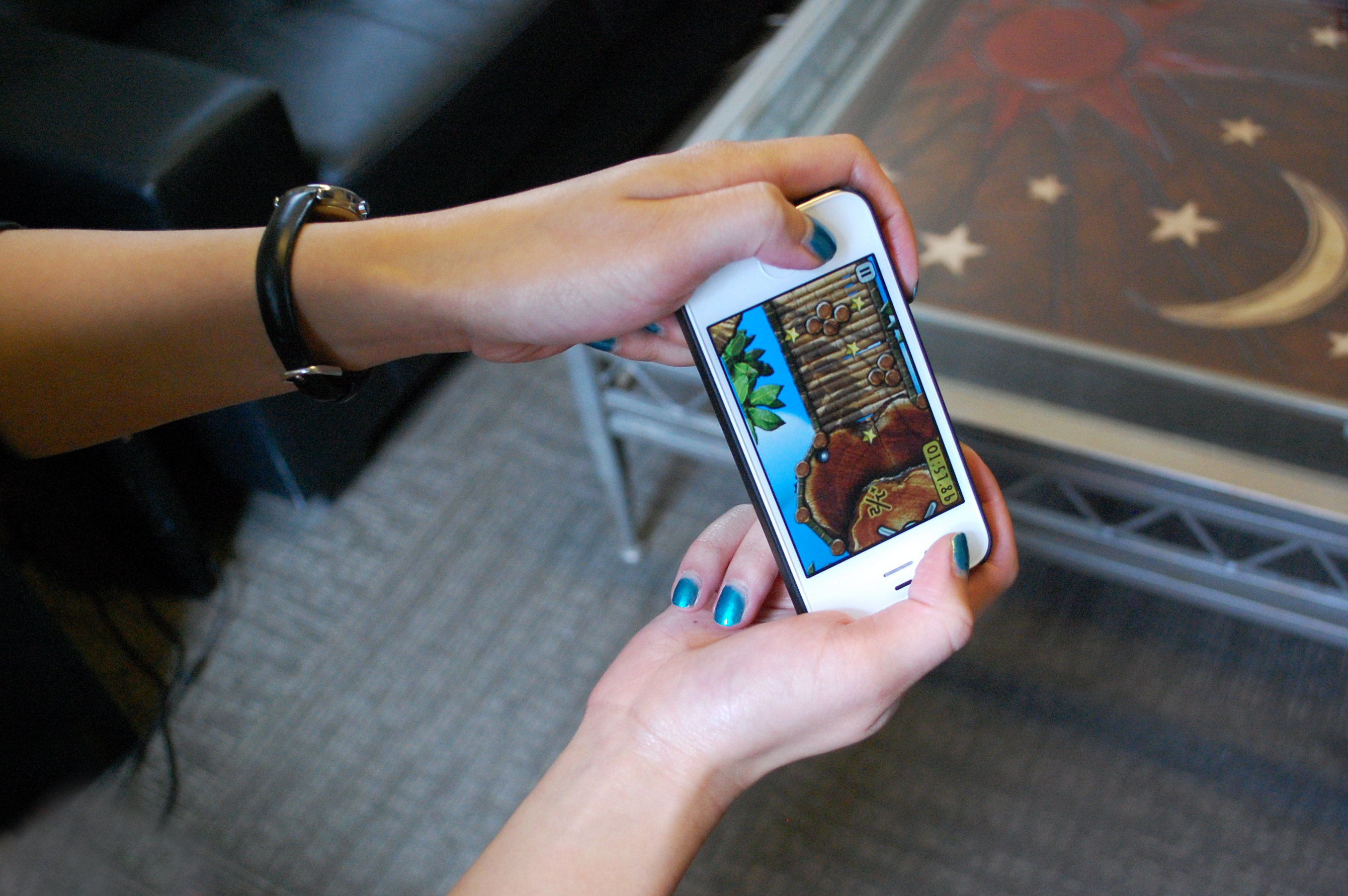
The gaming device can be held in both Portrait (vertical) and Landscape (horizontal) positions or orientations. This orientation is used in games like Cut the Rope, Angry Birds, Fruit Ninja, Jetpack Joyride, Flick Golf, Bejeweled, Plants vs Zombies, Flight Control, Where’s my Water , etc. As shown in Figure 2-5, notice the finger placement in this orientation. And, notice how it changes based on either the landscape or the portrait positions. Notice also that left-handed and right-handed players will come at the game from different sides, so the hand could cover the left-hand side of the screen, or the right-hand side.Notice that one of their hands is essentially incapacitated. One hand is used to steady the phone completely while the other is used for control. This means you cannot push the player EVER to use two control mechanics at once. But you can use a combination of :
(More on these later!) Each of these methods has good tracking ability, so players can use their finger to tap anywhere on the screen without much issue.
Subway Thumb

The “Subway Thumb” is the most casual of all of the orientations. Building a game with this orientation in mind will allow for the game to be played in the broadest areas. With the “Subway Thumb” mechanic, players hold the phone in one hand, and use only the thumb of that same hand to control the game. This allows players to hold onto something with their other hand to steady themselves. So when players are in transit, walking down the street, holding a coffee, etc., they can still play the game. However, as shown in Figure 2-6, since the player is using only one had to both stabilize the gaming device and play the game, this orientation is extremely limiting in game control.The “Subway Thumb” orientation is much less stable and much less attractive with the landscape orientation than with the portrait orientation. Small-handed people will not be able to stabilize the phone, and are less likely to feel safe without switching to the “Casual Prodder”. So,the portrait position is usually the way to go.
iBooks (the app) is a great example of the “Subway Thumb”. iBooks (and most book readers) are built on the phone so that reader can hold the device in one hand and turn the page with just a simple tap or swipe. This allows the player to progress through the book with just one thumb and one hand holding the phone, making it much more attractive when the player is doing something with the other hand such as using public transportation. When designing a game, keep in mind the placement of the thumb (for left- and right-handed-ness) and where the players can reach. The bottom half of the portrait screen is the most reachable area for the player to press. For this reason, you should design your interfaces so that buttons and controls are placed along the bottom of the screen.And, remember that this orientation is built for players who can only use one hand to operate the phone (while taking the subway or bus, while walking a dog, etc.) So, keep the following points in mind :
- Their attention is most likely not 100% on your game
- They will exit quickly if required
- These areas don’t necessarily have WiFi or Data access
Just food for thought.
Playing on an iPad
The iPad is a different beast altogether. It is built large and, despite updates being thin and lightweight, it is still a bundle to manage with just one hand. It basically REQUIRES two hands to operate or to be placed on a surface. Immediately “Subway Thumb” becomes obsolete. The player cannot operate the iPad with one hand. The iPad requires two hands to operate or a stable surface (such as a kitchen counter, some knees on a couch, etc.) to stabilize. If players are at the coffee shop, they are going to have to find a table to use their iPad. However, the fundamental differences between the iPad and the iPhone are the reasons why players play on it. The iPad actually pushes players to play longer and more dedicated game sessions. When a user picks up and decides to play on an iPad, it is a much more conscious and deliberate decision. Players cannot play the on the iPad on the go nearly as easily as they can play on the iPhone. The iPad device itself is better suited to the couch, the coffee table or a desk. The iPhone is built around a much more casual sense. It is with the user all the time. The user takes it out as often as possible. Players are more likely to play on their iPhones when they are on the subway, at a coffee shop, while they’re out doing errands, then they will be to play on an iPad. Keep this in mind when designing games specifically for the iPad.
Hardcore iPadder

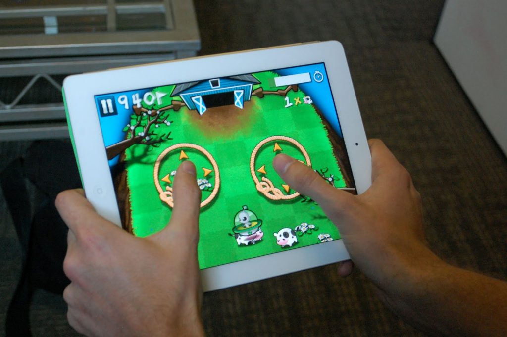
There is nothing casual about playing a game on an iPad. Just as the “Gamer Stance” orientation on an iPhone, a “Hardcore iPadder” holds the device in both hands and uses thumbs to control the game (as shown in Figure 2-8).
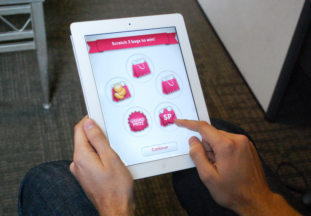
The iPad works well in both the Landscape and Portrait orientation. However, because of the size of the iPad, notice that players now cannot reach all parts of the screen without taking one hand off of the device. If players are required to reach any further areas (e.g., the top of the screen), they are more likely to take their hands off the iPad, place the device down on a table or their lap, and then prod the screen with their two index fingers. This is exactly what you DON’T want to have happen during your game. This means that your game cannot be played with just two hands! It can only be played with a “third hand”, that is a stabilizing base such as on the knees, on the kitchen counter, or somewhere else where the players feel comfortable putting the device down. As shown in Figure 2-9, note the change that Apple made with their iPad keyboard.

As shown in Figure 2-9, this update has made it so that iPadders can type without moving their fingers across the screen. Users can now type without putting the iPad down. Think like this when designing your game controls on the iPad. Placing buttons in difficult areas will force players to put the device down. Even though the device is weightless, most people don’t feel comfortable holding it with just one hand for extended periods of time. Keep this in mind. If your game requires two controls at once then keep buttons to the lower outside corners.
No-Hands iPadder

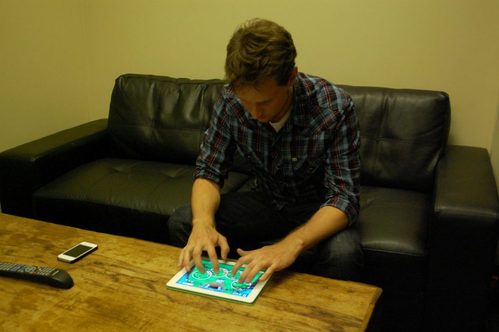
The other iPad orientation is the “no-hands” orientation. This orientation will limit how and when your players can play your game. They can really only play in circumstances where they can lean their iPad on something they deem stable and safe. Any other time (on the subway, in a small chair, in the car, etc.) they may not have that ability.
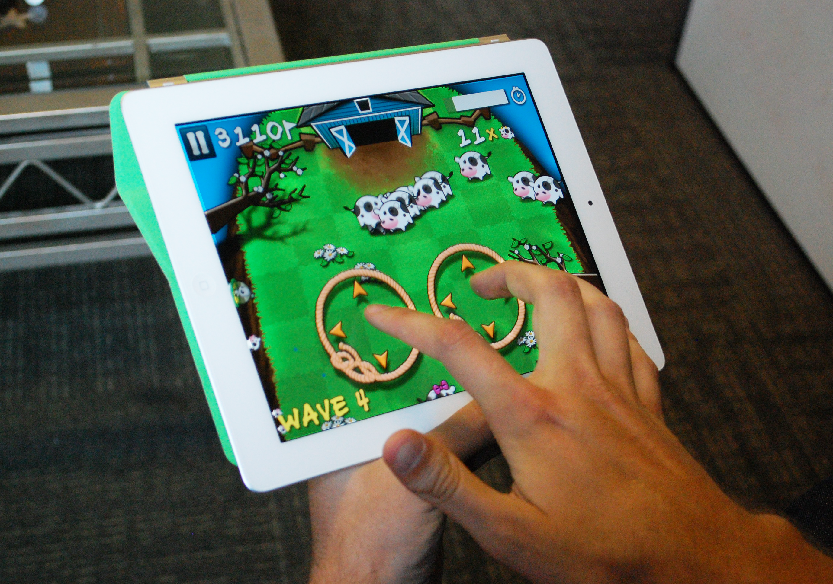
Players will play your game until it starts to physically exhaust them. This will limit game time. Or, they will just choose NOT to play your game. You, as a game designer, have made the choice simply by your control scheme. This scheme allows great two-handed “prodding” control, now that the screen is big enough and players don’t need to support the device with a hand. They can now have two fingers with which to prod the interface. For example, as shown in Figure 2-10, Cows vs Aliens on the iPad cannot be controlled in any other way. The iPad must be placed on a stable surface freeing up both hands to play the game. This can be seen as a hindrance or it can be seen as part of the innovative mechanic. As a casual game, Cows vs Aliens should attempt to bring as many users in as possible (like a board game). If the control mechanic prevents players from playing whenever and however they wish, then it restricts when and how the players will play….. and we want them to play.
