Big Fish, Small Pond: Surviving in a Maturing Market
Last week I attend Quo Vadis in Berlin and gave a talk on how to survive in a maturing mobile market. The slides are below.
[slideshare id=47449929&doc=2015-04-23-quovadisedbiden-150427033201-conversion-gate02]
My main take away was that companies need to set themselves smart constraints within which to be creative.
The four ideas I gave for setting yourself smart constraints were:
1. Know your strengths
Whatever your strengths are, be that an existing audience, particular technical expertise, or genre knowledge, you have to build on that. The market is tough enough without you giving yourself the best chance.
2. Find your pond
Incumbent games have too much market presence and content and too many systems and players to go head to head with. Define your market as a niche that is small enough for you to dominate (though big enough to pay the bills).
3. Manage the Risk
All game production is risk management – no one knows for sure if a game will be a success or not before it launches. Make sure that you manage the risk in production as well as possible. Do a risk assessment as you start out a project to get an objective feel for the number and scale of risks involved, and an idea of when they can be addressed (sooner is better!). This will also help you tackle the biggest risks first wherever possible.
4. Stick to the plan
It’s very easy half way through production, when things aren’t going well, to convince yourself that you just need a couple more months to fix things. Set yourself some fixed targets at the start of the project that trigger a full scale review of the project if they are missed. That way you will waste the least amount of time on projects that are doomed.
Harnessing the Psychology of Gifting
I feel like gifting has a bad name in games. Like the term “social” it has been ascribed to Facebook games that often implement interesting features in unexciting ways. Understand the psychology behind gifting in general – the phenomenon that is ubiquitous to all human culture and almost every human interaction – and I think things get a little more interesting, as well as suggest features that would work better than the average Facebook game.
Gifting and exchange are a component of almost every social interaction. This is even apparent in the way you greet your colleagues in the morning. If you see someone for the first time in the day that you work with then you are obliged say hello. They, in turn, are obliged to acknowledge your greeting and respond. If you barely know each other the exchange is short and perfunctory: “hey”, “hey”. If you know each other better, it might spawn a longer conversation or at the very least require more conviction.
Even this mundane situation exhibits what anthropologists know as the three obligations of gifting:
- The obligation to give (to say hello in the first place)
- The obligation to receive (to acknowledge that greeting)
- The obligation to reciprocate (to say hello back)
In such a minor social interaction the exchange is fast and low value. But even so, to omit any of these steps would be rude. If a colleague continually ignored your greetings, then you would think less of them. Let’s examine the three obligations in a little more detail.
Giving
Giving gifts or initiating exchange is an action that is required in certain situations. In western culture we buy each other gifts at Christmas and on birthdays, and we take a bottle of wine or contribution to the meal for a dinner party. Failure to give at these times can be a serious faux pas depending on how well we know the other person.
Receiving
When someone offers you a gift you are obliged to accept it. To refuse a gift is to be unfriendly, if not rude. To turn down an invite to dinner for no good reason would be frowned upon, to refuse a Christmas present from a family member almost unheard of.
Reciprocating
There is an obligation to repay all gifts. In some cases this is more immediate and calculated than in others. If you give a friend a birthday present then you might expect one back from them, and Christmas gifts are often a minefield of social obligations to find gifts that correctly reflect the value previously received and current state of the relationship between two people. The tighter the relationship between two people the more that the value and timing of gifts becomes varied – both parties expect that everything will work out in the long run.
Indeed to repay a gift too quickly or exactly and remove the implied social debt is as unfriendly as not returning it. If your friends help you move house you deliberately repay them with something where the value is hard to calculate, such as cooking them a meal, rather than paying them cash. Relationships typically start with small one-off gifts of time or effort and gradually extend into a continuing cycle of reciprocity. In extremis, almost all major religions advocate giving to charity for benefits in the afterlife or from the universe in general. We have an innate belief in karma of one kind or another that is hard to shake.
Now we’ve gone over the theory, let’s look at gifting in three games, in particular, to see how it’s applied:
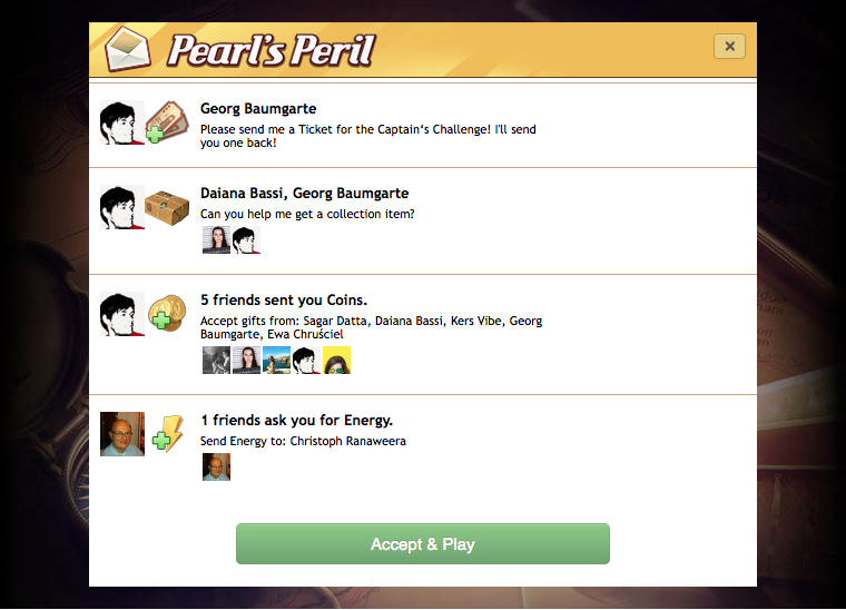
1. Pearl’s Peril is a Facebook and mobile hidden object game with fairly typical energy and item gifting. (Disclosure: I’m currently game designer on this game)
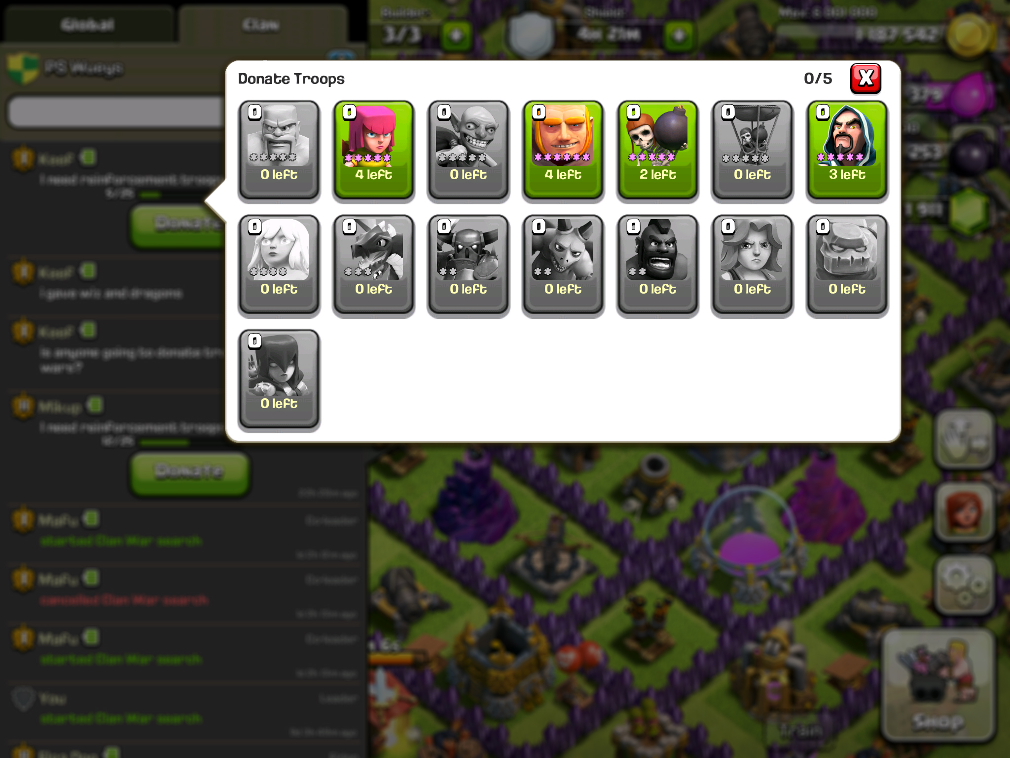
2. Clash of Clans gives you the ability to donate troops to your clan members when they request them.
3. Animal Crossing has a sophisticated gifting system with both other players and NPCs.
Pearl’s Peril

As in many Facebook games Pearl’s Peril allows you to send energy, soft currency and low value collection items to your friends. In each case it doesn’t cost you anything to send the gift – the gift is created out of thin air during the gifting process, and the process itself is incredibly streamlined, allowing gifts to be sent from multiple points in the UI and delivered to the recipient’s inbox where they are accepted in a click that is barely noticed coming into the game.
The result is a social feature that is rather like greeting a colleague each morning. In interviews players describe it as a habit that they fall into – almost like a pleasantry of saying hello. It’s a valuable feature because they value the energy, but the gifting act itself is less so. Players do not feel obliged to log in just to send gifts to their friends and maintain the cycle of exchange.
Clash of Clans

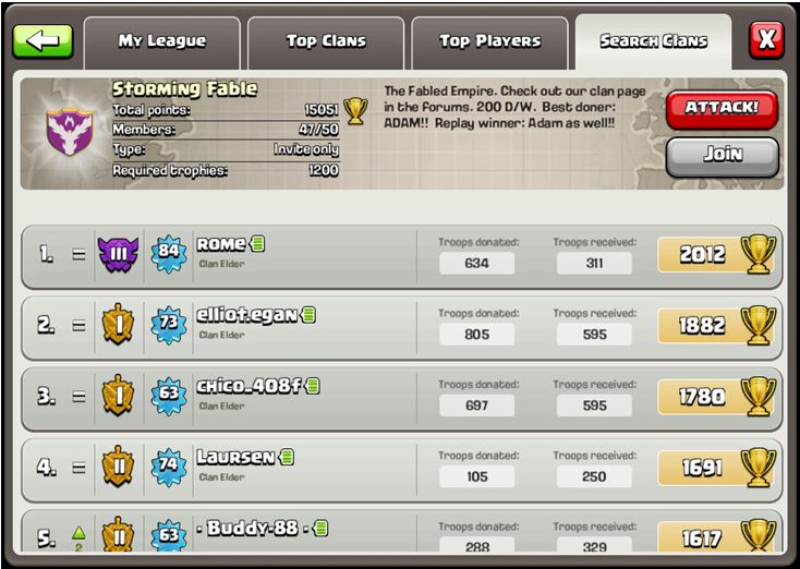
In Clash of Clans you can donate troops to your clan members. You have to spend resources to train these troops yourself, and you could use them in your own attacks if you didn’t give them away. In many cases the only value that gifting affords you is allowing you to take a few extra troops into battle: those troops stored in your clan castle and donated to you. It does however give lower level players the opportunity to play with much more powerful troops given by other members of their clan, foreshadowing units they will have in the future if they stick with the game. It also requires some degree of coordination so that you get troops that support your style of play, which stimulates discussion in the chat.
The system is much more powerful than energy gifting in Pearl’s Peril. Clan members can see how many troops they have donated vs. received and compared to other clan members helping them keep track of a number of different relationships and making sure that gifting doesn’t get too imbalanced. Donating troops was really the only thing that clans allowed you to do originally, but the system has been further reinforced by clan wars, which provide an obvious occasion to donate troops.
Players that fail to keep up their side of the bargain – not giving as many troops as they receive, or not giving troops when they should – face being kicked from their clan to make room for more committed players. Higher ranking clans often state these obligations and enforce them rigorously. At GDC this year, Supercell stated that the 2 year retention for Clash of Clans is 10%, and I believe that the gifting economy that they have created in the game is a key component driving this.
Animal Crossing

Anyone that has played Animal Crossing will tell you it is a magical game that creates quite a unique atmosphere. Dropped off in a village of anthropomorphic animals you can gather fruit, fossils and flowers, catch butterflies and fish, design your own clothes and furniture and develop relationships with the NPCs and other players in your village. There is no real goal, but players typically spend their time collecting things and exploring the world, which changes season by season and through a day / night cycle.
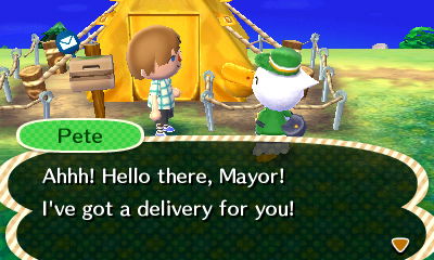
It is perhaps the game that shows the best giving mechanics that I have observed. The calendar gives you a natural context to give things due to birthdays, other occasions or simply because you found something you know they want or don’t have space for yourself. NPCs also prompt you to gift on a regular basis, by asking you for things, letting it known they are looking for particular items, and occasionally sending you gifts themselves.
Most of the activities in the game drop items on a semi random basis, with some items rarer than others, but the selection constrained by the time and place that you are collecting. This makes gifts unique items, with each one requiring time and effort to find in the game world. In contrast to the commoditised resources that are given in Pearl’s Peril, you know each gift is special.
Indeed even sending the gift requires effort as you need to find the recipient in the game world or visit the post office to send it to them. Even if players do have multiple items that they want to give, each one needs to be given individually, rather than sent off as a bulk action. Similar to sending someone a hand written note over an email, it enhances the sense that the donor really cared about giving something to you.
The result is a powerful system with real emotional weight behind each gift. Gifting is one of the key systems that runs throughout the game and gives it such a unique and magical feel. The series consistently gets superb ratings from critics and is listed as one of the best selling games ever with c.27m copies sold across 4 titles. However the real demonstration of how effective this gifting system is comes from anecdotes like this one, about a mother with multiple sclerosis’s gifts to her son. It’s impossible to imagine either Clash of Clans or Pearl’s Peril creating this kind of story.
Conclusion
Gifting and exchange are ubiquitous human behaviours found in all cultures and a huge variety of situations. Gifting consists of three obligations:
- To give in certain situations
- To receive gifts offered
- To reciprocate gifts received
Increasing the value of gifts increases the emotional engagement and social obligations that players experience. Increasing the power of gifting can be done by:
- Making gifts unique rather than commoditized
- Making gifts require more investment from the giver
- Making the giving process itself require some effort
- Prompting players to give in clear situations
Great gifting systems support strong long-term retention, player satisfaction and by extension commercial success.
Social Gaming: Facebook, Guilds and Beyond
Facebook has had a big impact on games. Before Facebook, video games were seen as an antisocial activity for spotty boys hiding in their bedrooms. Together with the ubiquitous usage of smart phones and Nintendo’s family marketing of the Wii, the perception of both the gender bias and social nature of video games is gradually shifting.
In fact, arcade games originally followed the distribution of pinball machines in bars where adults would socialize, before spreading to family friendly venues such as cinemas and malls. Reacting to a dire recession in the early 80s Nintendo decided to focus its marketing of consoles as toys for boys, rather than entertainment for all, and in doing so set the popular view of video games for the next 30 years.
Now, finally, the industry is beginning to come full circle, and it’s the social aspect that I want to focus on here. It was on Facebook that the term “social games” was coined. Of course, games were social before, whether you were playing Mario Kart with your friends or raiding with your guild in World of Warcraft. But now, even as Facebook is steadily replaced by mobile as the new platform for gaming, everyone is still talking about social.
It’s not hard to understand why. Kongregate spoke convincingly at GDC 2013 on the importance of social features, and particularly guilds. Their talk highlighted the dramatic ways that guilds can improve retention, engagement and monetization. A few facts summarized from their presentation:
- Every one of their top 10 games has some form of guild structure
- Dawn of the Dragons (5th Planet Games): conversion rate for non guild members: 3.2% vs. guild members: 23%
- Tyrant Unleashed (Synapse Games): ARPU for non guild members: $36.59, vs. guild members: $91.60
But guilds are only one part of “social”, just as Facebook and your real life friends are. Humans are social beings, but their social interaction can take many different forms depending on the context. There is not a one-size-fits-all solution to social in games, and each game must work out what is appropriate for its own audience and mechanics (and the same is true if you are building an app). I believe that the nature of social interactions depends on whether your game is really about your Friends, the Mechanics, or the Content.
Friends
When you play a game with your real life or Facebook friends, things work best when the experience is about your friends, and not about the game. Playing with people is a great way of strengthening your relationships with them. Games are appropriate for the majority of family gatherings, whether it’s Risk or Charades.
For the experience to work out well for everyone, then the game needs to be right. The game should facilitate building relationships, and act as a backdrop to this, rather than be the main event. Games of low skill typically work best as they allow participants of all ages and abilities.
This is why games like Draw Something and QuizUp work so well, and more complicated simulation games have quickly fallen out of favour on Facebook. In the former, the experience is more about your friends, and in the latter it is more about the game. Real life friends and family are not the way to drive distribution or underpin retention unless your game is about the people you are interacting with. As we all know from the complaints about people’s newsfeeds being spammed, it isn’t that common for our friends to share our taste in games.

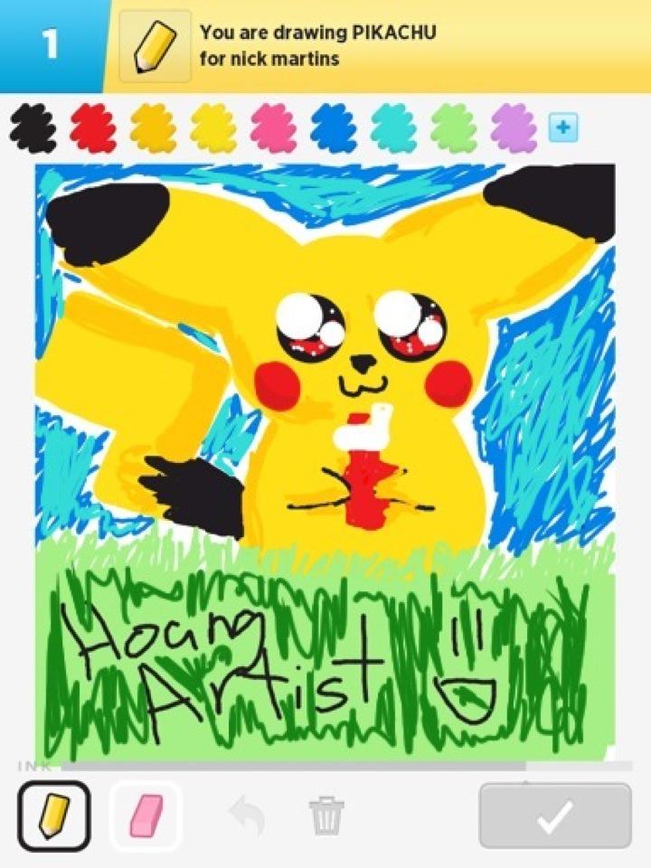
Draw Something.Chibi Pikachu by HoangArtist
Mechanics
In this category I would put everything from people who like playing otherwise family games to a competitive level, to immersive experiences such as World of Warcraft or Clash of Clans. If you are REALLY into bridge then you don’t invite your real friends over and grind them into the floor. You are going to have an unsatisfying time both in terms of the quality of gameplay, and social experience. Instead you either play a friendly match where everyone can enjoy the social aspect, or you join a bridge club and enjoy the gameplay.

This latter case is still a social experience of course, but it’s unlikely to be one with your immediate friends and family. It’s more appropriate to share it with other people that share your love of bridge. This is exactly what Netflix and Spotify have realized as they’ve shifted their recommendations engines from showing you what your friends like, to what other people like you like. Generally we do not really care what our friends have been watching. But if we enjoyed The Godfather and The Departed, then we are interested in what other people who also liked those films would recommend.
For games that rely on their mechanics, adding in a social layer can have some powerful effects. Initially, players can even be taught how the game works by more experienced players and this knowledge flow continues as players exchange thoughts on more advanced strategies. A social aspect can enrich the gameplay by requiring the coordination of several different players such as in raids in World of Warcraft or Destiny. Finally, as these interactions build new relationships between players, they develop a sense of duty to each other, which leads them to keep coming back even if they tire of the gameplay itself.
For the social layer to add value to players, and by extension developers, it doesn’t need to involve people who are real life friends. It’s much better to group people together by the intensity that they play the game, so that they can engage at the same level as the others in their group. This is exactly what happens in Clash of Clans and many other clan based games, where the top clans demand a certain level of engagement as a requirement for membership. Not that the developers need to worry about this, as given the right tools the players organize themselves.
Content
There is however a third, much rarer way of organizing people. In games where there is a strong narrative and the experience is largely single player and driven by consuming content in a linear manner, it makes more sense to group players by their progress through this content.
This is what happens when people live-tweet TV shows. Using Twitter, viewers can feel part of a larger experience and share in the unfolding drama, regardless of whether they are actually sitting with other people watching the same show. I believe there is an innate human desire to calibrate your social responses, and this fills the same role. It helps people comprehend their own reactions, see if they are appropriate and ensure they understand the situation in full.

This is the equivalent of catching a stranger’s eye and enjoying a moment of shared understanding – we know it in a diverse set of situations from sharing the frustration of waiting in line to sharing the elation of hearing the opening beats of a favorite song at a gig. The same sort of social experience could enhance games like BioShock and Mass Effect, maximizing the impact of the most dramatic moments. However, most games that would fall into this category do not have any form of social layer, because of two problems.
Firstly, how do we bring together people who are all experiencing the content at different rates and different times? The solution here might lie in something akin to the comments sections on newspaper and magazine articles. Here the comments don’t need to be by people you know, or written whilst you read the article. But they are still relevant to you, because the person commented after they experienced the same content as you just did, and they enrich your experience of the article by providing additional information and opinions.
Secondly, how do we allow people to be social without breaking the immersion of deeply engaging games? The last thing people want after deciding who lives and who dies in The Walking Dead is for the drama of the moment to be shattered by being prompted to see what everyone else did. Luckily TellTale have the good sense to wait until the end of the episode, a natural break point before allowing you to review what everyone else did and connect you to the forums. In free to play games this might in fact be even easier, as the breaks between sessions and timers are natural point to allow people to engage with each other, both savoring recently enjoyed drama and anticipating exciting things to come.
A few games do manage to solve these problems and pull people together in this way, however. Dark Souls 2 allows other players to leave messages as you work your way through the world and narrative. These can either be helpful tips or troll postings luring you to an untimely death. You can also summon other players into your world to help out with particularly hard bosses. These interactions with other players enrich the single player experience by adding a new, social layer to it. In both cases the associations with players work because they fit into the context of your game, not because of the relationship that you have with the other players. Other players appear as phantoms and in doing so stay consistent with the Dark Souls narrative, and do not break immersion.
Wrap Up
Social rightly continues to be a buzzword in the games industry. However, there is not a single solution for what social should look like. Different types of social interactions are suited to different game experiences. When designing a game there is almost certainly some way that it can be enhanced with a social aspect, but this needs to be designed according to the type of experience that you are building for your players, rather than the design fads of the day.
This post was written by Ed Biden, who also writes at Just for the Fun of it.
Mobile Game Tutorials & Storytelling
Tutorials and onboarding is an absolutely key process in mobile games. The less your game costs to the player, the more pressure it puts on your tutorial. Players won’t think twice about leaving a free game and not coming back. If it’s not the game they believed it was from the beginning, they will move on to another.
As with “easy in, easy out”, with every mechanic you design for the player, it’s incredibly important to speed your target audience into the optimal game flow of your game. The sooner you can get your target audience into a fun state in the game, the better. Staging and gating complexity as the game moves on will allow you to grow your players into deeply engaged players you want, but during the onboarding process they’re shy, timid and exploratory. Don’t expect the majority of your players to handle a huge jump in complexity within the first few sessions they play.
Measure
The first rule of building a tutorial : measure and optimize each step. Similar to social games, it is extremely powerful to measure the rate at which users leave your game during the tutorial stages.
You may believe your game is the greatest thing in the world, but Analytics will always keep you grounded into what is actually happening with your players. Some designers, developers have ethical issues with analytics. Your opinion is your own, some designers chose to use it as a tool that helps them design games for their target audience with more detail. Flurry, SWRVE, Kontagent, Mixpanel, etc. all offer amazing third party solutions, you may even choose to use your own.
At each step of the tutorial, make sure your game is sending an event to an analytics service. This will help you devise points in your tutorial that are specifically painful for users. Then you can look to soften the blow.
Common issues with tutorials are :
- Too long
- Too complex
- No Freedom
- No Interaction
Too Long

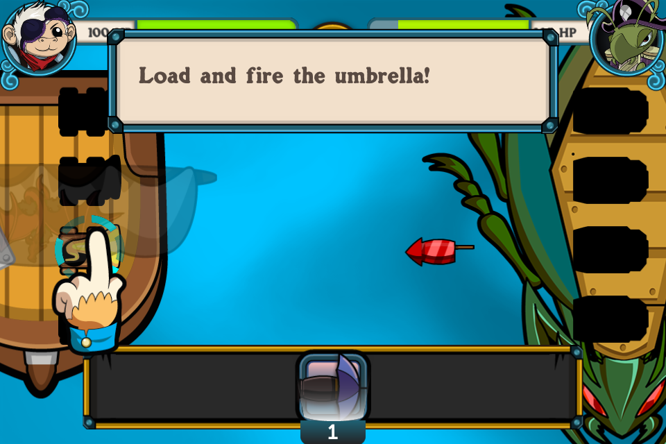
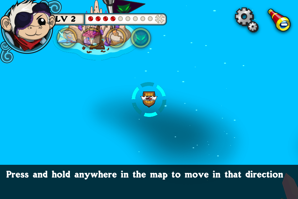
Powder Monkeys had a 3 stage tutorial : teach battle, teach world map, then teach island capturing. Each stage took about 30 seconds to complete, which ended up being far too much time.
Attrition is inevitable with a tutorial. The more steps your tutorial has, the more %ge of users you will lose. It’s just bound to happen. Players have a limited amount of time they have to experiment with your game, so give them a chance to ease in to your mechanics.
Too Complex

At this point we had a massive dropoff rate of players. They needed a breather, and we didn’t give them enough direction on what to do next.
When the player completed the battle tutorial, they were dropped in the middle of a map. They were allowed to travel anywhere. We found many players just got lost and left the game at this point rather then moving on to the next stage. We marked the next stage with a red arrow, but some players still struggled.
Manage your game complexity so that at no point the player is introduced to too much complexity all at once. Players will immediately feel frustrated if they are introduced to too much complexity all at once.
No Freedom

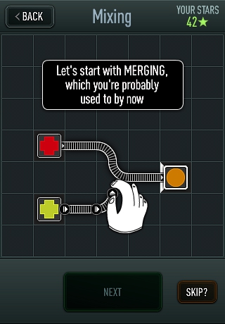
Trainyard, a great game launched on the AppStore by an Indie game designer, Matt Rix. The initial launch was without much fanfare. The tutorial involved the player going through 20+ levels with each level increasing the complexity of the game, some reaffirming lessons taught before. This does a great job of managing time, each level is 10-20 seconds and gives the player time to leave the game. This tutorial does a great job of managing complexity, with each level introducing new complexity. However, each tutorial is a straight line track, with one input allowed on each screen. With so much text and blatant hand holding it made the tutorial feel rigid and boring. The player never reached a fun state in the game until 10 minutes or more into the tutorial. Make sure the player can reach an optimal game flow as quickly as possible, so in this case Matt Rix altered the tutorial to introduce a few mechanics, then allow the player to problem solve through a set of simple puzzles based on that initial mechanic. These quick victories pulled the player into the core game flow quickly, and made them feel smart. After these changes, and a well placed Reddit article, Trainyard was catapulted to the top of the App charts. This was a well deserved accomplishment.
No Interaction

Using learnings from Powder Monkeys, we reduced the time and text in Fashion Star Boutique. Each step is small and punchy, giving the player plenty of opportunities to interact with the game.
The final cardinal sin of game tutorials is the act of too much text, never getting the player to actually interact with the game. It’s all about the game flow. Get the player into the game flow as soon as possible. Every line of text the player has to read to get into the game, is a huge delay on them entering on game flow. Not to mention that 80%-90% of players don’t read text in tutorials, they won’t read it, they won’t understand it, they are looking to get to the core gameplay as soon as possible to make a decision whether this is the next staple game on their phone. Don’t give them an excuse to leave!
Storytelling on Mobile
Story is a major compelling reason for creating addiction and immersion in games. Regardless of its business value, it’s also a true reason why games is a creative art form. Combining story with amazing graphical design, with immersive audio in a cohesive interactive package is what makes games such a joy to develop and to design.
Core games, such as TellTale games, the Final Fantasy series, and many point and click adventures on the AppStore, lean on a heavy story to lead the player through the gameplay. This is at the core of their game, and they each target a separate niche which loves that style of game. This audience has a longer then usual session length, and are willing to memorize and recant stories from sessions before. They are also more likely to remember previous sessions since this audience is more likely to beat the game within a week or less. Their sessions have little time between them.
For most casual mobile games, having that in depth story is not possible. The average casual player on the AppStore just doesn’t have enough focus and attention to retain a full scape story. Yet story is still a very compelling reason for players to be immersed in games. But, like game mechanics and control mechanics you have to find ways to adapt the story telling to the distractions and mobile environment the player is playing in.
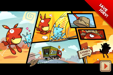
The best casual stories on the AppStore usually can be captivated with just a few pictures. Run Roo Run, Angry Birds, Cut the Rope, etc. all introduce their story within seconds. The core message is memorable, and the impact is felt through great artistry and simple but sophisticated storytelling techniques.

This was the entire beginning story for 5th Cell ©’s Run Roo Run(tm) game. It established the character, and a core message within 10 seconds.

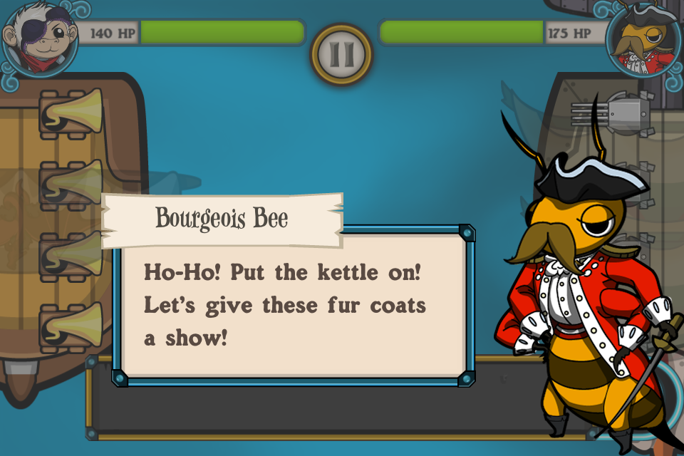
Powder Monkeys supported a deep story with multiple characters. While it’s important to set up characters, build personality, you must balance this with the mobile experience.
Think like Pixar’s “Up” instead of Game of Thrones. Tell a captivating story simply with a few screens first. Come up with a simple, initial core message, then build on it from there. Understand that many casual gamers just don’t have time to read long passages, so using as many story telling devices without text is usually far stronger.
Mobile Session Design: Easy In, Easy Out
Games that are designed specifically for mobile must always realize one thing :
Your users are distracted
This is sometimes counter productive to the true reason behind most game design. We want to create an immersive environment which the user enters this fantasy and is compelled to stay within the circle. This isn’t always possible with mobile games. Trying to force a user to stay within this circle and never break out is an uphill struggle.
The major restraint with working with mobile, is that it is in fact… mobile. They may not be sitting quietly in a chair, at home with minimal distractions playing your game. You can’t design your game around this ideal circumstance. You have to create that immersive environment so that it wraps neatly around the player’s day to day activities.
You have to design your game with distractions in mind.

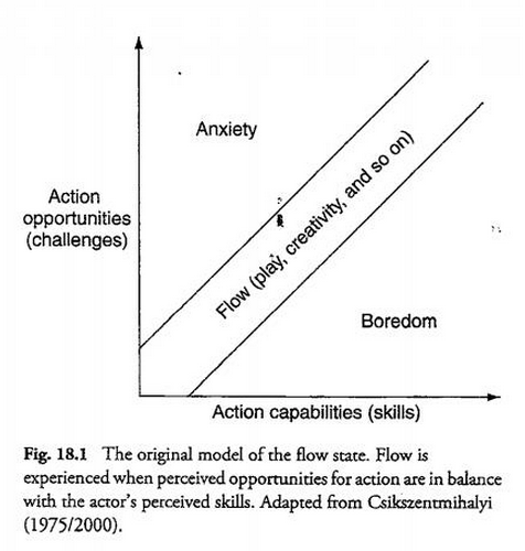
Mobile Game Design must account for a player with distractions. Specifically when they come back into a game. It’s all about managing a player’s flow state, and bringing them back into the “flow channel” (the balance between boredom and anxiety, building up their skills over time) as quickly as possible.
Immersion is still very possible in this mobile environment, but it takes on different forms. You have to design your game in such a way that at any time the user can leave, come back and still understand what it is they are supposed to be doing.
Dealing with distractions also means catering to your audience. You have to design game mechanics that adapt to the player’s life style. If your target audience is casual, then they have a smaller average session length then a core gamer. You have to design your game mechanics around getting your player in and out of the game within that average session length. They need to be able to get in, reach a high value part of the game quickly, then have the opportunity to leave without pain.
This is sometimes hard to incorporate in games that :
⦁ Depend on a strong narrative to lead the player
⦁ Require many complex steps which require the user to remember ongoing information
⦁ Push the player to play for long periods of time (5 minutes+ required to play)
Taking many cues from casual games, it is important that you design with intermittent play in mind.
Building a mechanic that allows the player to quickly enter the game. A game design that enables the player to quickly understand the game state as soon as possible.
Building a mechanic that allows the player to leave at any moment is imperative. You can’t assume the player will stay in your game for very long, life will usually take priority over playing a game for the player.
It’s important to not disrespect your players at this point. A great game will create a lot of depth and strategy while keeping within these constraints. Many games on the AppStore will dumb down their concept for mobile to a point that it lacks depth.
As always, it is important to understand and know who you’re targeting. If you’re targeting core gamers and want to introduce a lot of complex depth in the gameplay, then you can expect that your user base will be more likely to have higher play session lengths and minimize distractions. Games are higher priority for them (then life).
But even core gamers have distractions — and allowing them to play with depth while balancing these distractions will create an immersive game.
Easy In
Phone calls, texts, life will get in the way of your game — so make sure that your game can adapt to the player’s distractions. Easy In is about having an appropriate strategy for your player’s when they return from distractions. When the player returns to the game they should have as few clicks/steps as possible to return to the optimal game flow (the most exciting part of the game).
Turn-Based Games
The ideal design for a mobile game handling distractions is for the player to be able to exit the game whenever they want, and upon returning they are returned to the exact state they were in. Games that are turn-based can execute on this very easily. In a typical turn-based board game each turn has infinite time. So in the event the player leaves because of a distraction in the middle of game, has unlimited time to get ramped back into the game. The game would return right to game board, where the game’s optimal flow takes place. The player is quickly shown the game’s current state (the entire game board) and can easily think through their move. This is the ideal, since the gameplay is simple enough that the game state can be shown within one screen (the board) and the player has unlimited time to make the choice. Casual Games like Bejeweled do this well : even with a more arcade mechanic, each move the player makes has unlimited time for them to do so. This allows the player to put down their device, not worry about pausing the game, and return without worry. When returning, they can quickly understand the game state (all the jewel placement) and make a move at their leisure.
Angry Birds, Cut the Rope and Where’s my Water all have unlimited turn times for a very good reason. The player can return to the game from distractions and reach optimal game flow as quickly as possible.
Sometimes a player will need a little nudge. You want them to return to the optimal game flow as quickly and delicately as possible. So if the player just can’t spot the next move quick enough, it may be a good idea to “nudge” them to the right answer, so they can get back into the game quickly as possible. Bejeweled does this nicely. When a player hasn’t responded to the game in a few seconds, they add a nudge to show the player where a move is. Sometimes this can be disrespectful and insulting to the player, so use with caution. As always, understand your audience and decide how best to nudge without insulting their problem solving skills.
This ideal situation does not work for all games however. If your mechanic requires the player to make very quick responding moves or make a move within a specific amount of time, then a player coming back in the middle of a game move will cause panic. This isn’t the optimal game flow state. The casual player will panic.
Reaction Games
In arcade games, creating unlimited timed moves would absolutely kill the nature of the game. Timing, speed and panic are the core components of these games. So how do we ramp the player up quickly?
Well a naive solution is to cancel the previous game session they were having. When a player returns from a distraction, they must start from the beginning of the level. This is possible if your game sessions are 20 seconds or less. While the player will feel frustrated their 20 seconds of effort was wasted, this is a minimal punishment… but is still punishment.
The other solution is a pause menu. The player is able to pause the game at any point in the chaotic gameplay. This isn’t new. There was a reason why home console games had the “start” button in all games do this. I’m sure most parents would never had bought consoles for their kids if the pause button wasn’t invented. Many dinners would be skipped without pause menus.
It’s important to use the pause menu for a real purpose.
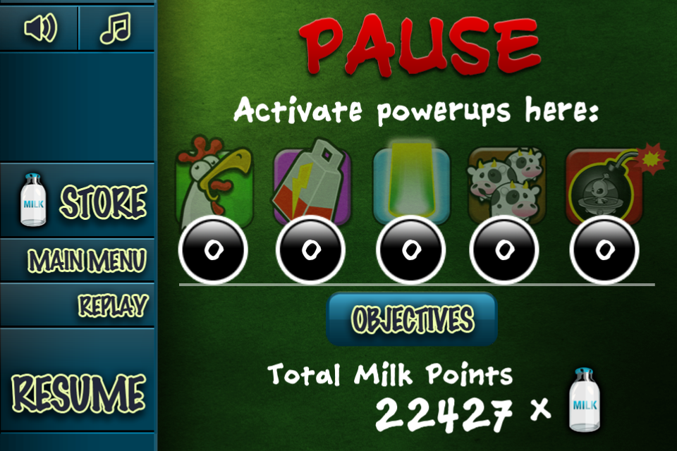
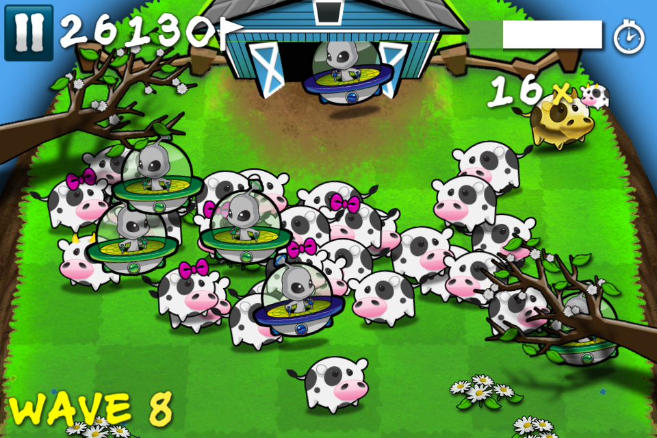
Cows vs Aliens used the pause menu to display briefly the game state (the player’s points, wave) and give them opportunity to trigger powerups. This doesn’t help the player return to the optimal game flow at all.
Here is how a casual player would return to Cows vs Aliens :

How a player would enter Cows vs Aliens upon returning to the game (locked screen, re enter the app)
⦁ Navigate the menu and try to find the resume button
⦁ Press the resume button

Instant Panic as the player returns to the game
⦁ Instant panic as the game snaps back to the game, there are aliens headed towards the barn.
⦁ As a casual player, they don’t respond in time, they don’t have enough time to get back into the game flow.
⦁ Game over screen.
⦁ Navigate the main menu to restart the game.
This is just an example, but in this case it would have been better for this player to just restart the whole game and start from the beginning again. The player wasn’t able to ramp up quickly enough, and because of that it took 6+ steps to get back into the optimal game flow, with a few steps making them feel inadequate of playing the game. Some players would drop out by this point.
Instead, allowing the player some ramp up time would be more ideal.

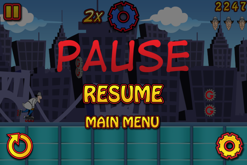
The Pause Screen is transparent
Notice in Inspector Gadget’s Mad Dash, the pause menu is transparent overlaying the actual gameplay. This is essential. Immediately when the player returns to the game, they can see the game state, can take their time, take a deep breath, then plunge back into the game flow. Just this basic design decision makes a massive difference in how players can come back into the game. In the event that the game is much further down the track, the player has a difficult jump to make, or returning to the game would cause a game over, the player can predict this when returning, and at least make the decision whether to give up and try again, or try it out. At least they are aware of their fault, and will try to fix it next time they get a distraction.
Taking this a step further, it’s important to nudge the player into the mechanic on a return as soon as possible. For more casual audiences, it may be more important to change the mechanic when the player returns from distraction to ease the player back into the mechanic. In an arcade situation, slow down the generation of obstacles, slow down the gameplay, and gradually speed the game back to its original state. Of course, close attention to exploits is important. You don’t want your player to use the pause menu to make the game easier.
Management Games
Management games, which involve the player managing their time, their town, their bakery shop, their pet shop, have challenges with managing easing a player back into the game play.
In a game like FarmVille, it can be overwhelming for a player when they come back into a game to understand what they should be doing. They have to water their crops, plant new ones, gift their friends, add more friends, purchase that new item, there’s that sale on that barn… do I need it? etc. etc. etc.
It can be a bit overwhelming. Especially as you add more steps and concurrent tasks to the player. Hyper-engaged players will not have a problem navigating this ocean of tasks, but many casual players, which you want to slowly ramp up to being more engaged can walk away when they are presented with so much choice.
In this case it’s important to think of how a returning user can be quickly ramped up in the game. The optimal player flow is for them to work through a step by step process, doing each of their required actions, then leaving the game. But that’s not fun. That’s too restrictive and requires no thought by the player. However, you can help the player organize their required tasks in a convenient list, and allow them to opt-in to following the list of steps in whatever order they choose.
When the player returns to the game, allowing them to press a button, or automatically bringing up their task list is a good idea. Each task should be a bite sized chunk of gameplay (collect all your plants, build a building, etc.). You can include some long term goals which require multiple sessions, but its important to hide these or allow the player to see them only when they’ve completed their short-term bite-sized goals first. Making these bite-sized and manageable within a few seconds allows the player to be nudged back into the core gameplay as soon as possible. It gives them a sense of accomplishment, and pushes them forward. Prioritizing quick wins over long-term victories is a great way to motivate people and to create habits.
Full Reset
Some games will restart the entire game from scratch every time the player opens the game. This is a terrible idea. While this will simplify the game start-up : the player will immediately understand what they need to do to continue (press play, start game from scratch) it clearly means that the game isn’t built with distractions in mind. If the player has to back-track and repeat more then a few steps of work to get them back to the game step they were at then this is just frustrating.
If your game can’t adapt to a player’s life then a player won’t adapt their life to play your game.
The only time which “restart completely” makes sense is when the player’s necessary steps to reach optimal flow is less if they just restarted from the beginning.
Easy Out
Easy out is all about making sure the player feels no remorse for leaving the game.
A big part to make sure this happens is having a good strategy for their return. Allowing the player to leave whenever they only works if the player knows that when they return it will be easy to get back into the game.
It’s also important to find ways to add hooks to the game so that the player has clear areas of the gameplay that they can leave without feeling like they are going to be punished on their return. Classic arcade games and the original console games were terrible at this. If you ever had to shut down your console, leave the arcade machine, you knew that your game state would be lost forever. The day your parents accidently unplugged your Nintendo console while you were in world 8 of mario surely caused scarring effects on your psyche. The day that you wrote down your MegaMan password wrong, and ended up back at the beginning made you throw the controller through the wall.
With mobile, we’ve evolved. We have far better solutions to this. Make sure your game does this as well. Easy Out is making sure that the player feels no remorse leaving the game flow. They can leave the game flow as often and as quickly as they need to.
No Penalty for Leaving
The biggest rule of easy out, is making sure there is no penalty for leaving.
This includes making sure that when they come back their difficulty does not spike. This happens inadvertently many times. Pausing during an intense arcade game will put the player back in the middle of the fray, this time without time to react to the game. This spikes the difficulty and punishes the player for leaving. Makke sure the game has an effective easy in strategy to manage this punishment.
Some games will pull the player back in the game allowing them to ramp up in the game easier. This is great to ramp up the player but has to be balanced with feeling like a punishment for leaving.
Have Coffee Breaks
The other important idea for easy out is to make sure you have plenty of “coffee breaks”. Every so often, the player should be able to take a break from the intensity and feel “OK” with leaving. Counter-intuitive when you want to create an immersive environment, but it depends on how you portray it to the user. You want to try to influence the player so that they leave at good areas of your game. This allows you to better design their return. In an arcade platformer game, It’s better for a player to stop playing your game between levels, than during. If a player exits your game during a level, they are far more likely to return to the game at a point that will confuse them. Having “safe zones” as often as possible allows the player to return to a point in which you as a designer can ramp them up as smoothly as possible. If a player feels like the next coffee break is too distant in the future, they are more likely to exit the game in an awkward area, then when you intend them to.
Do’s and Don’ts for Easy In, Easy Out
DO
⦁ Remind the user what it is they are supposed to do when they return
⦁ Have access to reference for information they are required to remember from previous sessions.
⦁ Have a clear “task list” which pushes the user to complete as many small chunks of gameplay they can
⦁ Have constant small chunks of gameplay actions with breaks which allow the player to leave at opportune times
⦁ When returning to the game, pause the action and allow the player to ease back into the game
DO NOT
⦁ Require the player to remember things from previous sessions
⦁ Have a long intricate story the user is required to remember each time they play
⦁ Have many complex steps for each step in the gameplay
⦁ Penalise the player for leaving in any way
⦁ Require the player to play for over 1 minute continuously


