Beyond Fun: Real Drama and narrative gameplay

We don’t tend to typically think about games as emotional experiences, and perhaps because of this, the most interesting talks I saw at GDC 2013 were about games that had made people cry. Crying is not something that we expect from games, yet if a book, film or play made us cry we would think that a great achievement. Instead, we expect games to be fun, which whilst pleasant, is not a deep emotional experience. However, the games that do go beyond fun to deliver real drama are some of the most interesting, memorable and successful games out there.

Here are some four techniques that games can use to deliver hugely engaging, dramatic experiences.

Jeopardy
dayz-2-1

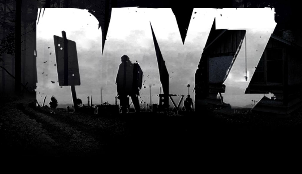
One of those talks at GDC 2013 was on DayZ (the other was about Journey). Dean Hall, the lead designer talked about creating a consistent world where things had value. The game is an FPS in a zombie apocalypse setting – so far, so generic. But the game is also permadeath, has scant supplies, and as well as zombies, has other players who may or may not be friendly. As well as avoiding zombies and bullets, you have to keep your character fed, watered and warm.

The zombie apocalypse does not itself generate tension and danger, it just provides the backdrop for this. The game boasts incredible levels of tension from the unpredictable way that other humans will act in a world without strict rules, and where killing you for ammo is just as likely as agreeing to team up. Staying alive is a painstaking process of amassing equipment from match boxes up, and all of which can be snuffed out in a moment from a sniper you never saw.

Players have been quick to share their stories on the forums. Many are the early triumphs of new players surviving more than a few minutes to gather some food and set up camp. Others are more heroic, inflicting revenge or justice on rogue players. Most make some reference to the feelings and ethical dilemmas that players experience – how a miscommunication can lead to unintended bloodbaths, or the acceptability of sniping noobs.

As with so many other Rogue-like games, it’s the danger of loss, the jeopardy, that makes the experience so rewarding. When things in the game are hard to come by and easy to lose, players place a huge amount of value on them. It’s the same reason that players love FTL or Dark Souls, where every encounter is a story and a chance to be a hero, because the risk of failure is so real and tangible. (Here is another great review on DayZ).

Empathy
-1778070937

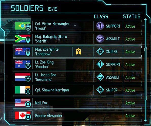
A sense of loss is also prevalent in X-Com, though to a lesser degree. Here your inevitable squad casualties from taking on alien invaders can be replaced for the next mission. However, a number of details make you feel each death of a soldier under your command more keenly. Some of this is down to the mechanics – troops gain experience and become more powerful as they survive longer, gaining unique special abilities that are crucial to your long term success. But beyond that each solider has a name, a nationality, and their own physical appearance.

These cosmetic details build on their varying stats to give a surprising amount of individuality that you empathise with, even in the absence of scripted dialogue. Pierre from France might be a craven sure to break at the first sign of danger, whilst Brad from the US is your favored sniper with a history of saving you from impossible situations. As a player you start to fill in the gaps and elaborate on their characters and backstories. If your troops survived long enough they also earn a nickname that further endears them to you, and if they die, their names are remembered in the in game memorial.

These details mean that when a soldier dies, it is not only a setback in your progression to build up an experienced team. It is a much more personal testament to your personal failure to protect your squad mates, who trusted you to command their every move. X-Com is a great example not because it is the best game at showcasing empathy for digital entities, but because it manages to achieve so much with so little.

Context : Half Life

dc-1936-41318787720windows_2890-81296681867

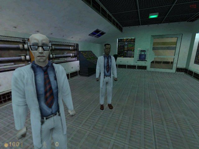
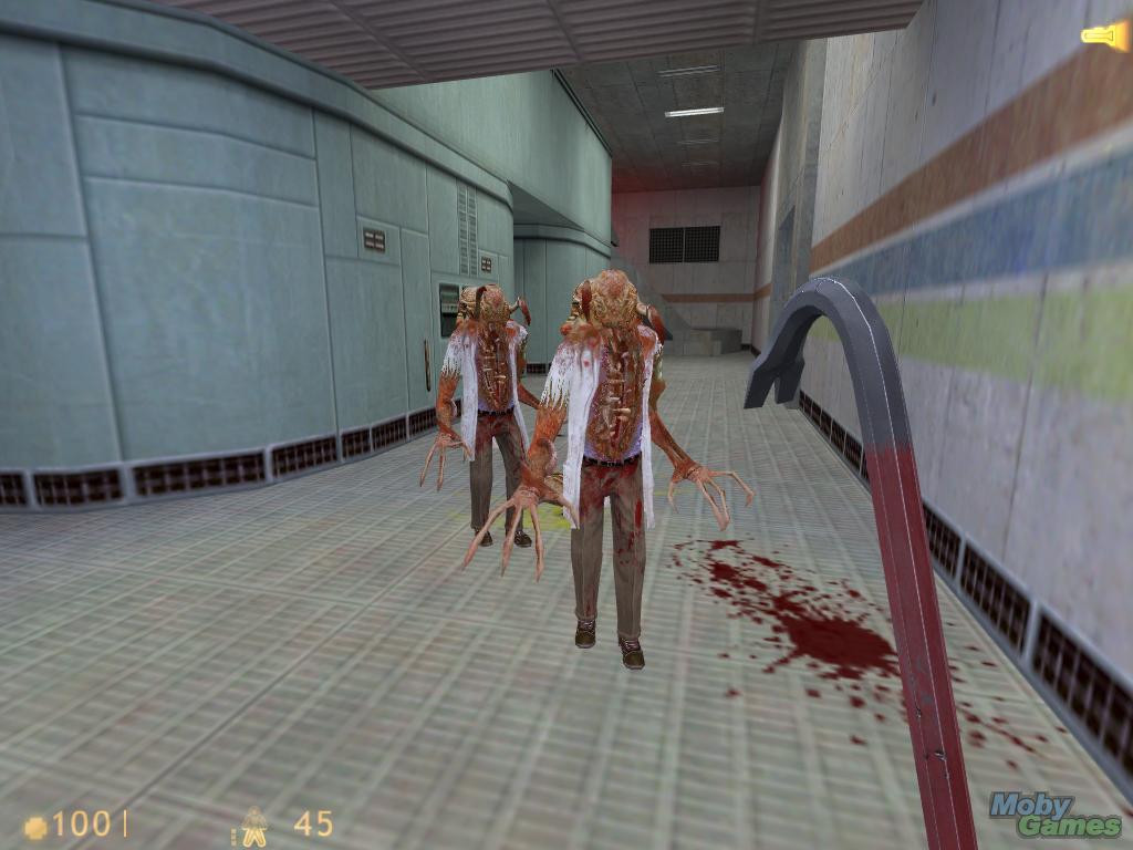
When you start Half Life, you don’t get a gun, and you don’t kill anyone. It’s an incredibly mundane start to an FPS, as you walk around a research facility going through the daily routine of the protagonist Gordon Freeman. But few games are as feted as much as Half Life for their quality of narrative. The slow start has a couple of beneficial effects on the rest of the game.

Firstly, you know that at some point, very shortly, Bad Things will happen. Just as Tarantino cranks up the tension with long, drawn out conversations that you know will eventually end in a blood bath, anticipating the upcoming excitement is every bit as good as actually experiencing it.

Secondly, once the facility is infested with aliens trying to chew your face off, there is an added gravity to the drama that you are going through. The dead bodies aren’t just decorative as in so many other games. Here they are fellow scientists you were exchanging pleasantries with a short while ago. You haven’t been born into carnage a hero, but thrust into the role of a reluctant hero as a survivor of an attack on the world you knew.

Agency : Game of Thrones

443541543

Telltale have been making games giving player big choices for 10 years. Their games are dialogue heavy, with players deciding how to respond to other characters from a range of predefined options. Their latest offering, Game of Thrones, has some exquisite moments, such as when you are interviewed by Queen Cersei. Squirming through her questioning was on a par with any similar scene from the TV series where some piteous underling is pulled apart, and I found new sympathy for the impossible situations that minor characters often find themselves in.

This scene works so well for the same reasons that many game choices of this nature fail. As an avid fan of the franchise I knew the political landscape and dangers I was traversing, and also had strong views on the type of character I wanted to play. Without this background knowledge and the sense that the choices offered would actually make a difference, my choices would have felt hollow.

In the same game there are breaks in conversation where as the player you are given the choice to say the same thing in three different ways. This adds nothing to the experience apart from slowing it down, and in reminding you that you should be identifying with one of the characters, that in actual fact you’re not.

I recently came across the other problem, of insufficient knowledge to inform a decision, in the otherwise excellent Dragon Age Inquisition. Here I had to choose between allying with one faction or another, but could explicitly not choose both. Although both factions were well known to me I felt I was still getting to grips with the world lore, and could not fully grasp the potential implications of the choice I was being given. Frustrated I resorted to the internet to understand what I was getting myself into in each case. Again, instead of deepening my immersion in the experience, poor agency had broken it.

Giving players choice to direct the story in a game is one of the defining attributes of the medium, and can be extremely powerful. However, it needs to be both a genuine choice and the player must understand the choice they are being given, or it can risk backfiring.

Conclusion

Games are often thought of solely in terms of fun. But engagement and memorability often peak when there is more than just fun, and they deliver real drama. Increasing the drama in games can be achieved by making things have value, getting players to empathise with the characters, giving the story context and allowing the player agency.

Mobile Game Tutorials & Storytelling

Tutorials and onboarding is an absolutely key process in mobile games. The less your game costs to the player, the more pressure it puts on your tutorial. Players won’t think twice about leaving a free game and not coming back. If it’s not the game they believed it was from the beginning, they will move on to another.

As with “easy in, easy out”, with every mechanic you design for the player, it’s incredibly important to speed your target audience into the optimal game flow of your game. The sooner you can get your target audience into a fun state in the game, the better. Staging and gating complexity as the game moves on will allow you to grow your players into deeply engaged players you want, but during the onboarding process they’re shy, timid and exploratory. Don’t expect the majority of your players to handle a huge jump in complexity within the first few sessions they play.
Measure

The first rule of building a tutorial : measure and optimize each step. Similar to social games, it is extremely powerful to measure the rate at which users leave your game during the tutorial stages.

You may believe your game is the greatest thing in the world, but Analytics will always keep you grounded into what is actually happening with your players. Some designers, developers have ethical issues with analytics. Your opinion is your own, some designers chose to use it as a tool that helps them design games for their target audience with more detail. Flurry, SWRVE, Kontagent, Mixpanel, etc. all offer amazing third party solutions, you may even choose to use your own.

At each step of the tutorial, make sure your game is sending an event to an analytics service. This will help you devise points in your tutorial that are specifically painful for users. Then you can look to soften the blow.

Common issues with tutorials are :

  • Too long
  • Too complex
  • No Freedom
  • No Interaction

Too Long

IMG_0412

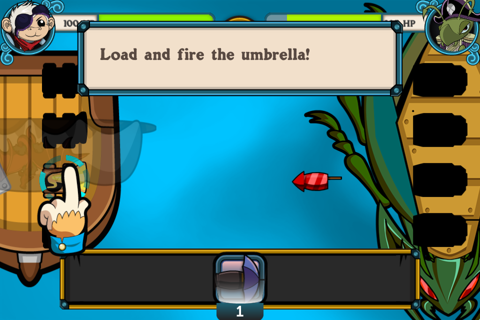
Powder Monkeys had a 3 stage tutorial : teach battle, teach world map, then teach island capturing. Each stage took about 30 seconds to complete, which ended up being far too much time.

Attrition is inevitable with a tutorial. The more steps your tutorial has, the more %ge of users you will lose. It’s just bound to happen. Players have a limited amount of time they have to experiment with your game, so give them a chance to ease in to your mechanics.

Too Complex

At this point we had a massive dropoff rate of players. They needed a breather, and we didn't give them enough direction on what to do next.

At this point we had a massive dropoff rate of players. They needed a breather, and we didn’t give them enough direction on what to do next.

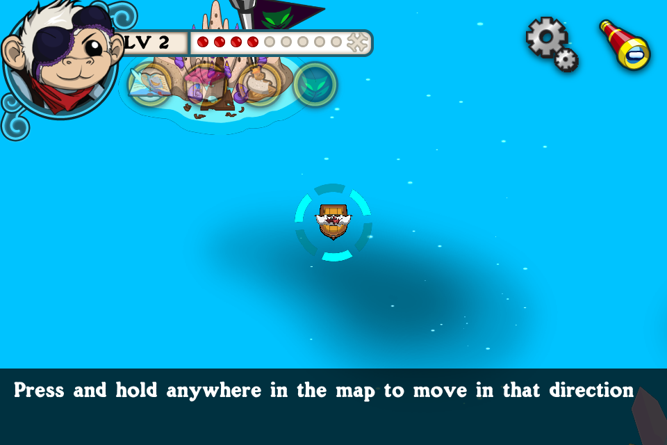
When the player completed the battle tutorial, they were dropped in the middle of a map. They were allowed to travel anywhere. We found many players just got lost and left the game at this point rather then moving on to the next stage. We marked the next stage with a red arrow, but some players still struggled.

Manage your game complexity so that at no point the player is introduced to too much complexity all at once. Players will immediately feel frustrated if they are introduced to too much complexity all at once.

No Freedom

248694-trainyard-express-for-iphone

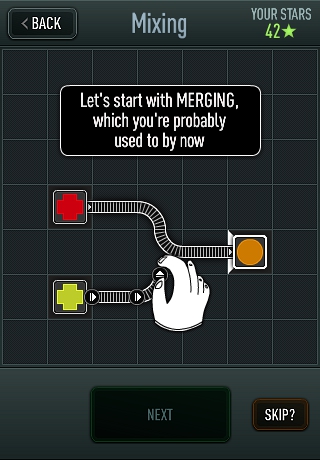
Trainyard, a great game launched on the AppStore by an Indie game designer, Matt Rix. The initial launch was without much fanfare. The tutorial involved the player going through 20+ levels with each level increasing the complexity of the game, some reaffirming lessons taught before. This does a great job of managing time, each level is 10-20 seconds and gives the player time to leave the game. This tutorial does a great job of managing complexity, with each level introducing new complexity. However, each tutorial is a straight line track, with one input allowed on each screen. With so much text and blatant hand holding it made the tutorial feel rigid and boring. The player never reached a fun state in the game until 10 minutes or more into the tutorial. Make sure the player can reach an optimal game flow as quickly as possible, so in this case Matt Rix altered the tutorial to introduce a few mechanics, then allow the player to problem solve through a set of simple puzzles based on that initial mechanic. These quick victories pulled the player into the core game flow quickly, and made them feel smart. After these changes, and a well placed Reddit article, Trainyard was catapulted to the top of the App charts. This was a well deserved accomplishment.

No Interaction

IMG_0422

Using learnings from Powder Monkeys, we reduced the time and text in Fashion Star Boutique. Each step is small and punchy, giving the player plenty of opportunities to interact with the game.

The final cardinal sin of game tutorials is the act of too much text, never getting the player to actually interact with the game. It’s all about the game flow. Get the player into the game flow as soon as possible. Every line of text the player has to read to get into the game, is a huge delay on them entering on game flow. Not to mention that 80%-90% of players don’t read text in tutorials, they won’t read it, they won’t understand it, they are looking to get to the core gameplay as soon as possible to make a decision whether this is the next staple game on their phone. Don’t give them an excuse to leave!

Storytelling on Mobile

Story is a major compelling reason for creating addiction and immersion in games. Regardless of its business value, it’s also a true reason why games is a creative art form. Combining story with amazing graphical design, with immersive audio in a cohesive interactive package is what makes games such a joy to develop and to design.

Core games, such as TellTale games, the Final Fantasy series, and many point and click adventures on the AppStore, lean on a heavy story to lead the player through the gameplay. This is at the core of their game, and they each target a separate niche which loves that style of game. This audience has a longer then usual session length, and are willing to memorize and recant stories from sessions before. They are also more likely to remember previous sessions since this audience is more likely to beat the game within a week or less. Their sessions have little time between them.

For most casual mobile games, having that in depth story is not possible. The average casual player on the AppStore just doesn’t have enough focus and attention to retain a full scape story. Yet story is still a very compelling reason for players to be immersed in games. But, like game mechanics and control mechanics you have to find ways to adapt the story telling to the distractions and mobile environment the player is playing in.

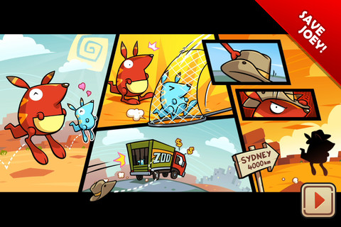
The best casual stories on the AppStore usually can be captivated with just a few pictures. Run Roo Run, Angry Birds, Cut the Rope, etc. all introduce their story within seconds. The core message is memorable, and the impact is felt through great artistry and simple but sophisticated storytelling techniques.

mzl.xwhjmvxu.320x480-75

This was the entire beginning story for 5th Cell ©’s Run Roo Run(tm) game. It established the character, and a core message within 10 seconds.

IMG_0415

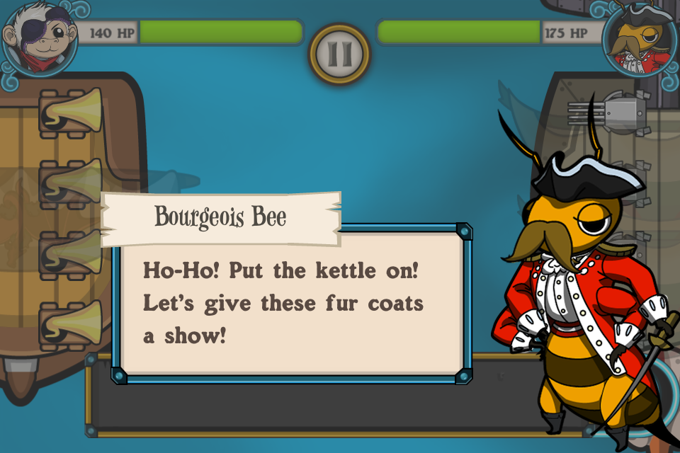
Powder Monkeys supported a deep story with multiple characters. While it’s important to set up characters, build personality, you must balance this with the mobile experience.

Think like Pixar’s “Up” instead of Game of Thrones. Tell a captivating story simply with a few screens first. Come up with a simple, initial core message, then build on it from there. Understand that many casual gamers just don’t have time to read long passages, so using as many story telling devices without text is usually far stronger.