Why does a player want to come back to your game?
As a mobile game designer, you need to come up with a very compelling answer. Creating a polished, addictive game is half the battle. You need to find ways to nudge your players to come back to the game after they have left. Designing your game around pulling your player back in is the critical battle on mobile.
So what games are good at pulling players back in? Not necessarily the games with the best mechanics.
Looking at the top ranks on the AppStore, it is inevitable as a traditional game designer that you will look at some of these games and be baffled at how they could possibly be so addicting and have so much traction. The player enters the game and collects simple rewards (which require no strategic input from the player). These actions levels up the player using archaic RPG mechanics, then the player quickly leaves. While it is easy to point and spot flaws, it is also important to recognize why these mechanics work on mobile. Specifically, these games allow the player to enter and exit the game very quickly. The player comes in, knows exactly what they need to do, quickly makes their strategic moves, and then leave to carry on with their daily lives. The game is adaptive to the player’s life, it allows them to complete a clear bite-sized section of gameplay within 30 seconds, and is clearly built with mobile in mind.
Yet despite how little time they are actually in the game, they are immersed in this environment while they are not even playing. While outside of the game, players commonly think of what they are going to do next, they plan out their long term goals, and rethink their strategy of their previous sessions. Even when the progression is fairly linear (for example, Cookie Clicker). This is an incredibly powerful technique that is a driving force of why these mobile games are so addicting. This is partially why FarmVille got its edge when it did, and why mobile games with similar mechanics continue to gain traction on Mobile platforms. So as a game designer, before you look to point flaws and discredit games that use these mechanics, challenge yourself to create a deep, immersive game mechanic which allows the player to obsess while they are away.
There are 3 strategies that help drive re-engagement on mobile :
- Building player commitments
- Always have reasons to return
- Flexible session design
Today I am only going to write about one: Player Commitments. The remaining two will follow in future blog posts.
Building Player Commitments
The most basic and impactful way to drive players to return after they have left your game is to push players to make a commitment to return before they leave the app.
The most well understood example of this is the farming crop mechanic. A player “plants” an object in your game, and chooses which contract they want: do they come back in 5 minutes for a little bit of crop, or in 4 hours for a large harvest. Regardless of which length they choose, they’ve made a commitment to return to the game.
Many social game designers have different takes on this method. It has been overused by farming style games, but it should not be underestimated for its value. If you manage to make the player care about coming back, this will drive re-engagement.
It is important to understand the difference between Opt-In commitments and opt-out commitments. A player should be able to select and commit to a selection of times to come back. They should not be forced into a specific time. There is distinct reasoning in allowing players to schedule their game around their life. If you take that control away from the player, then the mechanic fails to be a commitment, it just becomes an annoyance.
Adding Timers
If you use time-based commitments (or timers in general) it is important that you set the expectations correctly from the beginning. Timers should be only included in actions that are innately expected by the user. Repair times, travel times, investigation times are good examples of this. In reality, these actions take time, so of course the game will add a timer this.

Hay Day builds on the commitment systems of most farming games. Hay Day uses timers to pace the resource management and build interesting decisions. Timers are expected here — players understand that food takes time to produce, and the more complex the crafting is, the longer the time it takes.
Also ensure that timers are consistent — if starting an action sometimes has a timer and sometimes does not, this can really set users off.

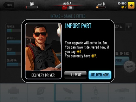
It was a bit odd that CSR had Import parts and non-import parts. In my opinion this mechanic would have been stronger if it was always imported, or the installation was always a set amount of time. Instead of players feeling like upgrades were randomly assigned import or non-import.
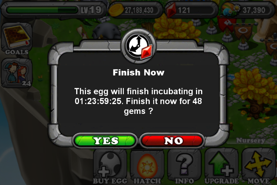
Lastly timers should not be added for every action of the game — namely it should only be added to areas that build excitement and anticipation. Adding timers to the end of an action loop is best. For example a player collects resources and then triggers building a structure. Or in Dragonvale when a player ends their loop with breeding two dragons :

Dragonvale’s egg timer is adjusted based on the quality of the dragon that will come out. This builds anticipation.
Dragonvale does this superbly with the breeding timer. Engaged players know that long timers are exciting! The longer the timer, the better the dragon. This makes the timers feel great, and is added in an area that boosts the anticipation — finding out what’s in the egg.
Social Commitments
Timers are not the only way to pull players back. The current market is becoming more and more apprehensive about this type of mechanic. Instead of using time-based commitments, Social commitment is another angle that many games use.
Building a mechanic that revolves around active players collaborating, competing and communicating with each other can drive re-engagement.
Asynchronous Multiplayer

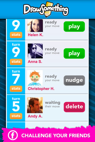
Asynchronous multiplayer is best found in games like Words with Friends, Draw Something and Tap Sports Baseball. They are games that revolve around social interactions between players. Each player makes a move in the game, then waits on their friend to make the next move. This has huge benefits for retention and virality. Players are prodding their friends in real life and through mobile push notifications to continue playing. Each time the player returns they have a set of games, ready to play.

The new words with friends adds a bit of “Tinder” to the app. Players are encouraged to play with random players to build social commitments.
The downside is that you physically can not play this mode unless you have friends that also own the game. This is the reason why these games are predominantly free, and also why they commonly take a long time to take off. The game only gets popular when a lot of players are playing it around the same time. Tap Sports and the New Words with friends have added new ways to start interacting with random strangers in the game. Not as engaging as playing with your real-life friends, but still better than playing with no one.
Challenges and Gifts
Depending on the nature of your game, a similar social connection to asynchronous multiplayer is the idea of challenges or gifts.
Gifts, like being able to send rewards to other players, is an easy way for players to push each other to play. This is not nearly as powerful as asynchronous multiplayer, but it does show some “social proof” that others are playing the game. The major benefit on mobile is that it can send a message to the other player. Popping up on their screen to rejoin the game.
Challenges can also be implemented as a “competitive gift”. Essentially players challenge another player to beat their score. This is a great way to push high score mechanics to be a bit more social. Players compete in one-time challenges and aim to defeat their friends as often as they can. A great idea is to incentivize this. Blend a bit more of a “gift” into the idea. So actually push players to challenge each other, and receive a reward regardless of winning or losing. This way players will push each other to play for quicker access to the rewards.
Social Leaderboards

Wooga’s Diamond Dash is an example of what you can do with simple social game design. A social leaderboard engages players and creates commitments. Players want to beat their friends!
Leaderboards are not a new concept. It is basically a must-have with any standard game. Most players do not pay attention to them.
But that is only if you chose it not to be their focus.
Social Leaderboards can really be used as a mechanic to pull players back in.
If your game revolves around a central leaderboard, then you can use social notifications to make players very protective of their rank. When Player A beats Player B, make sure Player A can send B a nasty note, saying how terrible they are at the game. Make sure Player B can receive that note on their device, they will immediately come back into the game and play until they can push themselves back up the leaderboard. This can be a hugely compelling mechanic if built right. This focuses on more engaged users, and more casual audiences may be turned away if this is completely the focus.
One key issue happens when a leaderboard has no expiry. A player reaches an amazing score one week, but then never has to return to the game ever again since no one can beat them. It is far better to make your leaderboards expire, so that the winners have to return to claim their crow. A weekly “tournament” leaderboard is a great way for a player to be engaged on a real time basis.
Overall there are many more ways to build player commitments. Here I’ve spoken about two types that are common in games: Time based commitments and Social based commitments.
Regardless of how you design and what you choose, be sure to ask yourself during play testing:
Is there a compelling reason for our players to return to the game in the future?
Have players made a commitment to the game before leaving to encourage them to return?
In my next post I’ll discuss more “implicit” features that can drive re-engagement. It doesn’t always have to be about Timers or Social features. Looking at the most popular applications like Facebook and Twitter will give you a strong idea about how to drive players to want to return to your game multiple times per day.
Games that are designed specifically for mobile must always realize one thing :
Your users are distracted
This is sometimes counter productive to the true reason behind most game design. We want to create an immersive environment which the user enters this fantasy and is compelled to stay within the circle. This isn’t always possible with mobile games. Trying to force a user to stay within this circle and never break out is an uphill struggle.
The major restraint with working with mobile, is that it is in fact… mobile. They may not be sitting quietly in a chair, at home with minimal distractions playing your game. You can’t design your game around this ideal circumstance. You have to create that immersive environment so that it wraps neatly around the player’s day to day activities.
You have to design your game with distractions in mind.

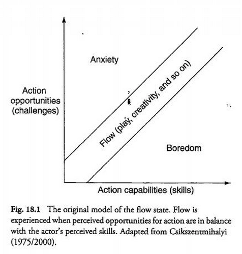
Mobile Game Design must account for a player with distractions. Specifically when they come back into a game. It’s all about managing a player’s flow state, and bringing them back into the “flow channel” (the balance between boredom and anxiety, building up their skills over time) as quickly as possible.
Immersion is still very possible in this mobile environment, but it takes on different forms. You have to design your game in such a way that at any time the user can leave, come back and still understand what it is they are supposed to be doing.
Dealing with distractions also means catering to your audience. You have to design game mechanics that adapt to the player’s life style. If your target audience is casual, then they have a smaller average session length then a core gamer. You have to design your game mechanics around getting your player in and out of the game within that average session length. They need to be able to get in, reach a high value part of the game quickly, then have the opportunity to leave without pain.
This is sometimes hard to incorporate in games that :
⦁ Depend on a strong narrative to lead the player
⦁ Require many complex steps which require the user to remember ongoing information
⦁ Push the player to play for long periods of time (5 minutes+ required to play)
Taking many cues from casual games, it is important that you design with intermittent play in mind.
Building a mechanic that allows the player to quickly enter the game. A game design that enables the player to quickly understand the game state as soon as possible.
Building a mechanic that allows the player to leave at any moment is imperative. You can’t assume the player will stay in your game for very long, life will usually take priority over playing a game for the player.
It’s important to not disrespect your players at this point. A great game will create a lot of depth and strategy while keeping within these constraints. Many games on the AppStore will dumb down their concept for mobile to a point that it lacks depth.
As always, it is important to understand and know who you’re targeting. If you’re targeting core gamers and want to introduce a lot of complex depth in the gameplay, then you can expect that your user base will be more likely to have higher play session lengths and minimize distractions. Games are higher priority for them (then life).
But even core gamers have distractions — and allowing them to play with depth while balancing these distractions will create an immersive game.
Easy In
Phone calls, texts, life will get in the way of your game — so make sure that your game can adapt to the player’s distractions. Easy In is about having an appropriate strategy for your player’s when they return from distractions. When the player returns to the game they should have as few clicks/steps as possible to return to the optimal game flow (the most exciting part of the game).
Turn-Based Games
The ideal design for a mobile game handling distractions is for the player to be able to exit the game whenever they want, and upon returning they are returned to the exact state they were in. Games that are turn-based can execute on this very easily. In a typical turn-based board game each turn has infinite time. So in the event the player leaves because of a distraction in the middle of game, has unlimited time to get ramped back into the game. The game would return right to game board, where the game’s optimal flow takes place. The player is quickly shown the game’s current state (the entire game board) and can easily think through their move. This is the ideal, since the gameplay is simple enough that the game state can be shown within one screen (the board) and the player has unlimited time to make the choice. Casual Games like Bejeweled do this well : even with a more arcade mechanic, each move the player makes has unlimited time for them to do so. This allows the player to put down their device, not worry about pausing the game, and return without worry. When returning, they can quickly understand the game state (all the jewel placement) and make a move at their leisure.
Angry Birds, Cut the Rope and Where’s my Water all have unlimited turn times for a very good reason. The player can return to the game from distractions and reach optimal game flow as quickly as possible.
Sometimes a player will need a little nudge. You want them to return to the optimal game flow as quickly and delicately as possible. So if the player just can’t spot the next move quick enough, it may be a good idea to “nudge” them to the right answer, so they can get back into the game quickly as possible. Bejeweled does this nicely. When a player hasn’t responded to the game in a few seconds, they add a nudge to show the player where a move is. Sometimes this can be disrespectful and insulting to the player, so use with caution. As always, understand your audience and decide how best to nudge without insulting their problem solving skills.
This ideal situation does not work for all games however. If your mechanic requires the player to make very quick responding moves or make a move within a specific amount of time, then a player coming back in the middle of a game move will cause panic. This isn’t the optimal game flow state. The casual player will panic.
Reaction Games
In arcade games, creating unlimited timed moves would absolutely kill the nature of the game. Timing, speed and panic are the core components of these games. So how do we ramp the player up quickly?
Well a naive solution is to cancel the previous game session they were having. When a player returns from a distraction, they must start from the beginning of the level. This is possible if your game sessions are 20 seconds or less. While the player will feel frustrated their 20 seconds of effort was wasted, this is a minimal punishment… but is still punishment.
The other solution is a pause menu. The player is able to pause the game at any point in the chaotic gameplay. This isn’t new. There was a reason why home console games had the “start” button in all games do this. I’m sure most parents would never had bought consoles for their kids if the pause button wasn’t invented. Many dinners would be skipped without pause menus.
It’s important to use the pause menu for a real purpose.
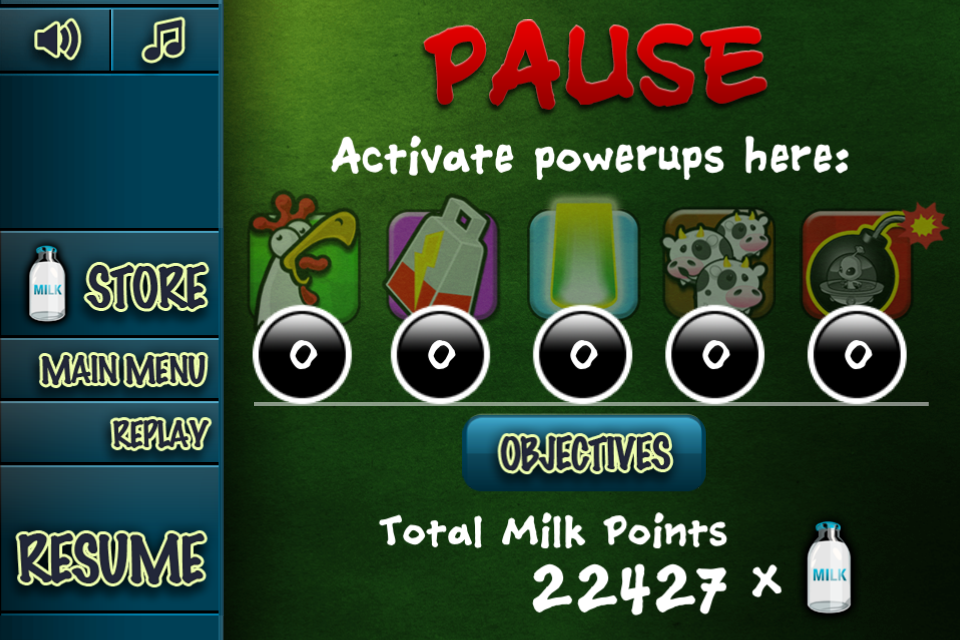
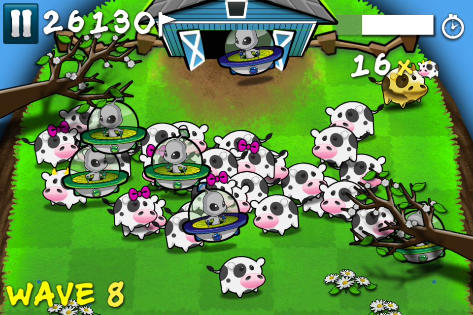
Cows vs Aliens used the pause menu to display briefly the game state (the player’s points, wave) and give them opportunity to trigger powerups. This doesn’t help the player return to the optimal game flow at all.
Here is how a casual player would return to Cows vs Aliens :

How a player would enter Cows vs Aliens upon returning to the game (locked screen, re enter the app)
⦁ Navigate the menu and try to find the resume button
⦁ Press the resume button

Instant Panic as the player returns to the game
⦁ Instant panic as the game snaps back to the game, there are aliens headed towards the barn.
⦁ As a casual player, they don’t respond in time, they don’t have enough time to get back into the game flow.
⦁ Game over screen.
⦁ Navigate the main menu to restart the game.
This is just an example, but in this case it would have been better for this player to just restart the whole game and start from the beginning again. The player wasn’t able to ramp up quickly enough, and because of that it took 6+ steps to get back into the optimal game flow, with a few steps making them feel inadequate of playing the game. Some players would drop out by this point.
Instead, allowing the player some ramp up time would be more ideal.

The Pause Screen is transparent
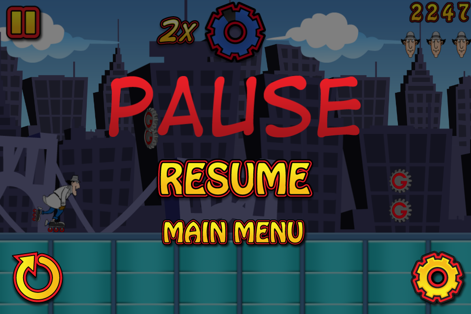
Notice in Inspector Gadget’s Mad Dash, the pause menu is transparent overlaying the actual gameplay. This is essential. Immediately when the player returns to the game, they can see the game state, can take their time, take a deep breath, then plunge back into the game flow. Just this basic design decision makes a massive difference in how players can come back into the game. In the event that the game is much further down the track, the player has a difficult jump to make, or returning to the game would cause a game over, the player can predict this when returning, and at least make the decision whether to give up and try again, or try it out. At least they are aware of their fault, and will try to fix it next time they get a distraction.
Taking this a step further, it’s important to nudge the player into the mechanic on a return as soon as possible. For more casual audiences, it may be more important to change the mechanic when the player returns from distraction to ease the player back into the mechanic. In an arcade situation, slow down the generation of obstacles, slow down the gameplay, and gradually speed the game back to its original state. Of course, close attention to exploits is important. You don’t want your player to use the pause menu to make the game easier.
Management Games
Management games, which involve the player managing their time, their town, their bakery shop, their pet shop, have challenges with managing easing a player back into the game play.
In a game like FarmVille, it can be overwhelming for a player when they come back into a game to understand what they should be doing. They have to water their crops, plant new ones, gift their friends, add more friends, purchase that new item, there’s that sale on that barn… do I need it? etc. etc. etc.
It can be a bit overwhelming. Especially as you add more steps and concurrent tasks to the player. Hyper-engaged players will not have a problem navigating this ocean of tasks, but many casual players, which you want to slowly ramp up to being more engaged can walk away when they are presented with so much choice.
In this case it’s important to think of how a returning user can be quickly ramped up in the game. The optimal player flow is for them to work through a step by step process, doing each of their required actions, then leaving the game. But that’s not fun. That’s too restrictive and requires no thought by the player. However, you can help the player organize their required tasks in a convenient list, and allow them to opt-in to following the list of steps in whatever order they choose.
When the player returns to the game, allowing them to press a button, or automatically bringing up their task list is a good idea. Each task should be a bite sized chunk of gameplay (collect all your plants, build a building, etc.). You can include some long term goals which require multiple sessions, but its important to hide these or allow the player to see them only when they’ve completed their short-term bite-sized goals first. Making these bite-sized and manageable within a few seconds allows the player to be nudged back into the core gameplay as soon as possible. It gives them a sense of accomplishment, and pushes them forward. Prioritizing quick wins over long-term victories is a great way to motivate people and to create habits.
Full Reset
Some games will restart the entire game from scratch every time the player opens the game. This is a terrible idea. While this will simplify the game start-up : the player will immediately understand what they need to do to continue (press play, start game from scratch) it clearly means that the game isn’t built with distractions in mind. If the player has to back-track and repeat more then a few steps of work to get them back to the game step they were at then this is just frustrating.
If your game can’t adapt to a player’s life then a player won’t adapt their life to play your game.
The only time which “restart completely” makes sense is when the player’s necessary steps to reach optimal flow is less if they just restarted from the beginning.
Easy Out
Easy out is all about making sure the player feels no remorse for leaving the game.
A big part to make sure this happens is having a good strategy for their return. Allowing the player to leave whenever they only works if the player knows that when they return it will be easy to get back into the game.
It’s also important to find ways to add hooks to the game so that the player has clear areas of the gameplay that they can leave without feeling like they are going to be punished on their return. Classic arcade games and the original console games were terrible at this. If you ever had to shut down your console, leave the arcade machine, you knew that your game state would be lost forever. The day your parents accidently unplugged your Nintendo console while you were in world 8 of mario surely caused scarring effects on your psyche. The day that you wrote down your MegaMan password wrong, and ended up back at the beginning made you throw the controller through the wall.
With mobile, we’ve evolved. We have far better solutions to this. Make sure your game does this as well. Easy Out is making sure that the player feels no remorse leaving the game flow. They can leave the game flow as often and as quickly as they need to.
No Penalty for Leaving
The biggest rule of easy out, is making sure there is no penalty for leaving.
This includes making sure that when they come back their difficulty does not spike. This happens inadvertently many times. Pausing during an intense arcade game will put the player back in the middle of the fray, this time without time to react to the game. This spikes the difficulty and punishes the player for leaving. Makke sure the game has an effective easy in strategy to manage this punishment.
Some games will pull the player back in the game allowing them to ramp up in the game easier. This is great to ramp up the player but has to be balanced with feeling like a punishment for leaving.
Have Coffee Breaks
The other important idea for easy out is to make sure you have plenty of “coffee breaks”. Every so often, the player should be able to take a break from the intensity and feel “OK” with leaving. Counter-intuitive when you want to create an immersive environment, but it depends on how you portray it to the user. You want to try to influence the player so that they leave at good areas of your game. This allows you to better design their return. In an arcade platformer game, It’s better for a player to stop playing your game between levels, than during. If a player exits your game during a level, they are far more likely to return to the game at a point that will confuse them. Having “safe zones” as often as possible allows the player to return to a point in which you as a designer can ramp them up as smoothly as possible. If a player feels like the next coffee break is too distant in the future, they are more likely to exit the game in an awkward area, then when you intend them to.
Do’s and Don’ts for Easy In, Easy Out
DO
⦁ Remind the user what it is they are supposed to do when they return
⦁ Have access to reference for information they are required to remember from previous sessions.
⦁ Have a clear “task list” which pushes the user to complete as many small chunks of gameplay they can
⦁ Have constant small chunks of gameplay actions with breaks which allow the player to leave at opportune times
⦁ When returning to the game, pause the action and allow the player to ease back into the game
DO NOT
⦁ Require the player to remember things from previous sessions
⦁ Have a long intricate story the user is required to remember each time they play
⦁ Have many complex steps for each step in the gameplay
⦁ Penalise the player for leaving in any way
⦁ Require the player to play for over 1 minute continuously

