Deconstructing Merge Town: The Rise of Hyper Casual
Rewarded Video Ads have been a constant, dominating trend in free to play over the last few years. Starting with companies like Ketchapp and Futureplay, it became abundantly clear that games can drive meaningful revenue from video advertisements, and advertisers can find a captive audience in mobile players. In the last couple years, Video Ads have reached a tipping point. No longer seen as superficial revenue on top of IAP revenue, designing for video ad revenue has become the dominant revenue growth area for free to play companies. Designing for video ads has allowed for innovation in the maturing mobile space that is much needed.
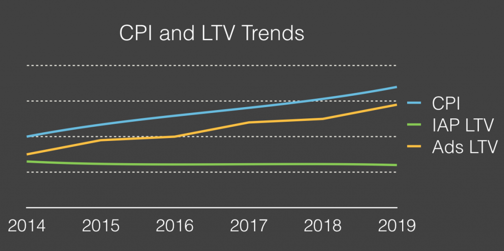
Source: SOOMLA Blog (an excellent source of info on Video Advertising!)
The rise of Video-Ad driven monetization has heralded in a new era within mobile game design. The casual segment has been dominated for years by the Match 3 Saga model with other casual categories struggling for meaningful revenue (ex. “with Friends” style games). Video Ads have opened up these categories because it monetizes on 100% of your user base. Instead of having to awkwardly cram in In-App Purchases into a casual title, developers can monetize off their active playerbase even if they don’t have a meaningful economy with anything to sell.
“The rise of hyper casual” it is called. Summarized here by Johannes Heinze of AppLovin:
“Players of hyper-casual games can be acquired at extremely low rates, so even though CPIs are increasing and gaining traction in the app stores is difficult, developers of hyper-casual games have a lot of opportunities. Hyper-casual games tend to be less costly to make, and users monetize almost immediately since ads are the primary revenue source, meaning that UA campaigns can be optimized early on. Hyper-casual games make the biggest share of revenue in the first couple of days, unlike IAP-heavy genres, where the most active users make the most money over time.” – Johannes Heinze, AppLovin
The rise of hyper casual category is exciting because it goes counter to what traditional free to play games have been moving towards: massive budget, multi-year long productions that are getting riskier and riskier. Hyper casual games are innovative, quick to make, and easy to market when done right.
Gram Games is one of many that successfully capitalized on the hyper-casual trend. Games like 1010! And Merged were quick to make, yet clearly generate more than enough revenue to support the mid-sized Turkey-based studio (now with an additional studio in London).
Gram Games’ most recent launch is “Merge Towns”, a mashup of a puzzle and idle game. The game has peaked at #3 top free downloads in the UK, and is within the top 20 downloads in the US. This game clearly shows the latest innovation in the video-ad driven monetization space and is an excellent guide for newcomers to space. Not only does it have strong proven video ad integration, it also supports an innovative core gameplay. Let’s take a closer look.
Core Gameplay
Merge Towns at the purest concept level is a Matching game core combined with an Idle game economy.
The core gameplay mimics that of Threes! and Triple Town in that you attempt to combine multiple of the same block to upgrade the square.
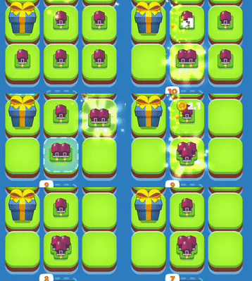
You can see above how the core is built. You can drag and drop any piece on top of another piece of its kind. There are no restrictions like Triple Town or Threes. Placing the same tier of a piece (a small house) on top of the same tier will upgrade the house to the next tier (a piece with 2 houses). This carries forward and forward throughout the game, creating more and more intricate pieces.
Whereas the goal in Threes And Triple Town was simply to survive for the longest time possible, Merge Towns is more akin to an Idle game. There are no failure states, there is just optimization of progress. Your goal is to generate pieces — so you can combine them — to make better buildings — which generate more revenue — to purchase better pieces. The core gameplay moves like this:
1. The first step is about generating pieces. Players can do this by rapidly tapping on a button, or by waiting.

2. With the generated pieces, players combine them to upgrade them and make space for more land and new pieces to fall.

3. With the upgraded buildings, these generate faster soft currency.
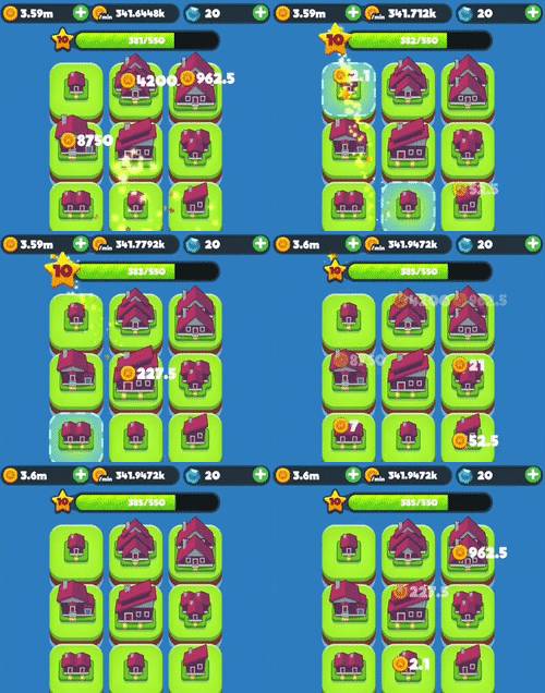
4. With the soft currency, players can purchase better pieces directly
Overall the gameplay feels significantly more approachable and casual than Threes or Triple Town. For Triple Town, the restrictions on movement and the loss condition make for a far more difficult puzzling experience. Merge Towns feels much more like a new take on an idle game mechanic (ex. Farm Away and Build Away’s core gameplay which is deconstructed here). Instead of simply asking players to tap-tap-tap their way to progress, they’ve added a thinly more involved matching mechanic which feels satisfying to complete.
Players don’t even have to pay that much attention to the numbers, the core gameplay of simply matching the highest tiered object possible works well on its own. It’s not so much a puzzle as it is just a pleasurable action.
What this says to me is that the key part that works for the Idle genre is the metagame and the economy. Clicking over and over again is just a relic of the Cow Clicker days — to innovate in this genre it will be about combining the economy of and idle with interesting core mechanics which have significantly more interest than tapping over and over. Merge Towns executes on this. Merge Towns appeals to a wide casual market while having the lasting economy of an idle.
Integrating the Idle Economy
To integrate the Idle economy with a new gameplay took some workarounds by the design team. If players can upgrade buildings on their own, what is the value of the currency generated?
Gram Games answered this by making soft currency the time skip currency. Players can purchase upgraded buildings directly with their soft currency, allowing them to make progress significantly faster as the economy naturally slows down with the exponential nature of the design.
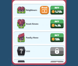
Players thus enter the store as part of the core loop, constantly aching to spend their soft currency to speed up their progression and purchase the highest upgraded buildings possible. It feels like an Idle economy, where I’m constantly making purchases to upgrade the rate at which I’m generating soft currency, but this feels very different. Something that all designers must strive for.
As time goes on, Merge Towns eventually opens up more tiles in which you can place pieces giving a small sense of Visual Progress. Your town can now get bigger and bigger. However, eventually, things do get boring as a usual idle economy does. Eventually the next major upgrade gets farther and farther away.
To keep players engaged when progress slows down most idle games use a prestige mechanic, forcing players to reset their progress in the current area. To make this appealing, games usually offer a permanent progress boost to the player, making their subsequent resets of progress allow them to get farther and farther in the progression. Merge Towns breaks this formula, and instead opts for a more heavy-handed design.
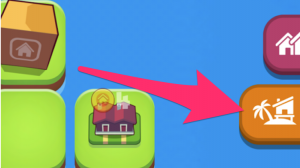
Eventually, new tabs open up on the right which introduces the player to new areas of the game. This offers up an entirely separate town to build up. Their soft currency is completely different, so progress in the first zone does not help at all to progress in the second zone. This is a far break from their idle game roots.

This design decision has some pros and cons.
On the one side, it feels casual because I don’t actually lose any progress — my initial town is still running and I can still keep upgrading it. All the visual progress that I’ve made upgrading my buildings is still felt. It removes the punishing feeling that most idle games can have.
However, it also means that my sessions will get longer and longer. While this game’s design already rewards players quite heavily for being active. As you progress the sessions continually get longer and longer to manage the multiple zones, making sessions more and more exhausting.
But in essence longer session length is what Gram games want. The longer their sessions — the more players stay within their game — the higher their Video Ads watched per DAU. Restricting session length too much actually isn’t in Gram Games favour. So Gram Games made the right design decision, as long as it doesn’t translate into exhausted players.
Advertising Strategy
Advertising strategy always revolves around getting the highest possible adoption and driving as many completed video ads viewed per DAU. More on this in our previous article.
For Merge Town, because their economy is so based on the Idle economy, they didn’t have to reinvent too much. Merge Town mostly takes cues from the dominant idle games like Farm Away and Build Away. However, they do make adjustments to make them work with the core merging interaction.
There are 4 key integrations of Video Ads:
#1 Welcome Back Bonus
Each time a player returns to the game they are greeted with a choice. Watch a video ad to double the soft currency generated while they are away, or lose out on this deal. Just as we’ve written about before, this is a no-brainer.
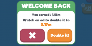
This integration is great for driving a high adoption. Right from the outset there’s a high adoption integration. Some scarcity + a clear benefit make this easy for a high percentage of your DAU to accept. However because it’s limited, it’s not great at driving a high quantity of views.
#2 Upgrade Rewarded Building
Throughout the game, there are also smaller rewarded video ad integrations which allow the player to upgrade a given reward for the cost of watching a video ad.

These integrations are great at driving quantity of views, since players can utilize them throughout a session without restriction. In most games offering video ad rewards like this without restriction isn’t possible, it floods the economy or gives too much progress away. However in Merge Town, because the economy scales exponentially, a small boost like this actually doesn’t really dent the overall economy.
#3 Double Production for 2 Hours
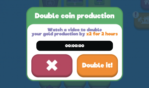
Similar to Build Away and Bit City (deconstructed here), Merge Towns gives the player the opportunity to double their overall coin production for an extended period of time for a video ad watch. This drives adoption (it’s an incredible deal) but is weak on quantity of video ad views due to its limited nature. This is also more likely for session design over monetization — giving players a compelling reason to come back to the game every 2 hours.
#4 Forced Ads in Flow
Lastly, Gram Games also has Ads forced upon the player when doing certain actions. When entering the shop (which happens multiple times per session) and sometimes when moving between zones (as you progress this happens more and more) you can be presented with a skippable full screen ad. They definitely are annoying, especially since they seem to appear randomly (most likely due to fill rates from advertisers).
Why would Gram Games opt for such a strategy? Isn’t rewarded video ads always better than forced?
This is most likely a strategy to drive the strongest revenue from players that won’t last forever. Merge Towns is a fun game, but it certainly won’t have the same staying power as traditional free to play games like Gardenscapes, Galaxy of Heroes or Clash Royale. But Merge Town doesn’t need to be like this. Not every game needs to be a 3 year epic hobby with clans and guilds. Which is why many of these video ad driven games are refreshing and are easy to market. They have instantly gratifying mechanics that most traditional free to play games wouldn’t utilize. Their design is simple making it easy to pick up and play compared to most free to play games.
On top of this, it allows Merge Town to monetize off the “No-Ad” version. Purchasing a In-App Purchase will remove the annoying ads, making their offers even more enticing for the power players.
So Gram Games’ embraces their shorter retention curve by their aggressive ad strategy. While it does no favours for their retention, they made a calculated trade-off between retention and revenue. If you know players aren’t going to be here a long while, retention isn’t king… revenue is.
In Summary
By having innovative, instantly gratifying core mechanics, Merge Town has made a game that feels immediately new and different. This game must be easy to market.
By connecting it to an idle game economy they’ve built a game that can last, and drive meaningful integrations of video ads for sustainable revenue.
For game designers in the market, Gram Games have shown that Video Ads and Hyper-Casual games have opened up new possibilities in the market. Now it’s time for us as game designers to adapt and embrace it.
4 ways Futureplay use mobile video ads to increase monetization
View-to-play is fast becoming the new dominant monetization model in the mobile marketplace. For the last few years, game companies like Futureplay, NEXT Games, Gram Games and Ketchapp have shown that you can create successful free-to-play games which drive sustainable revenue without focusing solely on In-App Purchases. Games like Crossy Road, Tap Titans, and Endless Runners like Despicable Me have reported that more than 50% of their revenue comes from video ads.
Creating successful Video Ad integrations is more difficult than simply rewarding a video ad watch with in-game currency. In order to generate enough video views, games need to be designed with video ads in mind. For video ads to perform well we’ve established four core principles of video ad monetization:
- All video ad views are opt-in
- Game design that pushes the maximum number of views per DAU
- Ads give valuable rewards in a positive way for the player
- Ads complement in-app purchase, they don’t replace IAPs
Futureplay is one company that have followed these four principles and built two games (Farm Away and Build Away) that use view-to-play to full effect. Founded in 2015 in Helsinki, Finland their focus is on shipping games based on the idle / clicker genre. If you haven’t played this style of game, I recommend reading our overview of Clicker/Idle genre:
Great interaction design and slick presentation make these games a joy to play. Let’s dive into how they integrated video ads into the core loop:
Farm Away! and Build Away! Gameplay
An Idle game’s core loop revolves around producing as many coins as quickly as possible. In order to do this, a player must purchase exponentially costly upgrades that increase their coin production rate. It’s a positive feedback loop.
The objective for a player becomes maximising the efficiency of earning currency. The skill in these games is choosing which upgrades are the most efficient. Rather than digging too deep, remember that for players, increasing the rate of earning feels powerful — and upgrades that provide 2X or 4X increases to your coin production for short periods of time feel very rewarding as progress is noticeably sped up during your session.
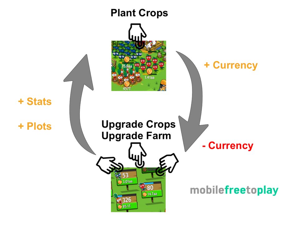
Increasing the rate of earning feels powerful
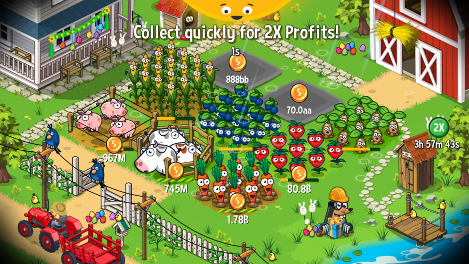
“Farm Away!” wraps the idle mechanic to planting and harvesting crops so that you can upgrade your crops and increase your rate of earning by buying more plots.
“Build Away!” uses a very similar system but you buy various building types and place them in blocks within a city.
Both games allow you to sacrifice all of your crops or blocks in order to get seeds in “Farm Away!” or keys in “Build Away!”. Investing into seeds or keys provide global growth bonus’ to help your future farms or cities.
Video Ads: Opt-in + Attractive Rewards
Nobody wants to watch a video ad. So if you’re going drive a full video ad view you need to make sure it doesn’t feel forced (it’s opt-in) and players feel they are getting a benefit from it.
If you think of watching a video ad as a transaction of time (30 seconds) it will help you to design systems that respect the player’s choice. Just as buying an in-app purchase is asking people to sacrifice money to gain progress, here you are asking players to sacrifice their time to watch an advert. Asking players to do this not always possible or preferable, you might be sat on a busy train or having a romantic catch up with your girlfriend. Playing mobile games while having a romantic catch-up with your girlfriend is not advisable or you may find your romantic catch-ups become few and far between!
Therefore, allowing users to opt-in to view your video enables them to choose a time and place to sacrifice their time. People will very quickly learn which features of your game are powered by video ads. The clarity of the trade enables people to opt-in when they will get the most value for themselves. Clearly labelling the reward at the point where you choose to watch helps here. Enabling scheduling and power-ups that each work for different amounts of time enables a player to chose the most efficient trade for them at that moment in time. Having a breadth of options that caters for these needs leads to many more opportunities to view a video. More opportunities give a higher chance that any one of these might convert to a video view.
Making a video ad watch opt-in allows for scheduling, but making the reward feel positive and special will lead to higher conversions. Well designed rewards are those than enhance a player’s experience. For example, a boost to currencies the player would normally receive, increased speed to reward or a dramatic / exciting feature that isn’t normally available. As with in-app purchases, a strong sense of value makes watching the video feel worth it.
Rewards from video ads don’t only need to come from giving away currency or increasing the rate of currency gained. People appreciate novel experiences, limited offers or a chance at a grand prize.
FuturePlay uses 4 different strategies that each create a positive experience for their users. Remember as we discussed in the mobile video ads value chain increasing the number of views per DAU will lead to greater payouts in the end. So from a game design perspective building systems that can support 2-8 views in a single session rather than the classic 1 or 2 can have huge increases in monetisation.
1. Scarcity and Growing Value (Daily Double!)
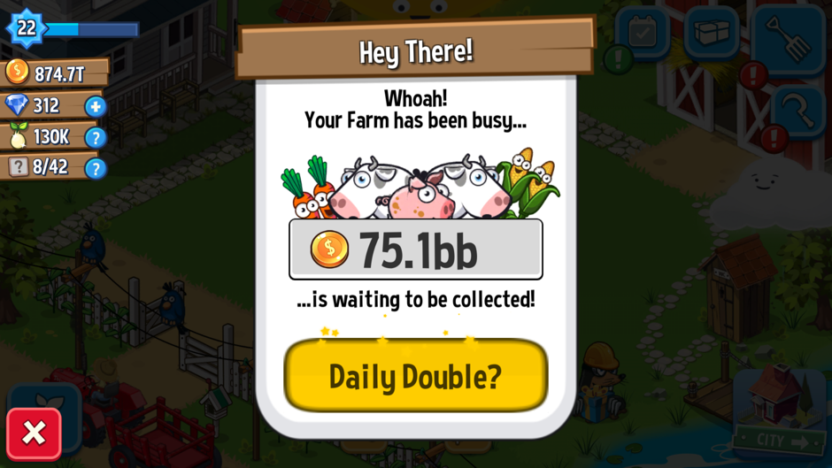
The strongest and most efficient video ad mechanic is the daily double. It offers to double the income you earned whilst away. Although very relevant to Clicker games as currency generation forms the core loop, a similar offer could be used in simulation games (currency doubling) or arcade (energy doubling) to give a highly valuable rewarding upgrade for the upcoming session. This has some very strong drivers:
- Obvious value that grows with time
- Presenting on appStart means everyone sees it and has the opportunity to opt-in
- Time limited availability which creates urge to take the deal now
The daily double effectively monetizes because it is high value (2x) and that starting value grows with time (seconds away from the game). Therefore, however long it has been, this bonus doubles it! 2X feels very rewarding for clickers and as a retention mechanic you get a larger boost no matter when you last logged, making your start feeling great!
Presenting a forced pop-up on appStart before the game begins, increases the % of your DAU which is likely to opt-in. People can only convert (earn you money) to an offer if they see it. People won’t feel bad if the opportunity is opt-in and valuable. As with all free to play designs you know your players are fickle, most players won’t even come back after a single day. Therefore forcing a high value, time-limited opportunity to kick start their game when they come back has the highest chance of conversion. For the view-to-play model to be successful you need to bump your average views per dau to 2-4. The way to do this is to be quite forceful. appStart provides the highest number of opportunities because it’s the first thing people will see.
The daily double is only presented once per session. By creating a scarcity in availability, people perceive the offer at a higher value even if the actual reward might be smaller. Putting people on the spot leads to more conversions. There are a number of psychology articles that talk about the effects of scarcity and it’s been used in marketing since the early 1970’s.
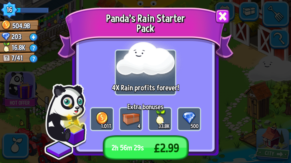
Any offer which is time or availability limited can create higher conversions due to a sense of urgency for players. To be effective the offer system should be presented to users multiple times across multiple sessions teaching people of its scarce nature. The more someone recognises a scarce item, the more likely they will be to convert when they see it. A good cadence for offers like this depends on the value of the reward. Once per session (Daily Double) has high cadence, low monetary value. A starter pack or time limited purchase (new players only) has high value, time limited. A special offer tied to an event or big update has high value and is availability limited can help to convert non-spenders into spenders. Video ad’s work best at the higher cadence lower value trades, whereas IAP works better at high value limited offers such as starter packs.
By creating a scarcity in availability, people perceive the offer at a higher value
2. Value over time (Session Doubler)

Clicker games benefit by being able to vary the rate of earning easily as their core loop supports a huge amount of depth.
By creating a large (2X or 4X) growth for an extended point of time the sessions themselves feel faster and progress feels quicker. This is quite like a feeling of increasing the flow of time (simulation) or even slowing down game-time in an arcade runner where a player’s game is made more comfortable. This form of trade adds value to your session, rather than short and sharp currency bonus’ that are quickly used up.
In other genres, it can be hard to create a similarly powerful video view because you need to keep a tighter grip over currency inflation. You should therefore consider speeding up an aspect of your core loop that encourages more play or more comfortable play of the core loop. For instance in a Base, Battle and Build (BBB) game, such as Clash of Clans, you might opt to increase the training speed of units by 2x by watching a video ad. This encourages more gameplay but doesn’t break your economy, it increases the number of battles played which positively reinforces the core loop.
If you have an RPG or adventure game then you might improve drop rates for 4h after watching a video ad encouraging people to continue to play longer sessions in order to maximise the benefit of the ad. Using video ads to strengthen the number of times a core loop is performed helps reinforce the positive moments and maximise the efficiency of a player’s time, creating a win-win scenario.
3. Short and Sharp Powerup (Instant Gratitude)

People run into situations where they need a little bit of help to achieve a gameplay goal. Creating a novel and fun power up that provides a short but sharp economic boost to help them reach a goal in that session. Futureplay turns this relatively simple power-up into a moment of joy for the player by encouraging them to interact intensely with the core action of harvesting in FarmAway! or collecting income from buildings in BuildAway! 20 seconds feels natural and a user can further increase the value by swiping as quick as possible to get an even bigger bonus.
Positive actions encourage a player to engage
Power-ups like this work by creating large environment changes such as increased animations, novel buildings or rare characters. The aim should always be to leave the user with a positive feeling. Some users may even watch a video ad in order to play the 20s mini-game. Think of a feature that fits your theme and allows people to play intensely for a short period of time, this might be doubling attack speed of a unit or increasing the power/size of in-game power ups in a match3. Think about ways you can trigger an exciting and special moment in your game that is unique but powerful to users.
4. Content Unlock or 1 More Life – (Unique Ability)
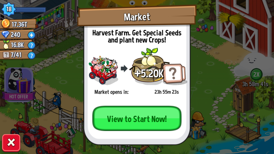
Certain features within your game might be critical to a player’s progress or score. In clicker games sacrificing your progress for global power ups is core to reusing the loop. Futureplay created a great and simple 24h blocker to prevent instant sacrifice. Players can skip this wait by watching yet another video ad. Patience is a virtue, but enabling players to gratify themselves instantly increases your views per DAU. Endless runners and frustration games use this very effectively to help people continue their progress in an attempt to get the highest score for a single run.
Unique abilities or instant gratification work so long as they are opt-in and don’t break your core game loop. Every game is different but by creating options and presenting them at different points allows people to choose when to feel clever.
Stack and Extend Video Views
The 4 different methods of watching a video are all unique but tied to positive actions that help a player to progress in their game. By providing 4 different features to watch a video, Futureplay has maximised the opportunities for players to watch a single video. In order to really boost their views per DAU, they have made more positive and valuable reasons to watch more than once.
- Every video views bonus stacks. So if the Session Doubler and Instant Gratitude feature are used together and effect 2×4 = 8x growth for a short period of time.
- Extending the period of certain bonus’ can occur by watching more than one video, this helps players to schedule their time in the game.
Effectively providing players with more opportunities to engage with video content around a feature will increase your views per DAU. Stacking of video views works well as long as you have a robust economy, be very careful that too many trades for currency or in-game growth don’t break late game systems in the game. When in doubt block players from too much stacking or extends. 2 or 3 stacks is enough for any single session. In this way, you can be sure that players need to keep coming back day after day and engaging with your game over a longer period of time.
At Slush in 2015 Futureplay revealed the Launch DAU and ARPU for FarmAway! Launch numbers and a staggering $0.09 ARPU during the launch window. Although they might not have maintained their high ARPU, it still shows what is possible for games that use the view-to-play model.
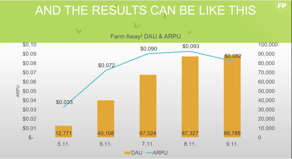
Watch the full video of View to Play by Futureplay at Slush 2015 – https://www.youtube.com/watch?v=TE6mF6VCxHA
Conclusion
View-to-play monetisation is now large enough to support gameplay mechanics that don’t work well with an IAP model. The biggest mistake companies make when trying to integrate the model is not providing enough opportunities for players to watch. Each of these opportunities should provide a positive experience either through value or interaction with the mechanics. High-value trades lead to a greater conversion of videos, but be careful that your economy is robust enough to handle this. When looking at your analytics make sure to track the video views per DAU in order to create features that lead to higher views. As the name itself makes clear View-to-Play requires views to generate revenue, use this to guide your development. View-to-Play is not applicable for all genres, but for some, it will be more lucrative than in-app purchases. Be sure to stick to the four guiding principles of view to play and track your video views in your analytics accurately. View-to-Play is here to stay and gives you more options to create financially successful games outside of the standard Match3, BBB or RPG mechanics.
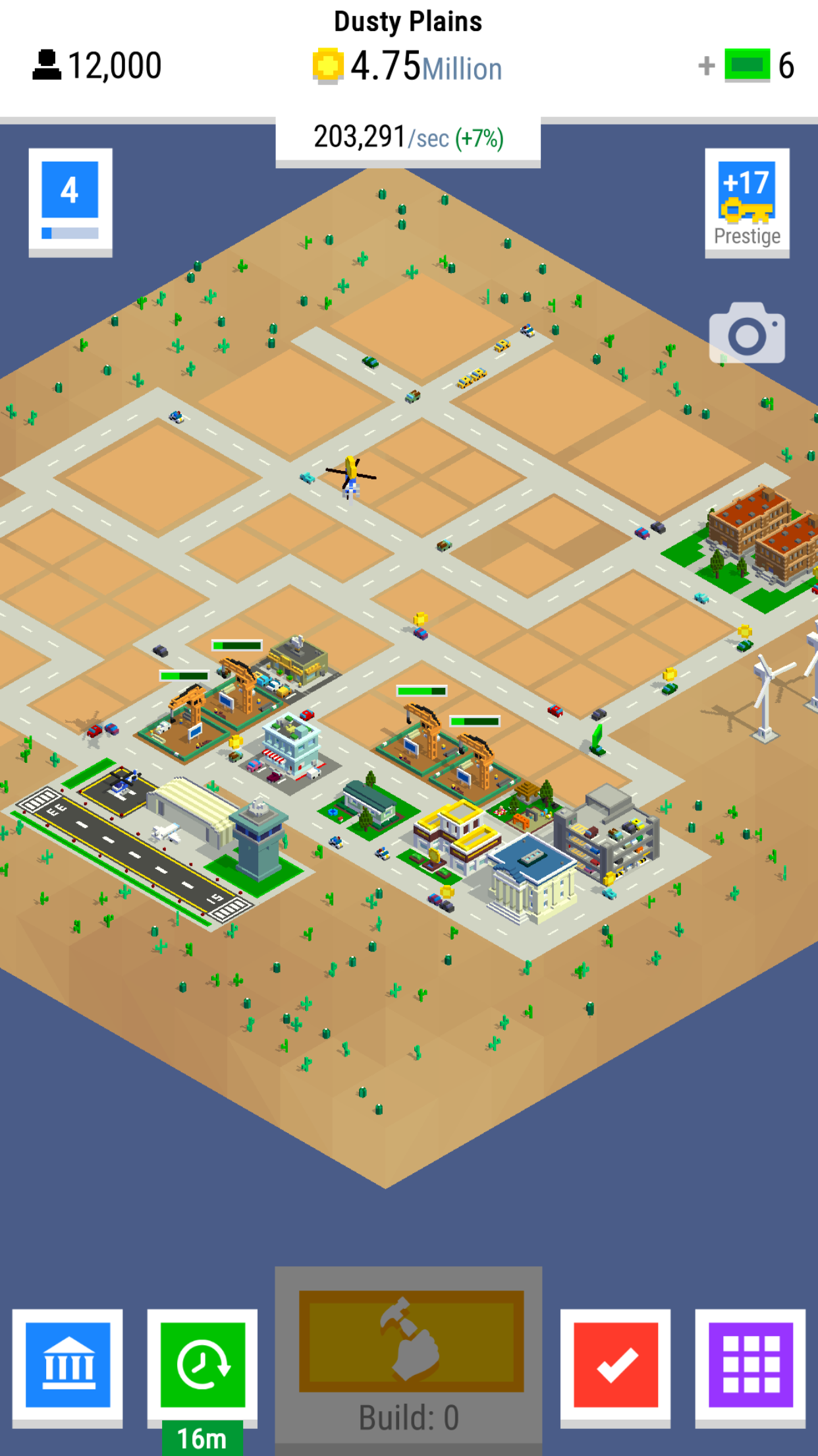
Deconstructing Nimblebit Bit City
The latest release from Nimblebit features the Bitizens and this time they’ve used an idle/clicker/tapper crossed with a city builder in their new release of Bit City (iOS / Android). I’ve been a long time fan of the Nimblebit team, started by the brothers Dave and Ian Marsh back in 2007 but expanded to a number of other key staff. My personal favourite game of theirs was Tiny Tower, but I’ve also played and churned out from most of their newest releases. Pocket Frogs deserves a design mention as it still has one of the best collection/rarity mechanics of any game that I’ve played on mobile. Nimblebit specialises in creating a collecting or simulation experience around common everyday objects.
Bit City’s core mechanic is an endless economic growth game and the aim of the game is to progress through the 8 increasingly sprawling cities to generate the most income per second.
Clickers in General
The clicker or idle genre is one of the more recent but extremely popular free to play mechanics that we’ve seen on mobile. There are some great reasons why the mechanic itself has been present in many large successes such as Adventure Capitalist, Tap Titans or Egg Inc. At it’s core, the loop for a clicker is very simplistic. You’re trying to improve your rate of earning, in order to buy items to increase your rate of earning.
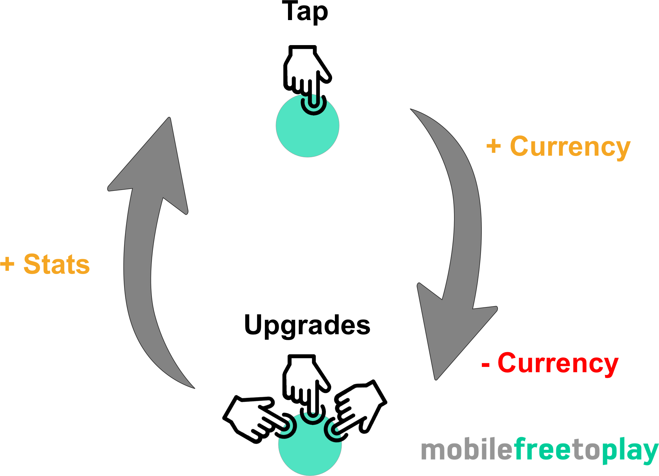
The simplicity of the core loop is both a blessing and a hindrance. The fact that everything you do in the game contributes to making you better at what you do (earning currency) feels very rewarding.
Every action is a positive action.
The hindrance comes when you eventually find the core interaction (tapping as fast as you can) repetitive and boring. In some clicker games, this can happen very fast. So, as a game designer, you eventually shift the player’s motivation from tapping to something that will last much longer. The clicker game genre eventually shifts into a strategy of choosing what to upgrade next. In Tap Titans 2 a player is strategically shifted from upgrading characters to gathering gear, pets or items. All of these have random drops and XP to give much more strategic depth. Upgrading anything feels good, but timing and choice matter.
No one can be expected to be active in a game forever which is where the idle aspect of most clickers come in. While you’re away your game is playing itself, constantly growing your earnings. That way when you come back, a stockpile of cash for you to quickly spend and improve to feel powerful. This happens every time you come back, whether it’s 10 minutes or 10 hours, the size of the stack changes but the feeling of reward stays the same.
The genre itself appeals to a certain type of gamer. Those obsessed with finding the most efficient and time-effective way to improve their progress (in the form of earning rate). Sometimes referred to as min/maxers finding 1-2% efficiency in upgrade choice is rewarding as you are progressing. Yet even the casual player feels good, you’re constantly making progress but at a lower rate. If you’re more interested in story and context then you will often not feel as excited about idle games. It is a game for fans of stats and numbers.
Bit City – Context provides content
Idle games began on the web with titles such as Cookie Clicker or Cow Clicker released around 2012-2014. 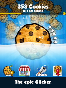 These games were incredibly simple. They drew huge numbers of returning users every day as the objective of “having the highest number” is so clear and powerful for players.
In more recent times games such as Adventure Capitalist, Tap Titans, Farm Away, Make it Rain have re-skinned the mechanic and given a context to the clicking. Context helps with design decisions as you immediately add more depth. Depth provides you with content and that content can better mask the simple stat progression. Player’s decide their goal is to “build the greatest city” rather than to “get the highest number” and this creates a better sales pitch if and when they tell their friends about your game. Context helps you design and it helps you sell, use it to your advantage and don’t neglect it by slapping it on at the end of development.
Bit City provides much more context to the clicking experience by using a city and it’s buildings to provide more visual substance and reference to the core loop. The City Context is a good one, used in multiple genres it’s easy to reference, has great depth and is applicable to people from all countries. Bit City uses this to great effect, but adding Building Zones, Cars, Planes, City Hall and Windmills each contributing to your currency earning.
Clicking = Building

The core mechanic of tapping furiously on the screen has been removed in favour of the idea of building. One must purchase and classify lots so that buildings of specific type are built. Buildings then fill each lot and the large Build button upgrades and refreshes the building on each lot for a small increase in coins per second earning power. The upgrading of buildings is endless and rather than getting stuck in a content farm black hole, the buildings are upgraded at random. Every upgrade levels up the block and each subsequent upgrade adds 1 second to the total time required to build the next block, leading in the later game to upgrades take minutes. Choice of which block to upgrade is removed from the player through randomisation and the player is taught very quickly that every upgrade is beneficial.
This is a very strong mechanic for a number of reasons:
- Thematically it makes sense. Your city changes with time and you can position blocks in certain areas to make your city look beautiful
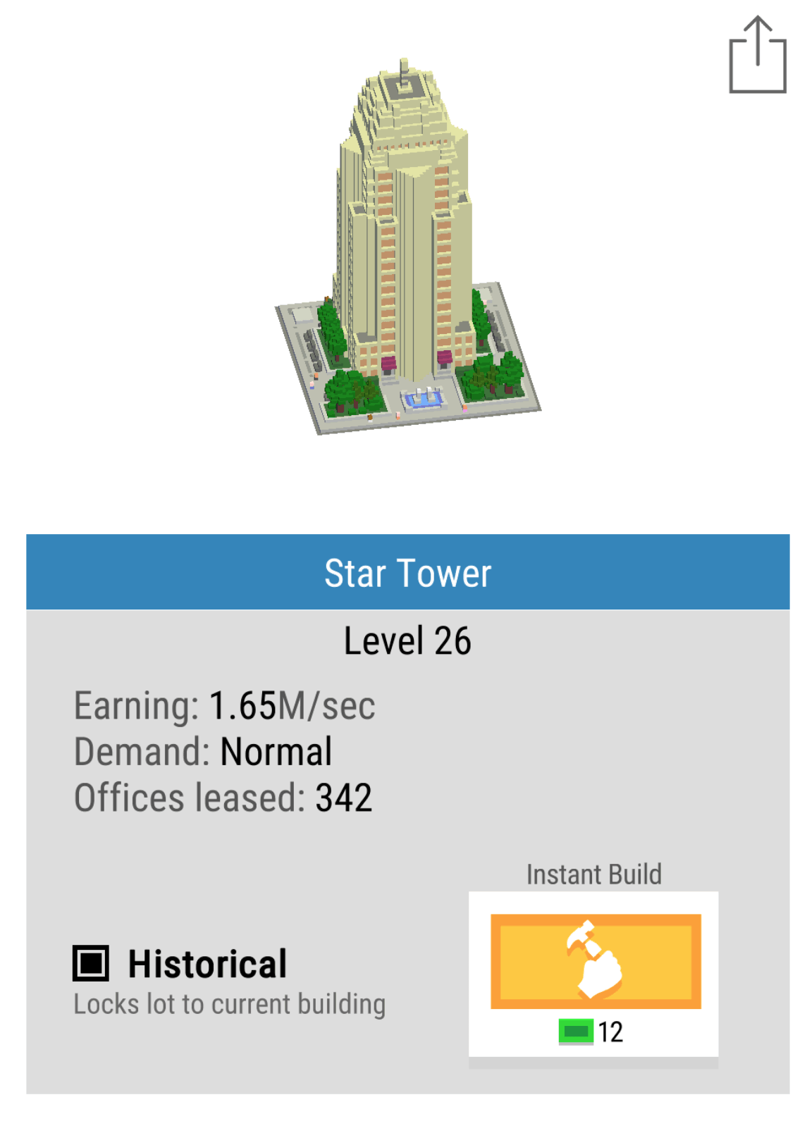
- You may also lock in place any buildings you particularly like allowing the creatives build beautiful masterpieces of a modern renaissance!
- Choice paralysis is removed because you don’t need to choose what to upgrade and all upgrades are beneficial.
- Build timers slow down sessions giving people incentive to leave.
As a pacing mechanic, it continues to engage at all stages of the game. This is often one area that other clickers loose me on as in the mid-late game, I simply stop clicking…
City Planning
Simplicity and clarity are always key design decisions for mobile game developers. People spend a few minutes at a time with your game and so everything needs to be clear and make sense in an instant. The choices available to a player in Bit City always relate to upgrades. The most profitable upgrade you can do is buying a new building for your city as each building provides a larger base earning rate. A really nice design feature is the idea of city zoning. There are 3 zones, Residential, Industrial and Commercial. Within this feature is a lot of shallow depth, that is there are a very large number of options and possibilities but as a player, the way they affect the game is incredibly minor. They do not affect the core in any way, they simply provide a route to micro-optimisation, reinforcing the fun of clickers.
Each building zone is balanced by providing a 10% bonus or 10% deficit depending on the overall % of zones, this promotes people to build in an ordered manner. At certain times you may want to opt for larger investments in certain zones because both the Mission system and the City Bonus system provide bonus’ specifically based on type of building built. This is a good use of shallow depth again. Most people would not obsess over the minutiae of which building to build, but to really get the most optimisation at each minute of gameplay it might be valuable to invest in specific zones at specific times.
Missions with increasing reward
Another clever design decision is to reward ever increasing premium currency (Bux) by completing missions. Missions usually revolve around building, improving or owning some upgrade or building.
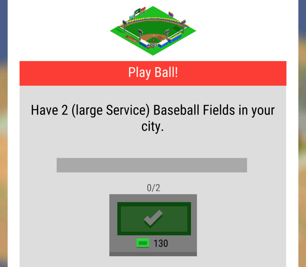
There is only one mission available at a time and they seem to be structured to appear in a specific order. Rather than having a small payout with lots of quick missions to teach people the mechanics, Nimblebit have used missions to give players a longer term goal. The cleverest of these is the ownership of 2 of the same building types i.e (2 Baseball Fields).
Mission systems are one of the classic mid-term progression systems. They provide a steadying hand and a focus for players when options of what to do open up. The best mission systems are usually curated or at least missions are grouped and then provided based on XP level.
The Premium Currency (Bux) are gifted in 10 bux increasing increments. This is risky, as it becomes a significant source of Bux in the mid game. I think the progression is a nice touch but the size of the progression is too high, it would have worked just as well say, 10,12,14 etc. At mission 13 I’m on 130 Bux which is equivalent to $0.13. Each mission can take an hour or more, but sometimes you might complete 2 or 3 in a few minutes. Although it might not seem a lot it lessens the requirement to spend. In the mid-game, it’s most profitable to focus on and perform the mission at hand. Balancing the rewards and spend of the premium currency is definitely one area that Bit City could improve on.
Progress, Profits, Prestige
Modern clickers increase the gameplay depth over time in a number of ways. These usually either increase the speed of clicks (Faster), the value of a click (More) or automating the clicking process entirely (auto). Each of these upgrades has a clear and tangible benefit, they help you gain more currency quicker, give your players a choice: do you invest in yourself being active in the game, or invest in the time you’re inactive?
Each city comes with a set number of plots. 4 for a level 1 city, 8 for a level 2 city etc. As you build more buildings you start to max out your plots. As soon as you have maxed your plots a new city unlocks and you sacrifice all of your upgrades and buildings to start again. This creates a clear goal for gamers and eases gamers into the game via small cities. As you progress the cost of each new building starts to become prohibitively expensive which encourages you to want to sacrifice everything in order to prestige to obtain Keys which will speed up everything in your game for the entirety of your play time.

System diagram of Nimblebit Bit City
What’s very pleasing compared to other clicker games is that the speed of progress is managed by a multiple limiting factors. Limits by multiple sources feel elegant rather than a strong single limiting factor. First, the coins themselves slow progress as you can’t build enough buildings, then the plots limit progress on one city as you max them out and finally the cities themselves become prohibitively expensive unless the global tap multiplier is improved by prestiging.
Prestige is very important as it adds ebbs and flows to an otherwise linear progression. Every time you do prestige you suddenly feel incredibly powerful as you race through early content, this is important as rather than having to create more complexity players are re-engaging with the game and reinforcing the simple systems of the game and progressing incredibly quickly. Bit City has created “mini- prestige’s” every time you upgrade to a new city once you have maxed out your plots. With every reset there is a sense of loss but also a sense of growth, getting your players used to this feeling helps them engage with the main Prestige mode.

In the mid to late game idle games, prestige currencies become the main goal in Bit City these are Keys. It’s very important to get the balance and the feel of Keys right. In Bit City, Keys feel underpowered as the quantity of keys provided when you prestige is too small. A user wants to feel progress at close to double the previous rate when they sacrifice all of their upgrades. Doubling up whilst keeping a logarithmic increase in the power curve of costs equates to half the time spent getting back to where you previously were. One you reach your old position the logarithmic power curve kicks back in and really winds back a player’s progress to a snail’s pace forcing them to prestige again.
A player chooses when to jump to the next prestige level and effectively picking at the right time can jump you onto a much more powerful curve. Great game design in this area wouldn’t use perfect logarithmic numbers but would add some randomness and inconsistencies to make it a guessing game for the player to find out if they are maxed out at an inefficient area of the curve.

Time taken to reach a city in bit city. Prestige levels and number of hours are representative and not factually correct.
UI / UX
It’s not mentioned in mobile how important the user interface is for a game. Especially in these management style games with large amounts of details, getting information across clearly and concisely is a challenge on a small screen. Nimblebit do a number of great reinforcements.

- Your key measure of progress is represented as a large central number of coins per second present on every screen.
- The build button (the button you click the most) is larger, more centralised and stands out from the rest.
- The subtle nuances of the game such as plot size, or building type are reiterated to you when you need the information, such as the quest system (large service)
- Before you make a large choice there is always a confirmation screen ensuring you are happy with your decision.
This attention to detail of the user’s journey removes frustration from the game. It allows you to choose where to focus your attention on to complete one or two of the tasks at a time and speed up your progress. A nice font and simple language make it enjoyable to read.
Monetising – Keep a tight grip
I’ve spent $10 so far in Bit City. For that, I got 10,000 bux. Bux are the only premium currency and are used to speedup progress, buy city upgrades that persist through prestige mode as well as unlocking certain famous buildings that provide enhanced bonus’. I feel that this was the point where the game design suffered.
- Bux are not a rare currency within the game. You can get 10s if not 100s of bux by completing missions or taping on vehicles that randomly drop bux, as a free player you can often buy a few persistent upgrades. When purchasing these upgrades there is no delight, magic or drama and as a player, all you see is your bux amount slowly draining. Purchasing the unlock of rare buildings was also much the same with a simple UI transition from locked to unlocked within the building card screen.
- No early conversion purchase. The Builder in Clash of Clans or World Multipliers in Adventure Capitalist, which immediately are the best bang for your bux! *pun intended…
- Gauging the value of upgrades is difficult. For instance, Market Gains for 1000+ bux increases your Bank Savings rate by 1%. This feels minor but would have a huge effect on the earning power itself. Rather than so clearly affecting such a powerful rate, investing in 20% cheaper bank upgrades would have had a similar effect to the player but would be immediately noticeable.
- No sense of mystery or delight when spending bux at any point. All bux are spent with a simple click and a UI change.
- No random drops. With it’s huge array of buildings creating a clear building rarity scale and then having a random drop element would make every bux much more exciting to spend. Random rewards have spikes of joy, rather than a focussed
I suspect the number of people purchasing bux will be low, simply because the number given out in-game is very high and people can immediately get a sense of what it would be like to have 1000s of them by spending a few hundred that they got for free. Games with great conversion rates keep the pressure on players to want to spend by constantly showing the value of having premium currency to progress. Bit City treats bux too loosely and as such the pressure to get my wallet out is low.
Video Ads – Double Time
I suspect that the game’s primary monetization route would be video ads. There is currently only one method to engage with a video ad through the opt-in button called “Double Time”. The value proposition here is strong, for a short period of time, double everything. Directly doubling the speed of progression is the best feeling for a player because it directly contributes to that core loop. Things that feel great in-game are strongest when they contribute to your progression directly. Clickers, by their very nature, are all about progress and so the reward is clear and easy to feel.
Unlocks happen more regularly I can build more buildings and progress shows a real gain. The upgrade itself is time limited to 10 minutes but with bux can be upgraded to 15 or more minutes. This again is a clever gamble as by getting people to potentially invest in an IAP they then encourage more video views, which if you remember is a key KPI for increasing monetization from video ads.
The major issue here is that there are not more ways to engage with video to improve those views per DAU that lead to more revenue. The 10-minute bonus is strong, but what about a 4h increase in the Bank Savings rate? Watch a video ad to upgrade a building directly would provide so many more places that a user could click the Watch button, increasing its adoption. The classic Double Up bonus for all returning players could be run once every 24 hours in order to highly incentivize at least one valuable video view per day. There is huge scope for expanding video ads integration.
Conclusion – Great Core, Monetization need Tightening
Bit City is a great example of expanding clicker mechanics into new genres. City Building and Clickers make a great match because of the depth in buildings and environment that are available to the team. Nimblebit have done a really good job of pacing the game across multiple cities causing you to have clear evolutions in your progress as well as allowing you to prestige at any time, making it your own decision. The type of upgrades and the thematic choice of upgrades fit nicely, all contributing to a busy and bustling city experience. The UI and UX of the game itself is also neat, simple and clear making playing the game an enjoyable experience.
The game’s biggest weakness will be its monetization. It’s very loose usage of Bux as a reward currency and the fact that players can only interact with video once per session without enough cues from the UI. The value of that video view is high so it should see good usage, but providing your most engaged and active players with more ways to watch would see many more views per DAU.
The games a great addition for the Bitizens and well worth a play!


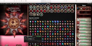




 These games were incredibly simple. They drew huge numbers of returning users every day as the objective of “having the highest number” is so clear and powerful for players.

