Touch Control Design: Less (Control) is More
The most common fault in touch control design: trying to incorporate too many concurrent mechanics at the same time.
If your game is a real time game (arcade games, action games) which requires the players to make quick decisions based on a real-time clock, having too many game mechanics operating concurrently will only confuse and frustrate your player. So you have to be vigilant with how many mechanics you as a designer ask the player to keep track of at the same time.
Choose the main priority of what you want your user to be focused on, and remove as many of the other mechanics as you can. If other mechanics are necessary, allow the player to switch between modes, so their focus can be on one mechanic at a time.
Commonly when porting a design from a previous platform, there are common design flaws that can be simplified to reduce the number of concurrent actions.
A Mindless button
If your game involves the player constantly holding down a button or tapping on a button mindlessly, then you have to rethink whether this mechanic is really required for mobile.
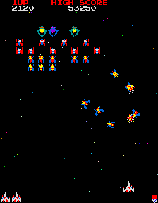
In a standard arcade shooter game, the player is responsible for two mechanics : Choosing when to fire, and avoiding obstacles. The player is constantly tapping on the fire button, while controlling their fighter with the control stick.
What is the core mechanic you are trying to focus on? When to fire, or avoiding obstacles? Choose one, and get rid of the other unless you’re willing to sacrifice users.
If choosing when to fire is the most important part, then remove obstacle avoidance. The player gets hurt if an opponent reaches the bottom of the screen.
If avoiding obstacles is the most important, then remove choosing when to fire. The ship auto fires and the player balances between attacking enemies and avoiding obstacles.
Mindless buttons show up in many traditional arcade designs. Rapidly tapping on the screen can be good design: this is a great way to change up the pace and get the game intensity up. But if you switch to a tap as fast as you can mechanic, then consider removing all other mechanics during this time.
Case Study : Drag Racer
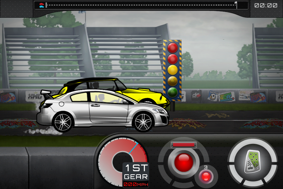
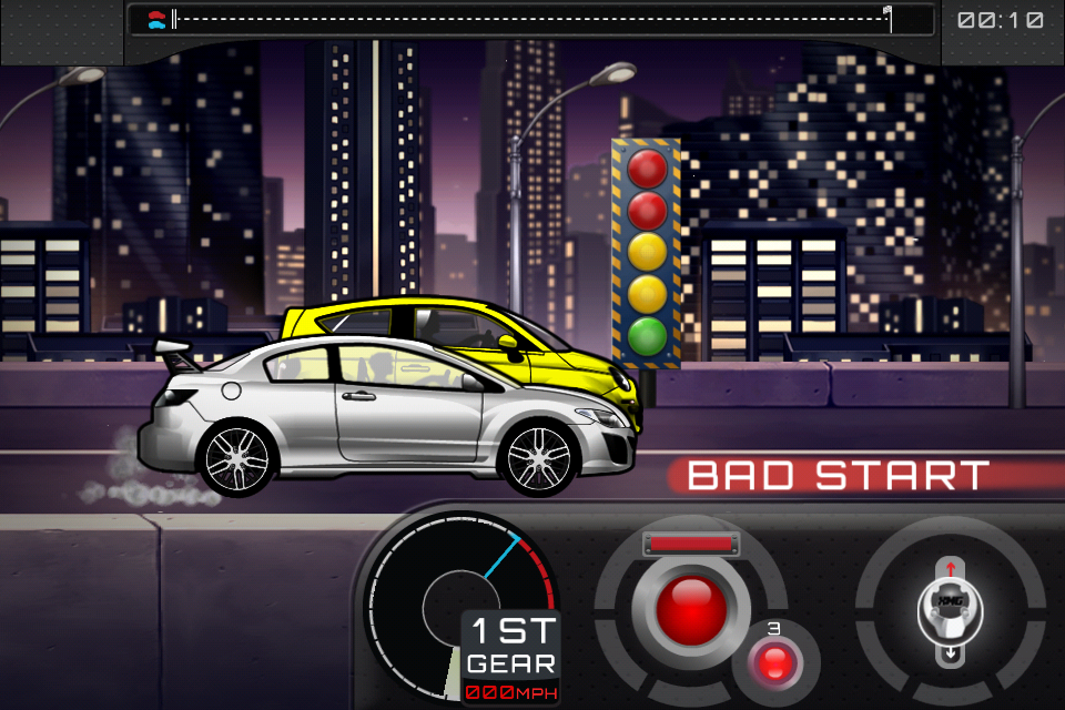
Why the gas button while racing? Players don’t need to control their speed, they just need to go forward!
Drag Racer was a game I designed back in 2001. It was a hugely popular flash game through 2004-2008 on all the top flash sites. It involved upgrading your drag racing car and competing for best time.
The game consists of upgrading and customizing your car, then competing against increasingly challenging drag racers. The race mode consists of the player tapping gas at the beginning, getting the best start possible, then shifting gears in the most optimal position. Its a game of timing.
The core mechanic is timing your gas and gear shifts. But why does the user have to hold down the gas pedal? That’s just a mindless button.
In Drag Racer World, we moved the gas pedal and gear shifter to the same side of the screen. This removed the need for players to just mindlessly hold down the gas button, wasting a finger and forcing two handed control.
In the latest installment of Drag Racer, Drag Racer World (2012), the player first taps on the gas, then taps on each gear shift. The player can leave their finger on the gas pedal if they wish, but play can be accomplished with just 1 finger, allowing more casual play of the game.
Too much control
Usually porting a game from another platform can create issues of “too much control”. Other platforms have more buttons, more controls, and the audience is prepared to use them. On mobile there is no way to accomplish this control without adding more buttons or controls.
This platform is mobile. The phone is jostling around, the player doesn’t have an accurate mouse to track and click exactly where they need to be. On screen buttons have no tactile feedback so if the user moves off of your hit area, they aren’t going to notice until time passes by and they lose the game because they didn’t realize fast enough. I don’t think anyone wants to play a game that the best users are the ones that can stay on a on-screen button the longest.
Ask yourself whether this much control over the game is really required for the game mechanic.
Case Study : Designing for a Puzzle Arcade game
Arcade Puzzle games suffer from too much control. Imagine trying to port a game like Tetris, Dr. Mario, Puzzle Fighter or any of the games which require the player to control a falling puzzle piece and place exactly where they intended in the game world.
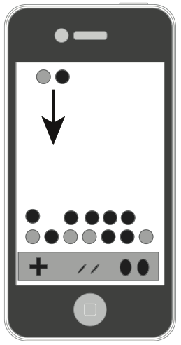
A Puzzle Arcade game : Slide or on-screen buttons to control the falling pieces?
These are notoriously hard to control on the touch screen device.
How do you control a falling piece? How do you rotate it?
Gestures? slide your finger left or right? That’s alright, but doing the left swipe over and over again is hard on the player.
Buttons? the player can lose track of them fairly quickly.
Do we really need to control the piece as it falls? Is that really the most important mechanic?
The most important mechanic is choosing where to place your piece in the limited time it has to fall. That’s the core of the game, and that’s the mechanic we should be using.
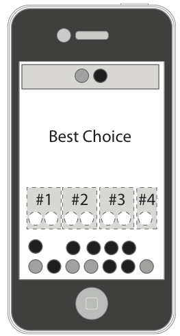
Tetris(tm) by EA Mobile uses tap to choose the location. Hardcore fans won’t have the flexibility of directing the pieces, but the mechanic simplifies the controls so that the player is focused on placing the pieces. Instead of dealing with the control mechanic.
You can instead design your game about deciding on where to place your piece in a limited amount of time. The game can guess all the best places to place the piece, and allow the user to choose where to place with just a simple tap.
Now immediately the player is not restricted by their ability to control on screen buttons. They can make moves quickly and without fighting against the controls. The player that wins is the one that can make the best split-second decisions, which is what the game design intended. In the end I consider this a great design decision by the team. However, the core audience most likely was turned off this because of the departure from the traditional mechanic — but if you’re serious about making a design work on mobile, you’re going to have to break some rules.
One at a time…
Too many mechanics at the same time will confuse players and frustrate them.
But sometimes multiple mechanics are necessary for depth in the game play. When this happens it’s always best to prototype and user test simplifications of this. Try to keep this down to one type of touch mechanic at a time. Don’t mix Tap and Hold mechanics with Line Drawing mechanics unless you really give the user a chance to change their thinking.
Allow advanced users to opt-in to multiple mechanics at the same time. But don’t force it on them. This is a great way for users to expand as they become better at the game. Add this feature in when Players are so used to controlling your game with the one mechanic they can easily adopt the second mechanic.
If your primary mechanic is intense, time based and twitchy, your user will most likely have no time for a secondary mechanic. But, if your primary touch mechanic is strategic and intermittent, then your advanced players can control this mechanic in their peripheral. This allows you to add depth in adding in another mechanic.
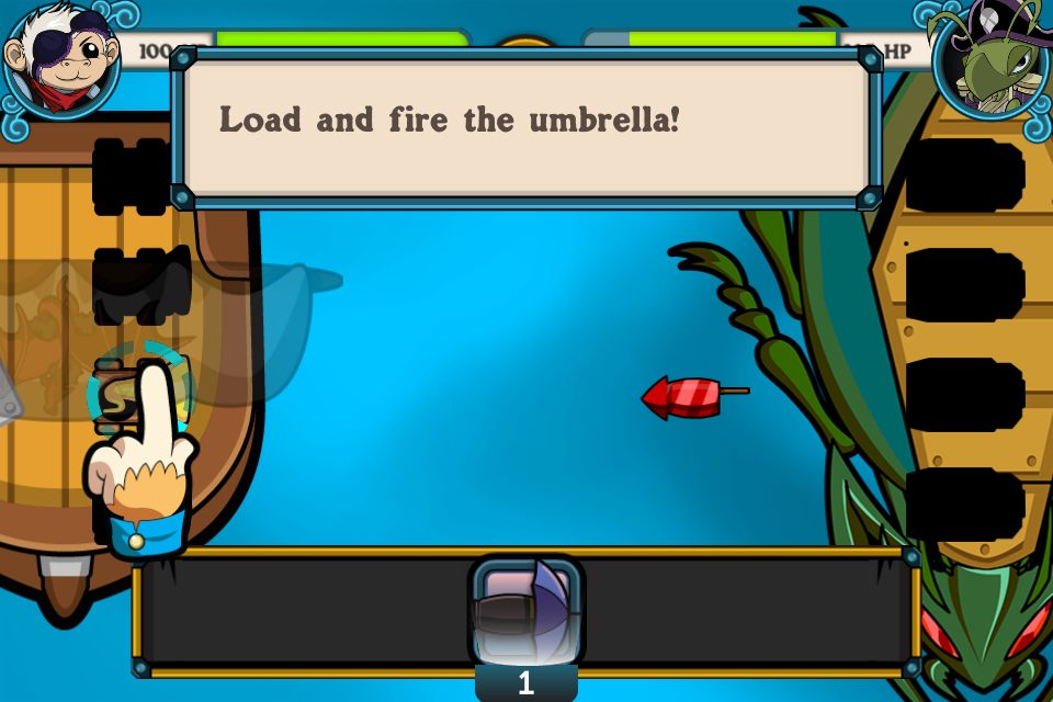
Powder Monkeys (2011 XMG Studio) Players primary mechanic is choosing which cannon to load the bullets. The Secondary mechanic is changing which type of bullet. This is only possible if the primary mechanic is strategic and intermittent. With Powder Monkeys when you are jumping between firing and choosing it can get really overwhelming. If the battles were paced a bit slower, we might have been able to fix this, but with the speeds of the battles we wanted, jumping between choosing cannons and choosing weapons felt overwhelming.
As always, user test your system to make sure it works and that users don’t feel overwhelmed managing the multiple systems.
Case Study : Cows vs Aliens Powerups
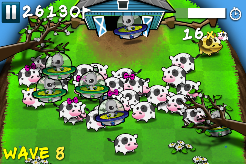
Cows vs Aliens has three concurrent game mechanics : Herd your cows, kill the aliens, and use your powerups.
The first two mechanics are complementary and require only the core game mechanic to control: touching your finger down and influencing where you want the cows/aliens to go: the barn, or the cliff.
Powerups was added after the first iteration of the gameplay. But how do you incorporate this without confusing the user?
Our first attempt was to allow the player to trigger them on screen. The player can click a HUD button to trigger a powerup. This method crowded the interface, make the game look more complicated than we intended, and we found players accidently clicked the powerups when their fingers were flying around the screen.
These are powerups the player could have potentially pay real money for, so this wasn’t acceptable.
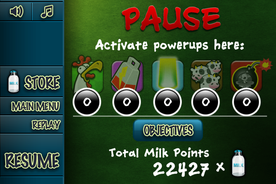
Our second attempt was to put the powerups in the pause menu. This was eventually launched since we couldn’t brainstorm a better solution. This method worked. Players were taken out of the game, they strategically chose their powerup, and it sent them back to the gameplay. No more accidental clicks. But this wasn’t optimal. Part of using powerups is being able to use them “in the fray”, right at that moment when they need it the most. Taking them out of the game isn’t great for that. The end result was that many users couldn’t find the powerups, they were hidden in the pause menu which didn’t scream “powerups are here” when the player needed them most.
Our final attempt was to have a draggable menu for selecting powerups. The player can press and hold the top right hand corner of the screen. This would bring out a menu, showing each of the powerups as a independent option. The player would then drag their finger to their selection. This isn’t that intuitive, this has only been done by a few apps on the AppStore, but allows for better flexibility, and less accidental clicks. It also keeps them in the gameplay.
Most importantly, when the player holds down on the powerups button, we slightly blur and slow down the gameplay, giving the player a bit more time, a breather to choose which powerup they wanted to use strategically. We find this works a lot better, and keeps the game intensity high.
But notice how we fixed the “3rd mechanic” problem : We found a way for the player focus on one at a time. When the player is choosing what powerup they want, the gameplay is slowed down and removed from focus. Having all 3 at once is too chaotic. This mechanic wasn’t complementary to the primary mechanic, so we had to shift the player from one “mode” to another to allow the player to utilize the mechanic without getting confused or frustrated.
Always aim to have 1 mechanic at time. It’s possible to have more then one mechanic, just allow the user to opt-in. Then make sure the player has time to acknowledge the context switch (slow down time, ease the difficulty) or else they will be confused and frustrated.


