Can Jurassic World Alive stand up to Pokemon Go?

The market for location-based gaming is heating up this summer. We’re finally starting to see some major developers come out with an answer to Niantic’s Pokemon Go, a game that is now nearly 2 years old and going stronger than ever. Pokemon Go is a staple in the Top Grossing Charts, and with user numbers reaching an all-time high this month, it’s likely to continue. As such, there are many attempting to repeat its success. Niantic plan another title this summer, “Harry Potter: Wizards Unite”. NEXT Games have soft launched their “Walking Dead: Our World”. Ludia + Universal just launched “Jurassic World Alive” in tandem with the new movie launch.
Check out our Free to Play Game Design Bible Here

Three Location-based games launch this summer, can any repeat the success of Pokemon Go?
But many in mobile questioned how repeatable the success of Pokemon Go is. Most would say it’s success is heavily based on the Pokemon brand. So what chance do other Location-based games have?
Location-Based Gaming: The New Frontier for Retention
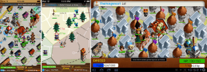
Location based gaming has been around since 2008. Games like Parallel Kingdoms by Per Blue
Location-based gaming has been public for awhile. Since smartphones had GPS, game developers have used location in their games. Parallel Kingdom, a game by Per Blue back in 2008 was one of the pioneers of this genre. Niantic’s Ingress in 2012 is an obvious iteration upon this genre. None of these games did remarkably well. So if all those games failed, and Pokemon Go succeeded, was it just the license or was it something else? What changed in 2016?

AR mode is more of a hinderance than a key gameplay element. Most players turn this off.
Some have pointed to the rise of Augmented Reality as a reason for Pokemon Go’s success — but this isn’t really true. While Pokemon Go does have Augmented Reality components to it, its novelty wears off fast. Many players report turning off AR mode pretty quickly after playing. True AR (using visual recognition to superimpose virtual items onto the real world) isn’t a major component of Pokemon Go. It’s just allowing players to play the catching mode using their camera. AR-mode actually just makes the catching gameplay harder and more inconvenient. AR was used for marketing rather than as a retention mechanic. So what really drives Pokemon Go’s staggering retention curve? (Seen below)
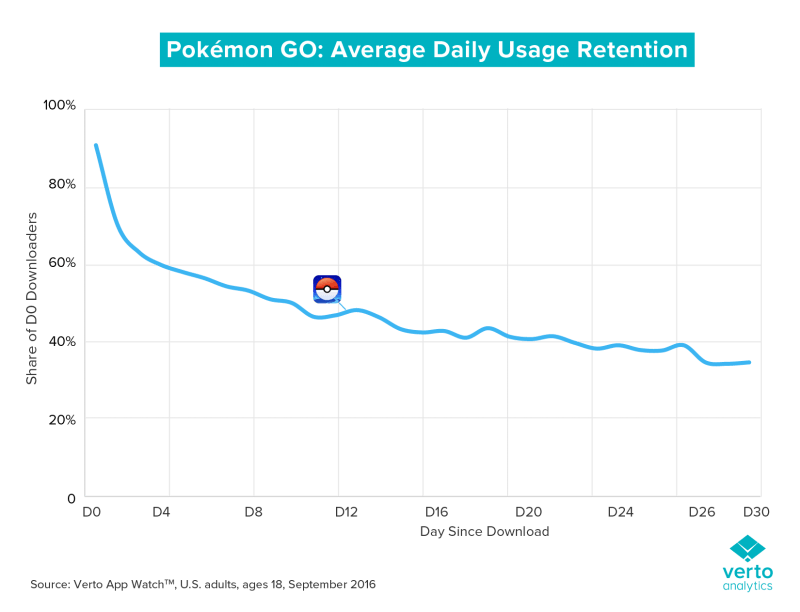
My hypothesis is that the success of Pokemon Go was partly based on branding, partly based on virality, but mostly because of the retention differences when using location as a trigger for gameplay.
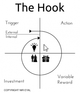
What I mean by trigger here comes from psychology. Taken from “Hooked” a book by Nir Eyal, we have a framework for what drives retention in apps and games.
To drive players to come back often:
- a player sees a visual trigger to enter the game (a player is bored, sees the icon on their phone)
- which has short, effective sessions (playing a quick match 3 level)
- with variable rewards (sometimes I win, sometimes I lose)
- that build long-term investment (reaching level 1000+ on a saga map)
All successful games use this loop to drive long-term retention. What changes in location-based gaming is the Trigger — the first step — pulling players into the game.
In typical mobile games, the trigger can be external (a push notification telling you your energy has refilled) or internal (I’m bored, let’s see if I can beat this level now). A location-based game has a new type of trigger — walking around in the world, being in a new place. Players that are stuck to games like Pokemon Go will tell you their trigger points — every time they’re getting a coffee, they check for Pokemon. Every time they are out at a restaurant, they check for pokemon. On their commute to work, they’re checking for pokemon.
If a game can attach itself to a commonly felt stimuli and use it as a trigger to play a game — this is an effective retention driver.
So location-based games, when they’re working, will build psychological triggers to play the game when you’re commuting, driving more repeat sessions and higher long-term retention. But do players have an appetite for multiples of these games?
Can a game with a lesser brand compete in this category? (sorry Jurassic Park, I love you but Pokemon is bigger)

Pokemon (Blue) vs Jurassic Park (Red) in Google Trends in the last 12 months. Even with the recent movie, Pokemon is a bigger brand.
Deconstructing Jurassic World Alive
Enter Ludia, a company that has proven over the last years to be confident in entering new genres and succeeding. Founded in 2007, they’ve focused on Facebook and mobile licensed games. They were acquired by Freemantle media in 2010, and have seen continued success since then. Associating with big brands, they’ve gone on to build consistent successes on mobile. Recently, they’ve built up the Jurassic Park games on mobile. Leveraging the brand and combining with the Dragonvale framework, they’ve carved out a success on mobile within a genre (Dragon Breeding) which has been out of the spotlight for years.

Their approach to taking the Jurassic Park brand and associating it with location-based gaming looks based upon Pokemon Go, but clearly trying to fix the aspects that were missing from the experience. Where Pokemon Go is a collector’s game, Jurassic Park is a competitive battle game.
The Core Loop
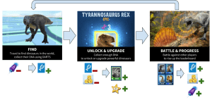
The core loop of Jurassic World Alive is simple yet effective. It builds upon the working framework of Pokemon Go, and adds a key element: battling.
- Find dinosaurs on your map, and send a drone to collect DNA from it. Based on how well you play the mini-game, the more DNA you collect.
- This DNA is converted into dinosaurs in a Clash Royale style system. The more DNA you collect, the faster you can unlock a dino and upgrade it.
- Using your upgraded dinos, you can battle other players, which rewards players with chests. These chests contain everything you need to restart the loop: coins and darts.
The keys here are the currency sources & sinks:
- Finding dinos takes darts, which can only be collected from battling and a daily free chest. So you need to battle to collect and upgrade.
- Coins are needed to upgrade, unlock, and fuse dinosaurs. Coins start off plentiful but become tighter and more strategic as you reach the end game.
- XP is gained only from unlock & upgrading. So levelling up is relative to how big & high levelled your collection is. Collecting & upgrading any dinosaur is helpful.
- Upgrading your dinosaurs is needed to keep battling. As you battle, your elo rating is improving, forcing you to match against more and more difficult players. In order to keep up with the matchmaking, you need to be constantly upgrading your dinosaurs.
Let’s go into each step in more detail:
Collecting Dinosaurs

The game’s main screen is the map. It takes a perspective view of a typical google map and shows you the locations of dinosaurs currently wandering your city. If you’re close enough to a dinosaur, you can send a drone out to collect DNA from it. If you’re not, you’re going to have to move closer.
For this mechanic, Ludia creates an upsell mechanic. The radius of being able to capture a dinosaur is pretty small for free players, but if you pay into their VIP system, you get an increased radius for collecting. A compelling reason for beginning + lazy players (like myself) to commit to playing the game. Very smart!
Besides this, Jurassic World Alive conveniently places a few dinosaurs near you every session. So even as a lazy player that mostly checks their devices in similar to locations, you can still make good progress. A must for location-based games.
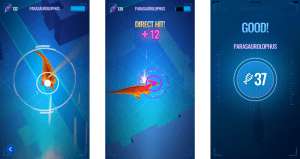
If you’re in radius, you can send a drone to pick up DNA from the dinosaur. This is a pretty compelling minigame of aiming with your drone and sending darts to collect DNA. A bit of timing, prediction and control wonkiness make it a pretty exciting minigame. Direct hits can get you large amounts of DNA, so being more accurate pays off big time.
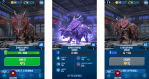
DNA is a precious resource, it’s similar to cards in Clash Royale. The more DNA you collect, the faster you can unlock and evolve a monster. Giving a very compelling reason to play well in the mini-game. This makes their progression significantly more skill-based than most, makes it more difficult to balance for different play types, but makes the DNA collecting minigame much more compelling. As you progress and start wanting to collect rarer and rarer dinos, you only have limited chances to collect the DNA, adding further pressure to be on the lookout for the best dinosaurs.
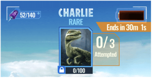
Long Term Retention: Fusion System
One interesting addition Ludia have added to the Pokemon Go/Clash Royale style system is the addition of Fusion:
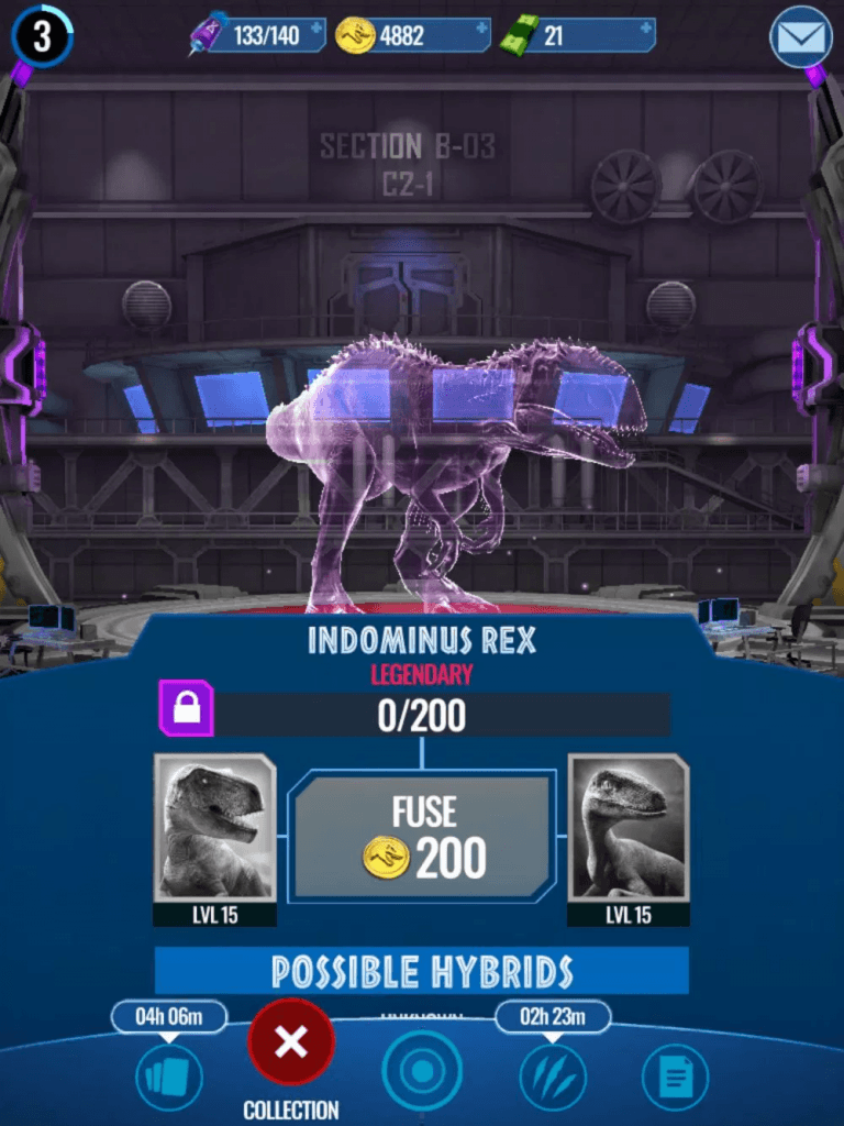
The fusion system allows players to create specific hybrids of dinosaurs. There are a number of pre-designed recipes which require you to combine two dinos (ex. Combining t-rex and raptor to create indominus, just like the movie). This typically requires both to be a high enough level as well as a modest fusion cost. This is how you can create legendary level dinosaurs.
It’s a smart tie in from the movie that adds significant depth to their chase for the best dinosaurs.
In the case of Clash Royale, it can get frustrating with some of those early cards not being of use in the endgame. Also having no visual change to a character after unlocking it feels less powerful. With the fusion system, having a goal to level up a set of characters to unlock a more powerful character is a good long term retention system.
So overall, Jurassic World Alive has a nice mix between Clash Royale and Pokemon Go, with some interesting additions. Being able to influence how much DNA/Duplicates you collect is great for players (less so for balancers), and adding the fusion system creates a visible long term goal.
The Battle
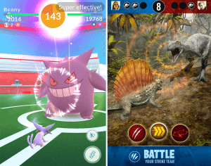
JW:Alive significantly builds upon Pokemon Go’s simplistic battle system.
Comparing Jurassic World Alive’s battle system to Pokemon Go’s, you can clearly see that Ludia took the weakest system from Niantic and improved on it substantially.
Pokemon Go opted for a system that is centered around their experience — location-based design. Instead of making battles central to their core loop, battles can only be done at certain locations (gyms), making battling tied to an overall social goal (take gyms for your team), and make it very asynchronous (the winner leaves a defending team for attackers to try to beat). The actual battle mechanic itself is really simplistic — bring 6 of your best pokemon in, and just tap madly on the screen to try to damage them as much as possible. There’s some skill in dodging and in selecting pokemon, but Pokemon Go’s battle system is very shallow that’s gotten plenty of criticism from their fanbase.
The Challenge of a 1v1 Battle
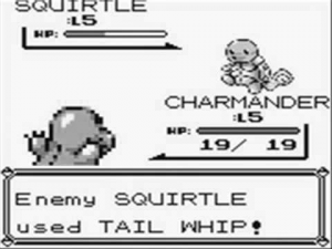
To be honest, Pokemon’s original battle mechanic wasn’t that great either. Since it was single player experience, the original Pokemon games were balanced very much in favour of the player. So they could get away with the game being pretty simplistic. When players started battling pokemon in PvP, there wasn’t alot of depth. The strategy usually was to keep swapping pokemon until you had the advantage on the field. Because it was a 1 on 1 turn-based battle, it didn’t leave a lot of room for countering and strategy. It’s why most turn-based PvP RPG games today typically have more fighters on the field (ex. 3v3 in Summoner’s War) or add a grid to move around units to create interesting countering tactics (ex. Fire Emblem Heroes).
Jurassic World Alive seems to have taken the original Pokemon style battling system and built it out so that it actually can function as a 1v1 PvP RPG battle with a healthy meta. Instead of dinosaurs having clear explicit strengths and weaknesses (ex. Water dinosaurs and weak against flying dinosaurs?) they’ve gone for a system where dinosaurs have much less obvious strengths and weaknesses. There’s no explicit rock-paper-scissors strategy, and it makes for a better game.
There are many types of dinosaurs, some with high health, some with quick attacks, some with high damage, some with status effects, and some as a hybrid. The strategy becomes trying to use your dinosaurs to the best of their abilities: having your high health dinos suck up damage, high attack dinos rip through without taking damage, and having your speedy dinos to do the final blow, preventing the opponent from attacking back. Overall, I counted 19 different attack types. This creates a nice base layer of strategy for a 1v1 game.
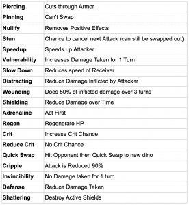
With status effects this also means that a dino’s strengths and weaknesses can change through a battle. Remember “Tail whip” from Pokemon? A useless move to increase damage taken by your opponent? — here in Jurassic World Alive it actually makes strategic sense. These moves have enough impact to make you second guess leaving your dinos in a weakened state.

Take out 3 dinos before your opponent does
The goal of the battle is to take down 3 opposing dinosaurs before your opponent does. You bring in 4 dinosaurs, and can switch as often as you’d like. Similar to pokemon however, swapping out your dino leaves them susceptible to a free attack by the opponent.
So typically what happens is there’s some mind reading of your opponent. You make assumptions when they will swap out their dinos and try to take advantage of them losing a move.
Overall this gives the PvP battles a good level strategy. You’re trying to counter the opponent’s, while preventing swapping at the wrong time. You’re trying to avoid your opponent from saving their speedier dinos, who can take down your weaker dinos without being hit back. The upgrades and matchmaking also keep battles intense — most battles feel like you lost because of skill.
However, some of the battle’s elements show that they can’t break away from the innate issues of a Pokemon style battle: a core strategy of the game is to try to guess what your opponent will switch to. Guess that your opponent will start with a heavy armor dino? Then start with an armor piercing one. Guess that your opponent will swap a weak dino before you can kill it? Then make them pay by using your special attack rather than your weaker one. This is fun to pull off, but call-your-bluff/mind-reading strategy isn’t going to last for the long term.
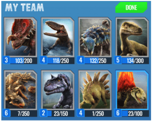
On top of this, your battle team is made up of 8 dinos, yet when you battle, it randomly selects 4 out of the 8. This feels like a tacked-on system to increase the pressure to upgrade more dinosaurs rather than increasing the strategy before the battle. As a player it means you have some arbitrary randomness about whether the strategy you wanted to use will pay off, and can mean that right from the onset of the battle you already feel like you’ve lost (you got a bad draw from move 1). While randomness can be good, this much pre-determined luck can make players feel helpless early in battle.
This points to an issue that the 1v1 gameplay has. It’s just too limiting. The in-game strategy hits a cap which turns into a mind-reading battle, and the out-of-game strategy is limited so they had to tack on a “random 4” system.
I wonder if the game’s battle system would have been better if they’d broken from the pokemon style design and instead gone with something like a 3v3 battle system. Increasing complexity, but increasing the depth substantially. There would be substantially more attack types, more in-game strategy. Makes swapping dinos a far more interesting choice, and makes directly countering a more nuanced strategy.
Regardless, the Jurassic World Alive battle system is far better than the tap fest that is Pokemon Go — I just wonder if it could have been even stronger with a 3v3 system.
Pacing & Progression
And just for good measure, to pace the battle system, Jurassic World Alive relies on the good ol’ chest system from Clash Royale. Instead of pacing you based on energy, players can only have 4 chests at a time, and each chest must be opened one at a time. Because of matchmaking and the importance of stats in the outcome of a battle, it prevents players from rushing too far ahead by winning too many battles. Eventually, you will need what’s in the chests in order to compete.

From Clash Royale: Chest Slots and Arena Tiers
Arena tiers are another borrowed feature from Clash Royale. Players earn trophies for victories, which unlock higher and higher tiers which contain bigger prizes and better dino DNA each time you win. This gives a clear, compelling reason to keep playing.
Comparing to Pokemon Go, my goal in the game is far more explicit and I can make progress towards it immediately: reach the next arena.
3 Reasons why it’s Working

Regardless of your thoughts of Jurassic Park IP or Location-based gaming, Jurassic World Alive is within the Top 100 grossing, and has sustained there since launch. While I think many would dismiss this as a “lesser Pokemon Go” — it clearly has done something right.
I believe that there are 3 key reasons why Jurassic World Alive has seen success so far:
#1 – Smart Merchandising
Merchandising — the features of a game that are typically there to upsell players towards spending money — are top notch in Jurassic World Alive. Ludia consistently have launched games that have taken the best merchandising practices and executed on them well. In Jurassic World Alive this really is showcased in their VIP System:

Jurassic World Alive showcases throughout the game the value of their VIP system. From the onset, you are constantly shown that a dinosaur is just out of reach on your map — the cure? Join VIP! This is an excellent conversion leverage point. On top of this, getting an epic incubator and increased supply drops makes the progression far easier.
The VIP system is also a subscription. Utilizing the latest trends in F2P, which is now even a common tactic in Hyper Casual games. The power of committing players to an ongoing subscription seems to be driving a lot of revenue these days (hopefully not too much off the back of forgetful users…).
#2 – Clear Progression & Goals
As mentioned above, one aspect I think Jurassic World Alive does far better than Pokemon Go is the visibility and clarity of their progression system and goal systems.
For Pokemon Go, the goal is mostly focused on completing your Pokedex. This is alright for collectors, but it doesn’t hit all player types. Jurassic World includes the Battle loop + arenas, which give a clear focus for battling your dinosaurs. Now there’s a way to clearly show off my progress and a competition I can engage in that will give me clear progress & clear recognition.
Comparing this to Pokemon Go, having to go to Gyms, and choosing a team which is far too large to feel impactful within makes the competitive goals far too end-game heavy. In the beginning, the goal is just to collect — and this is only compelling for so long.
#3 – Less Reliant on Location-Based Gameplay
Lastly, I think it was a smart choice for Jurassic World Alive to make their systems less dependant on the location-based gameplay. In Jurassic World Alive you can have many sessions without ever really caring about the map or moving to different locations.
Within Jurassic World Alive, usually there are a number of dinosaurs directly near me that helps me progress. These “freebies” may not be the optimal path, but still help me progress faster and give a reason to check my phone even when I’ve been in the same location for awhile (which, if you’re like lazy me, is common).
On top of this, the battle system & chest system not being location specific means that throughout the day when I’m not walking around I can still complete a meaningful session. I can open up chests, start the opening of the remaining. I can win some battles and fill up my slots. I can open up my free incubator.
Comparing to Pokemon Go, it instead relies a lot on location-based design. Incubators require you to remember to walk around with them on (which is a pain). Gyms are at specific locations, making you need to remember to check your phone at that location to make meaningful progress. While this is great for getting some location-based retention, it can make “regular” mobile sessions a pain in Pokemon Go.
Jurassic World Alive, on the other hand, is stronger because it has location-based elements, but you can still play the game often without needing to worry about where you are.
But can it hold up?
Looking at the grossing charts now, it looks like it will stabilize within the Top 150 grossing. While the movie is still in theatres and advertisements are running daily, they should be able to sustain here.

By prediction however is that it will fall, and will be tough to retain within the Top 250. This bump from movie goers and IP is inevitable, but sustaining at this level will still be difficult. This is partially because of the brand — its not Marvel — there isn’t a new movie every 6 months. It’s not Harry Potter — the fanbase isn’t nearly as large. The simple nature of the IP will be resistance for Jurassic World Alive.
From the design side there are also some issues:
The battle is effective, yet still too simple. Building out a lasting meta should be priority. Driving players to collect and upgrade a wider range of dinosaurs is crucial, and the current system of randomly picking 4 out of 8 isn’t strong enough. They could drive this width from some PvE gameplay, shifting the meta more explicitly in events, or from shifting the PvP to 3v3. Either can be a way to drive players to collecting & upgrading a wider range of dinosaurs to compete.
The social component is lacking. Where pokemon go has built this up over time, Alive still has ways to g and launched with less features than Pokemon did at launch. No lures, no chat, no clans. For now this is fine, but to take advantage of the location-based gameplay and drive local players to work together like Pokemon Go does, adding some ways for players to communicate & strategize locally would be simple but great addition.
Ludia is an excellent company which has proven time and time again to break into new categories with confidence and deliver on the live operations side. This game should be no different. I have no doubt that Ludia will be able to take the strong base of this game, respond to player feedback, extend the battle gameplay to last longer, design events that drive players back, and develop social features which will build up over time.
I expect this to be a staple on the Top Grossing chart, just not one to beat Pokemon Go. However, I don’t think that’s necessary for success here — what we should all take from this is that location-based games may be more interesting than we all once thought.
Summer of 2016 was the summer of Clash Royale’s gacha.
2017 was the summer of Battle Royale gameplay.
2018 may be the summer of location-based gaming.
The Maturing Mobile Market: Why Fostering Firm Feedback Pays Off
This two-part series explores the modern practices in mobile game development by interviewing 9 mobile game studios. The work is based on a master’s thesis Conquering the Mobile from Aalto University, Finland wherein you can find detailed references to cases and articles.
“When we had finished almost all of the art for the game, we decided to change the whole visual style,” a mobile game company manager explained as part of the study. The studio had been working with the product for some year, but found the aesthetics just did not resonate with the target audience. “All graphics, whether it was characters, environment, or UI was redone. It was the right move, but we did it too late. Today, we make these changes in the very early stages.”
Mobile game production requires the ability to consciously seek information throughout the development to have the best chance of success in the mobile market. During pre-production, said developers manage to establish an overview of the market opportunities and the various competitors to help shape their strategy. As the production moves forward, studios can seek feedback and validation through game testing – the results of which can often prompt much-needed adjustments.
After the possible soft launch and, of course, the game’s release, successful developers continue to improve the title, making use of live feedback and metrics. However, the research suggests there are considerable differences when it comes to company practices for gathering information and feedback.
Creating understanding in pre-production
It’s fair to say, pre-production doesn’t generate all too much hype within the game industry. It is, nevertheless, a fundamental element in development. It’s during this phase when the studio explores both the competitive landscape and the needs of the market, framing them in terms of team resources and capabilities. In short, the goal is to take the first steps in product strategy and evaluate its financial viability.
It should be noted, however, that carrying out market analysis and being aware of the particular opportunities and threats doesn’t in itself ensure success – rather, it helps avoid potential oversight. It’s only by understanding the key competitors and customer trends that a company in any industry can avoid direct competition with one of the industry giants, heading instead for blue, unsaturated waters.
The research also suggested that the smaller, less experienced studios tend to pay less attention to framing and evaluating the project before starting it. Rather than basing the project on a market possibility, these companies were more likely to base the project on the intrinsic, creative vision of the team. This sometimes led to challenges and rising awareness that the project should evaluated as soon as possible:
“Creating ideas is extremely easy. The difficulty is considering the idea in terms of the development and business. That is more difficult than coming up with an idea, and this requires product management.”
As companies gain experience, they begin to pay more and more attention to pre-production, market research and competitor understanding. Key to this, many of the developers we spoke to made use of several sources of information:
“One is all free and paid market data. There are a lot of information services and banks such as App Annie where you can check the data on other games, draw your own conclusions and do deeper analysis. Also, almost every month we are present in some game industry event, and discuss with other companies.”
Of course, more established studios may well have more resources at their disposal to facilitate such analysis. They often have more employees, and thus more specialised roles. This allows management to spend more time on market research and strategy when compared to smaller start ups where everyone is often required to have their hands on the product.
Some smaller companies have also encountered challenges resulting from insufficient planning. One studio found they developed their game for too niche audience, which in turn made it difficult to acquire users. Another company discovered the scope of the game developed was too large for the team to execute. At the same time, without established position the small teams are under pressure to perform. This creates a difficult tension where the companies have to make plans while running:
“How could I say this, we didn’t have much time or resources to plan marketing, execute it, or think about the business. There is no time to do master plans. Would it be sensible? Yes it would. Our focus was not sufficiently on marketing. Yet, it is easy to be wise on the hindsight.”
The developers that worked with particular target audiences were more aware that they needed to cater to specific player needs. In these cases, the studios sometimes found they were not the target audience themselves. Rather, they were creating the game for a group of people whose playing style might be considerably different from theirs, which led on to them gathering information on their behaviour, needs, and playing style during pre-production.
Difficulties in testing
As a game becomes more and more defined during production, it becomes possible to validate the concept with its target audience through testing. Interestingly, none of the nine companies interviewed had gone to the excess on this score: on the contrary, it could be said some of the problems encountered by said studios come from insufficient or unclear feedback.
When you add to this the fact many studios admitted their most considerable learnings came from feedback, its importance cannot be underestimated. Yet, several companies had found difficulties in gathering insightful and actionable feedback.
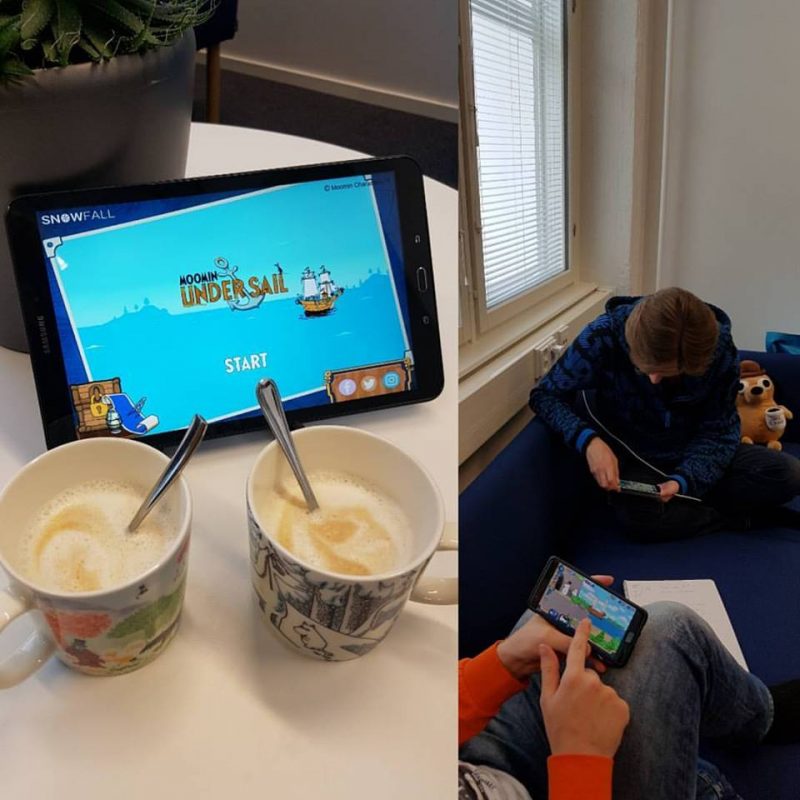
One of the interviewed companies had tested the game with friends and family, and found said testers weren’t motivated enough to give structured feedback. Another company found their testers focused on minor usability issues while the company wanted to understand the game experience far more broadly. A third company found feedback was useful in identifying usability challenges and discovering bugs, but contributed less towards understanding what makes the game fun and valuable to the player.
“We have put a lot lower importance on our online testing service provider reviews. The reviewers can evaluate the usability, how to use the user interface etc. That is wonderful with the online service. What it is not very good at is evaluating whether the game is fun.”
Several companies warned against listening to the views of players too closely. The players are likely to see the symptom but not the core issue embedded deep into the game system. The players are laymen in design, and it requires humility and patience to turn their comments into actionable insights.
“We didn’t do soft launch, we did some usability testing with other game developers. We got good feedback. After launch we got some feedback from the players on what they appreciated. However, you can never fully trust on what the players say. You need to deduce what they really want.”
Two of the nine companies actively sought to integrate both qualitative and quantitative feedback, believing the two kinds of data complement each other.
“User feedback is extremely valuable but also extremely dangerous because it is biased. We create hypotheses that we seek to validate through market testing. This market testing leads to numbers, data, and this is explained through user feedback.”
The nature of player feedback proposes a conundrum considering the timing of testing. The closer the product is to the launch, the easier it is for the players to elaborate on their thinking and give precise feedback the designers can take action on. Yet, the later the feedback highlights any issues or challenges, the more considerable the changes required to fix them may be. This makes late feedback difficult to accommodate to. Because of this, several of the companies had explicitly turned towards seeking feedback as early as possible.
“Discovering problems quicker, earlier in development means they cost less to fix. Every single game will have something that is not quite right. The longer it stays not quite right the harder it is to change. If you can find it four months in development as opposed to fourteen months in development, it will cost a tenth as much to change.”
The value of metrics
Soft launching a game in chosen territories was a common practice amongst the nine studios we spoke to. However, the practices behind those launches varied considerably.
Some companies opted for a rather passive approach and did not actively seek qualitative feedback. These developers used the soft launch to optimise the game and ensure its technical performance, with no significant changes made to the game or its mechanics. Some made incremental improvements through specific tests:
“We tweaked the game in soft-launch. We didn’t make any drastic changes. We fine-tuned the difficulty through funnel tests: we identified in which level the players end playing and then adjusted the levels accordingly.”
Analytics were seen as highly valuable, offering an objective, trusted metric of the product performance and its financial viability. Only one of the nine companies stressed the importance of both qualitative and quantitative feedback:
“If you are ever playing a soft launch title I encourage you to send any and all feedback to developers, because it really helps. – – Getting unfiltered player experience and feedback is extremely important. There are certain ways to understand the data without the player text input, but the feedback definitely helps. It gives context to the data.”
Making considerable changes to a game after launch is often challenging. It, for instance, requires taking into the account the existing playerbase and their opinions. One company reflected on their experience in changing the monetisation system in a live product:
“We were aware that if we make some makeshift solution it will be transparent to the users and will not work. We had to change the core logic of the game which required a lot of time and design. If I had a car and I changed change the power line and the engine, its character changes. When well executed, the whole will be balanced. However, if you just change a large engine to a small car it will not work.”
The current ethos and culture in mobile game development does little to support the use of qualitative methods such as interviews and focus groups. Big data is valued, and qualitative methods are sometimes dismissed as unreliable. Many companies have their backgrounds in natural sciences that lean towards quantitative methods and their experience in qualitative methodologies may be more lesser. This creates a vicious circle, where developers skip potentially impactful approaches and, as a result, positive case examples are not created.
Increasing learning
The developers improve the game throughout the production. However, without external feedback studios can find themselves unable to make informed decisions which, in turn, slows the development down or leads to work based on assumptions.
Iteration is the de facto way of creating any design: something is created, evaluated, and improved upon. Instead of creating a final, polished version, the work is produced in iterations that incrementally improve it in terms of its stated goals.
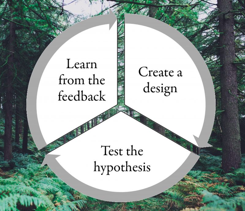
Game designer Jesse Schell goes as far as to state the rule of the loop: “The more times you test and improve your design, the better your game will be.”. The approach has had a significant impact on the startup scene as well through the idea of Lean Startup.
Too often, the critical evaluation of the game occurs too late. One reason for this may be that the mobile game industry lacks specific models that would guide the company focus. The iterative loop is unapologetically vague. It doesn’t state what you should create, nor how it should be tested. Useful in any field of design, it lacks specificity to address any particular industry.
To address the issue, the Design-Process-Stakeholders model was created. It guides the company to consider the key aspects of free-to-play (F2P) mobile game design particularly. It guides the company to map and test its key hypotheses with the stakeholders to validate them. The goal-oriented iterative process is structured and clarified to serve these aims. The model is described in detail in the book Conquering the mobile.
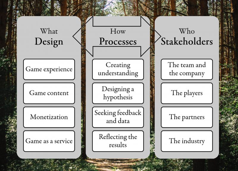
Hunger for learning
Mobile game development company goals are two-fold: to create value for the players by offering enjoyable experiences, and to transfer this customer value into revenue. It becomes difficult to evaluate whether the design is moving closer to this goal if the developer does not seek feedback from their players. Without constantly creating understanding on the product and combining this with sufficient understanding of the market and competitive products the players are engaged with, a developer operates in the dark.

Feedback is a wonderful remedy for inconspicuous ignorance. It is a tool in risk-management allowing the team to identify challenges in a game’s value proposition and improve upon them. In addition to tactical improvements, it facilitates strategic changes to the high-level, long-term product goals.
However, there is even more elevated side-effect: Feedback facilitates individual and company-level learning that spans multiple projects. Professionals in any field should be hungry for feedback that allows them to improve their performance and grow their competencies.
Whether individually or collectively, acknowledging the limitations of our understanding guides people to examine their environment critically. This open-minded process exploration and reflection paves the way for creative and imaginative solutions that also find their audience. It’s through other people’s opinions that we can choose to enrich our perspective.
Lauri Lukka is a Helsinki-based game designer and psychologist focusing on user-centered design.
Toon Blast & The Death of Saga
At the beginning of this year, Peak games soft-launched a game called “Toon Blast”. Some developers took a look, but most pushed it aside. The game appeared to be a direct re-skin of Toy Blast, Peak games’ original hit game.
Time went on, and Toon Blast was finally globally launched in August 2017. Again, most developers took a look, dismissed it as a re-skin, then walked away. But under the surface Peak Games was testing a key change within the game that is a true sign of the times: they removed the Saga Map:

Two versions that Peak Games was testing in August. One version with the Saga map, another without it.
For those creating matching games, this has been a slow but obvious change. Since King dominated the puzzle game genre starting in 2012/2013 developers in the space have been actively trying to differentiate themselves from the dominant players.
The Evolution of the Matching Genre & Toy Blast

In 2014 there was Gummy Drop by Big Fish Games, which added a dash of resource management to the saga framework. Players collected resources to eventually be able to afford to move through gates. Also in 2014, Seriously launched Best Fiends, which added a light RPG upgrade system on top of the core mechanic. In 2015 Playrix launched Fishdom, where players could collect fish and decorate their fish tanks. In 2016 Playrix launched Gardenscapes, already deconstructed here, which added narrative and decoration to the saga metagame. The biggest games in the genre managed to add new elements to the metagame to separate themselves from the usual Saga-based model.
But during that time, most matching game companies stuck to the pure Saga framework. Some saw modest success with it, while others did not. Peak Games was one of the few who did see success with the Saga framework. Toy Blast, launched in 2015, featured a pure saga model, but with a new yet familiar take on the core mechanic.
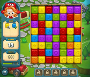
Toy Blast, Peak Games big hit, was one of the last games to see success with a pure saga based model.
Toy Blast’s main mechanic was similar to older games like Collapse, Diamond Dash or Pet Rescue Saga. Instead of asking players to swap, players simply had to tap individual groups of gems. Any group of 2 or more pieces could be removed instantly, but each costs a move. Similar to Candy Crush in terms of strategy, but feels very different. While the interaction itself is fast, as you get into the more difficult levels you start to see that this mechanic can be far more punishing if you’re not paying attention, and rewarding if you’re planning a few moves ahead.
Still, most developers dismissed Toy Blast initially as “just another Candy Crush clone” — but this is definitely not reflected in the numbers. Looking at net monthly revenue from Sensor Tower, Toy Blast has grown into a massive revenue driver:
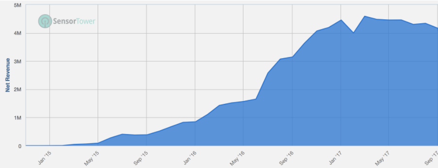
source: Sensor Tower Estimates
Toy Blast grew to be a sticky top grossing puzzle game. But unlike most top grossing games, it was clear that Peak Games had a slow and steady growth to the top. Much to the credit of their team, they managed through methodical improvements and strong performance marketing to build Toy Blast into the success it is today.
After the success of Toy Blast, it was no wonder that Peak Games started work on Toon Blast. It’s an obvious safe bet to repurpose the gameplay they already have. King and Playrix have done the same with their top franchises with clear success. Being able to retain players that lapse from your hit games by cross-promoting them to your new exciting games is powerful.
But why is it that Peak Games, the last developer to have found success with the “pure” saga model, opted for a radically different design in Toon Blast?
Why are top developers are abandoning the pure Saga model?
There are 2 key reasons for this.
Reason 1: Facebook doesn’t matter
The biggest shift that has changed since Candy Crush Saga first came out is that friends within games, especially through facebook connect, have become decreasingly important.
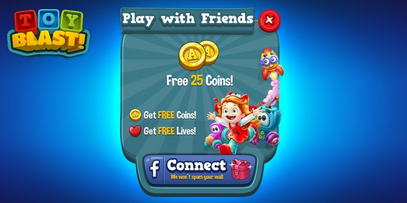
For one, facebook connection has gone steadily down since 2012. Players are less likely to connect their games, even when games offer big rewards for connecting. While socially connected players tend to retain longer (they see their friends progress) — players are less and less likely to opt-in to that kind of peer pressure on mobile. Especially in puzzle environments.

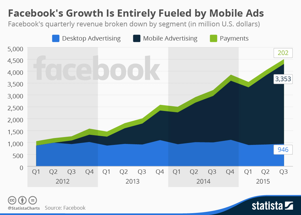
The first factor here is Facebook. Facebook’s strategy dramatically shifted for games after Candy Crush. Instead of allowing games to post spam all over walls and notify other players freely of every small bit of activity, Facebook has scaled down over the last 4 years the impact of facebook connect. They’ve seen the negative impact it has on their user experience, and slowly made changes to avoid games from taking advantage of their platform with spam. Adding to this, they shifted their revenue strategy to ads. Giving free virality to games, cuts into Facebook’s main revenue source. Instead of offering free virality, Facebook has gradually shut down their virality and instead sells the users to publishers through ads.
So with connection rates down and much of the importance of Facebook virality gone, puzzle games, which typically depended on this model to be successful, have turned to other sources to drive new users and retain their players.
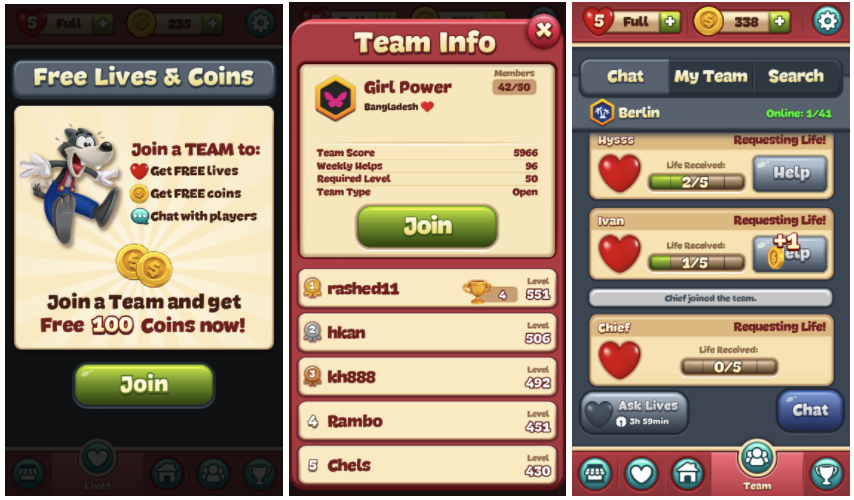
For Toon Blast, this means that instead of only allowing players to play together with their friends, they can now join guilds, which are made up of other active players in the game. Instead of players slowly becoming less engaged as their friends drop off in engagement, players are actively pushed to join together with other active players in the game. With Toon Blast, players send lives and earn coins based on how active their guild is. This is obviously taken out of the playbook of Clash Royale and most mid-core games on the AppStore. Many games have had guild features for years, and many have gone deeper with the mechanics. Yet this is a casual matching game — this is a bold choice.
Toon Blast’s addition of clans and guilds is a sign of the times that free facebook virality is gone, and that games can’t rely solely on a player’s group of friends to give reasons to come back and progress in a game.
With facebook gone, developers need to push players to create their own bonds with other players that are active in the game
The standard guild system in Toon Blast accomplishes this.
Reason 2: Events are more Important
The second reason why Saga has been cut from Toon Blast, is Peak Game’s experience with what drives meaningful revenue growth: Events.
If you look back and the timeline of Toy Blast, and what drove the growth of their revenue from 2015 to 2016: it’s a clear focus on engagement events and competitive events.
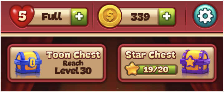
Looking at how King, Playrix, Wooga and Peak have managed to drive stronger retention in their games, it’s not from adding social features. It has been from adding features to the game that push players to complete more levels, faster. Features like the “Star Chest” in Toon Bast: each star you gain on a level fills up a bar which grows towards a chest. A chest that rewards a player with boosts and coins to help them through tough levels.

Or features like the “Crown Rush” event in Toy Blast: which demands that players complete certain levels before a time limit counts down.
These type of single-player, goal-driven engagement events drive retention and drive monetization in players. Looking at the UI/UX of Toon Blast, now with the Saga map removed, these can now be far more centre stage, and feel far less “tacked on” than the usual Saga Map:
 But besides engagement events, Peak Games’ prominent form of revenue growth comes from competitive events within the game. Events which pull players together and ask them to compete against each other for prizes. This is usually just reinforcing the core loop: asking players to progress as fast as they can within a limited time for access to great prizes. Best shown in games like Gardenscapes’ Fireworks Festival:
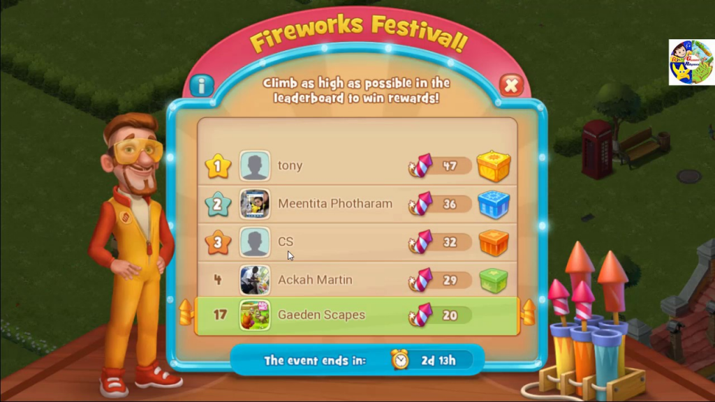
Engagement + Competitive events are what drove Toy Blasts’ growth, so of course, Peak Games would want to double down on that with Toon Blast. By adjusting away from the simple saga map model, they now have a method to make this far more a part of the core. Mimicking the same UX patterns as Clash Royale, to put events as the core focus for players.
In Conclusion
Peak Game’s decision to move Toon Blast away from a typical Saga map UI was a bold choice, but one that clearly is a sign of the times.
- The importance of Facebook has faded to a point that even puzzle/casual developers are leaning on guild-like structures to retain players
- Since events are the major revenue driver for puzzle games, toon blast puts its UI focus much more on events than on the saga progress
With everything in life and in video games, what goes up must eventually come down.
Saga was one of those trends that has been up for so long that many of us were asking when would it ever fade. What would come next. We now have our answer.
Deconstructing Merge Town: The Rise of Hyper Casual
Rewarded Video Ads have been a constant, dominating trend in free to play over the last few years. Starting with companies like Ketchapp and Futureplay, it became abundantly clear that games can drive meaningful revenue from video advertisements, and advertisers can find a captive audience in mobile players. In the last couple years, Video Ads have reached a tipping point. No longer seen as superficial revenue on top of IAP revenue, designing for video ad revenue has become the dominant revenue growth area for free to play companies. Designing for video ads has allowed for innovation in the maturing mobile space that is much needed.
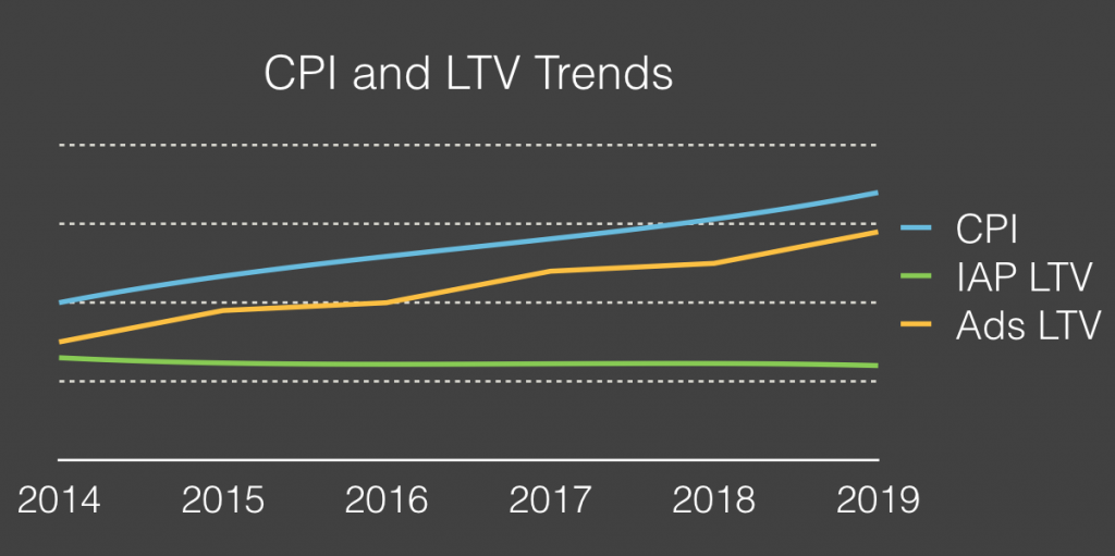
Source: SOOMLA Blog (an excellent source of info on Video Advertising!)
The rise of Video-Ad driven monetization has heralded in a new era within mobile game design. The casual segment has been dominated for years by the Match 3 Saga model with other casual categories struggling for meaningful revenue (ex. “with Friends” style games). Video Ads have opened up these categories because it monetizes on 100% of your user base. Instead of having to awkwardly cram in In-App Purchases into a casual title, developers can monetize off their active playerbase even if they don’t have a meaningful economy with anything to sell.
“The rise of hyper casual” it is called. Summarized here by Johannes Heinze of AppLovin:
“Players of hyper-casual games can be acquired at extremely low rates, so even though CPIs are increasing and gaining traction in the app stores is difficult, developers of hyper-casual games have a lot of opportunities. Hyper-casual games tend to be less costly to make, and users monetize almost immediately since ads are the primary revenue source, meaning that UA campaigns can be optimized early on. Hyper-casual games make the biggest share of revenue in the first couple of days, unlike IAP-heavy genres, where the most active users make the most money over time.” – Johannes Heinze, AppLovin
The rise of hyper casual category is exciting because it goes counter to what traditional free to play games have been moving towards: massive budget, multi-year long productions that are getting riskier and riskier. Hyper casual games are innovative, quick to make, and easy to market when done right.
Gram Games is one of many that successfully capitalized on the hyper-casual trend. Games like 1010! And Merged were quick to make, yet clearly generate more than enough revenue to support the mid-sized Turkey-based studio (now with an additional studio in London).
Gram Games’ most recent launch is “Merge Towns”, a mashup of a puzzle and idle game. The game has peaked at #3 top free downloads in the UK, and is within the top 20 downloads in the US. This game clearly shows the latest innovation in the video-ad driven monetization space and is an excellent guide for newcomers to space. Not only does it have strong proven video ad integration, it also supports an innovative core gameplay. Let’s take a closer look.
Core Gameplay
Merge Towns at the purest concept level is a Matching game core combined with an Idle game economy.
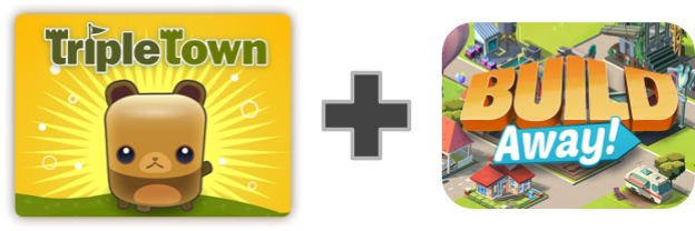
The core gameplay mimics that of Threes! and Triple Town in that you attempt to combine multiple of the same block to upgrade the square.
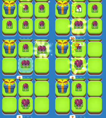
You can see above how the core is built. You can drag and drop any piece on top of another piece of its kind. There are no restrictions like Triple Town or Threes. Placing the same tier of a piece (a small house) on top of the same tier will upgrade the house to the next tier (a piece with 2 houses). This carries forward and forward throughout the game, creating more and more intricate pieces.
Whereas the goal in Threes And Triple Town was simply to survive for the longest time possible, Merge Towns is more akin to an Idle game. There are no failure states, there is just optimization of progress. Your goal is to generate pieces — so you can combine them — to make better buildings — which generate more revenue — to purchase better pieces. The core gameplay moves like this:
1. The first step is about generating pieces. Players can do this by rapidly tapping on a button, or by waiting.

2. With the generated pieces, players combine them to upgrade them and make space for more land and new pieces to fall.

3. With the upgraded buildings, these generate faster soft currency.
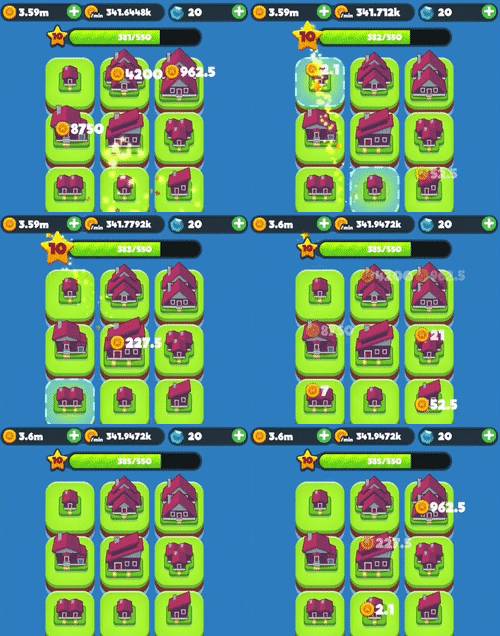
4. With the soft currency, players can purchase better pieces directly
Overall the gameplay feels significantly more approachable and casual than Threes or Triple Town. For Triple Town, the restrictions on movement and the loss condition make for a far more difficult puzzling experience. Merge Towns feels much more like a new take on an idle game mechanic (ex. Farm Away and Build Away’s core gameplay which is deconstructed here). Instead of simply asking players to tap-tap-tap their way to progress, they’ve added a thinly more involved matching mechanic which feels satisfying to complete.
Players don’t even have to pay that much attention to the numbers, the core gameplay of simply matching the highest tiered object possible works well on its own. It’s not so much a puzzle as it is just a pleasurable action.
What this says to me is that the key part that works for the Idle genre is the metagame and the economy. Clicking over and over again is just a relic of the Cow Clicker days — to innovate in this genre it will be about combining the economy of and idle with interesting core mechanics which have significantly more interest than tapping over and over. Merge Towns executes on this. Merge Towns appeals to a wide casual market while having the lasting economy of an idle.
Integrating the Idle Economy
To integrate the Idle economy with a new gameplay took some workarounds by the design team. If players can upgrade buildings on their own, what is the value of the currency generated?
Gram Games answered this by making soft currency the time skip currency. Players can purchase upgraded buildings directly with their soft currency, allowing them to make progress significantly faster as the economy naturally slows down with the exponential nature of the design.
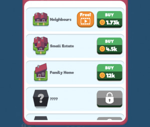
Players thus enter the store as part of the core loop, constantly aching to spend their soft currency to speed up their progression and purchase the highest upgraded buildings possible. It feels like an Idle economy, where I’m constantly making purchases to upgrade the rate at which I’m generating soft currency, but this feels very different. Something that all designers must strive for.
As time goes on, Merge Towns eventually opens up more tiles in which you can place pieces giving a small sense of Visual Progress. Your town can now get bigger and bigger. However, eventually, things do get boring as a usual idle economy does. Eventually the next major upgrade gets farther and farther away.
To keep players engaged when progress slows down most idle games use a prestige mechanic, forcing players to reset their progress in the current area. To make this appealing, games usually offer a permanent progress boost to the player, making their subsequent resets of progress allow them to get farther and farther in the progression. Merge Towns breaks this formula, and instead opts for a more heavy-handed design.
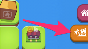
Eventually, new tabs open up on the right which introduces the player to new areas of the game. This offers up an entirely separate town to build up. Their soft currency is completely different, so progress in the first zone does not help at all to progress in the second zone. This is a far break from their idle game roots.
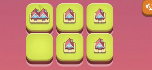
This design decision has some pros and cons.
On the one side, it feels casual because I don’t actually lose any progress — my initial town is still running and I can still keep upgrading it. All the visual progress that I’ve made upgrading my buildings is still felt. It removes the punishing feeling that most idle games can have.
However, it also means that my sessions will get longer and longer. While this game’s design already rewards players quite heavily for being active. As you progress the sessions continually get longer and longer to manage the multiple zones, making sessions more and more exhausting.
But in essence longer session length is what Gram games want. The longer their sessions — the more players stay within their game — the higher their Video Ads watched per DAU. Restricting session length too much actually isn’t in Gram Games favour. So Gram Games made the right design decision, as long as it doesn’t translate into exhausted players.
Advertising Strategy
Advertising strategy always revolves around getting the highest possible adoption and driving as many completed video ads viewed per DAU. More on this in our previous article.
For Merge Town, because their economy is so based on the Idle economy, they didn’t have to reinvent too much. Merge Town mostly takes cues from the dominant idle games like Farm Away and Build Away. However, they do make adjustments to make them work with the core merging interaction.
There are 4 key integrations of Video Ads:
#1 Welcome Back Bonus
Each time a player returns to the game they are greeted with a choice. Watch a video ad to double the soft currency generated while they are away, or lose out on this deal. Just as we’ve written about before, this is a no-brainer.
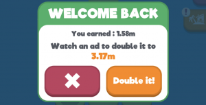
This integration is great for driving a high adoption. Right from the outset there’s a high adoption integration. Some scarcity + a clear benefit make this easy for a high percentage of your DAU to accept. However because it’s limited, it’s not great at driving a high quantity of views.
#2 Upgrade Rewarded Building
Throughout the game, there are also smaller rewarded video ad integrations which allow the player to upgrade a given reward for the cost of watching a video ad.

These integrations are great at driving quantity of views, since players can utilize them throughout a session without restriction. In most games offering video ad rewards like this without restriction isn’t possible, it floods the economy or gives too much progress away. However in Merge Town, because the economy scales exponentially, a small boost like this actually doesn’t really dent the overall economy.
#3 Double Production for 2 Hours
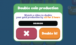
Similar to Build Away and Bit City (deconstructed here), Merge Towns gives the player the opportunity to double their overall coin production for an extended period of time for a video ad watch. This drives adoption (it’s an incredible deal) but is weak on quantity of video ad views due to its limited nature. This is also more likely for session design over monetization — giving players a compelling reason to come back to the game every 2 hours.
#4 Forced Ads in Flow
Lastly, Gram Games also has Ads forced upon the player when doing certain actions. When entering the shop (which happens multiple times per session) and sometimes when moving between zones (as you progress this happens more and more) you can be presented with a skippable full screen ad. They definitely are annoying, especially since they seem to appear randomly (most likely due to fill rates from advertisers).
Why would Gram Games opt for such a strategy? Isn’t rewarded video ads always better than forced?
This is most likely a strategy to drive the strongest revenue from players that won’t last forever. Merge Towns is a fun game, but it certainly won’t have the same staying power as traditional free to play games like Gardenscapes, Galaxy of Heroes or Clash Royale. But Merge Town doesn’t need to be like this. Not every game needs to be a 3 year epic hobby with clans and guilds. Which is why many of these video ad driven games are refreshing and are easy to market. They have instantly gratifying mechanics that most traditional free to play games wouldn’t utilize. Their design is simple making it easy to pick up and play compared to most free to play games.
On top of this, it allows Merge Town to monetize off the “No-Ad” version. Purchasing a In-App Purchase will remove the annoying ads, making their offers even more enticing for the power players.
So Gram Games’ embraces their shorter retention curve by their aggressive ad strategy. While it does no favours for their retention, they made a calculated trade-off between retention and revenue. If you know players aren’t going to be here a long while, retention isn’t king… revenue is.
In Summary
By having innovative, instantly gratifying core mechanics, Merge Town has made a game that feels immediately new and different. This game must be easy to market.
By connecting it to an idle game economy they’ve built a game that can last, and drive meaningful integrations of video ads for sustainable revenue.
For game designers in the market, Gram Games have shown that Video Ads and Hyper-Casual games have opened up new possibilities in the market. Now it’s time for us as game designers to adapt and embrace it.
Messenger Games – The next big opportunity?
Messenger games could be the next land grab opportunity in the mobile space. I spoke at Digital Dragons conference in Poland, evaluating the different messenger platforms (iMessage, Facebook Messenger and WeChat) as potential routes to market. There are still a large number of restrictions on what you can do as a developer, but the scale and gamer engagement seen on new Messenger platforms is a positive sign.
Overview
- Discussion of the Messenger Landscape. Who controls which apps, what is the scale and usage within these apps.
- Blue Ocean – Currently the number of developers making messenger games is low, there is still opportunity to land grab.
- How Messenger Gaming works – how a user gets a messenger game on to their device.
- Why Messenger games are unlikely to work with IAP, but will focus more on social distribution.
- Breakdown of a number of top messenger games. What are the good and bad game design decisions that have been made:
- Give player meaningful choices on each round
- Everything should be instant, high intensity.
- End rounds naturally, by easing people in and easing people out
- EverWing uses social mechanics to drive higher engagement and to bring people back to the game more often.
- Messenger games have more, short sessions. Design yours for 30 seconds rounds.
- How to write engaging messages to bring people back in messenger. Dynamic, Social, Competitive.
- Messenger games retain for longer periods due to compelling social, and less competition in the space (being first helps your game to be noticed and played more often)
- Why are you not thinking about messenger games?

Deconstructing Nimblebit Bit City
The latest release from Nimblebit features the Bitizens and this time they’ve used an idle/clicker/tapper crossed with a city builder in their new release of Bit City (iOS / Android). I’ve been a long time fan of the Nimblebit team, started by the brothers Dave and Ian Marsh back in 2007 but expanded to a number of other key staff. My personal favourite game of theirs was Tiny Tower, but I’ve also played and churned out from most of their newest releases. Pocket Frogs deserves a design mention as it still has one of the best collection/rarity mechanics of any game that I’ve played on mobile. Nimblebit specialises in creating a collecting or simulation experience around common everyday objects.
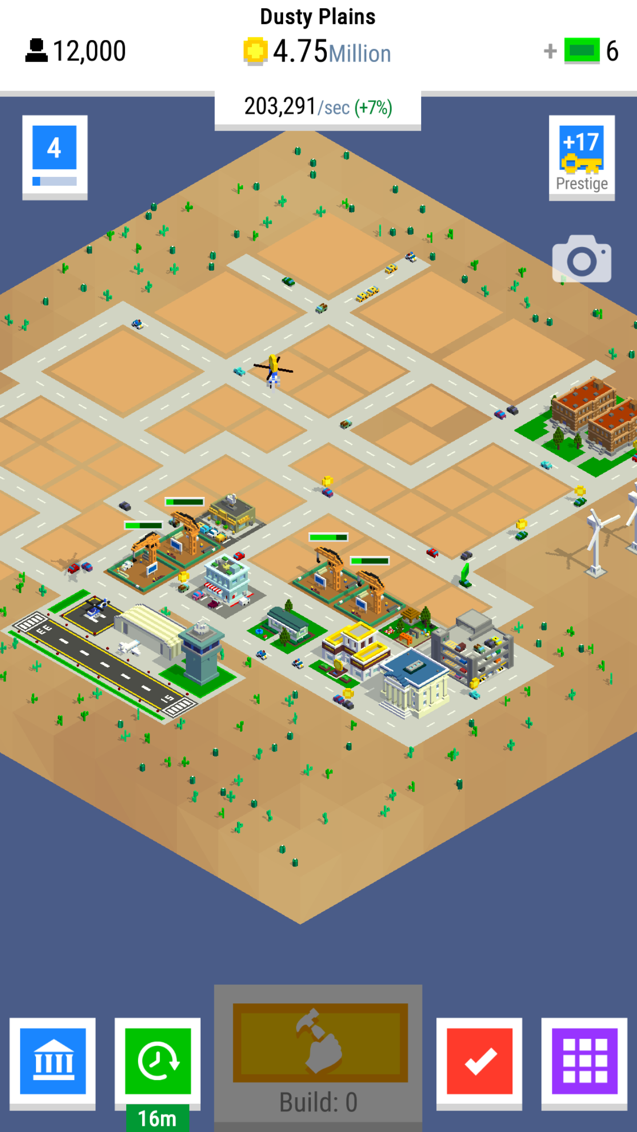
Bit City’s core mechanic is an endless economic growth game and the aim of the game is to progress through the 8 increasingly sprawling cities to generate the most income per second.
Clickers in General
The clicker or idle genre is one of the more recent but extremely popular free to play mechanics that we’ve seen on mobile. There are some great reasons why the mechanic itself has been present in many large successes such as Adventure Capitalist, Tap Titans or Egg Inc. At it’s core, the loop for a clicker is very simplistic. You’re trying to improve your rate of earning, in order to buy items to increase your rate of earning.
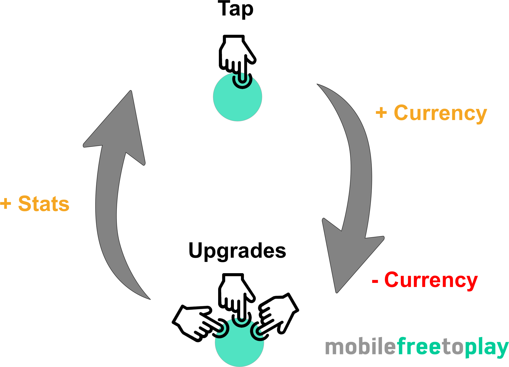
The simplicity of the core loop is both a blessing and a hindrance. The fact that everything you do in the game contributes to making you better at what you do (earning currency) feels very rewarding.
Every action is a positive action.
The hindrance comes when you eventually find the core interaction (tapping as fast as you can) repetitive and boring. In some clicker games, this can happen very fast. So, as a game designer, you eventually shift the player’s motivation from tapping to something that will last much longer. The clicker game genre eventually shifts into a strategy of choosing what to upgrade next. In Tap Titans 2 a player is strategically shifted from upgrading characters to gathering gear, pets or items. All of these have random drops and XP to give much more strategic depth. Upgrading anything feels good, but timing and choice matter.
No one can be expected to be active in a game forever which is where the idle aspect of most clickers come in. While you’re away your game is playing itself, constantly growing your earnings. That way when you come back, a stockpile of cash for you to quickly spend and improve to feel powerful. This happens every time you come back, whether it’s 10 minutes or 10 hours, the size of the stack changes but the feeling of reward stays the same.
The genre itself appeals to a certain type of gamer. Those obsessed with finding the most efficient and time-effective way to improve their progress (in the form of earning rate). Sometimes referred to as min/maxers finding 1-2% efficiency in upgrade choice is rewarding as you are progressing. Yet even the casual player feels good, you’re constantly making progress but at a lower rate. If you’re more interested in story and context then you will often not feel as excited about idle games. It is a game for fans of stats and numbers.
Bit City – Context provides content
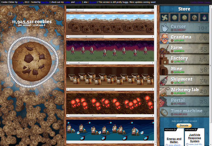
Idle games began on the web with titles such as Cookie Clicker or Cow Clicker released around 2012-2014. 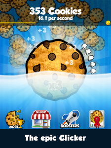 These games were incredibly simple. They drew huge numbers of returning users every day as the objective of “having the highest number” is so clear and powerful for players.
In more recent times games such as Adventure Capitalist, Tap Titans, Farm Away, Make it Rain have re-skinned the mechanic and given a context to the clicking. Context helps with design decisions as you immediately add more depth. Depth provides you with content and that content can better mask the simple stat progression. Player’s decide their goal is to “build the greatest city” rather than to “get the highest number” and this creates a better sales pitch if and when they tell their friends about your game. Context helps you design and it helps you sell, use it to your advantage and don’t neglect it by slapping it on at the end of development.
Bit City provides much more context to the clicking experience by using a city and it’s buildings to provide more visual substance and reference to the core loop. The City Context is a good one, used in multiple genres it’s easy to reference, has great depth and is applicable to people from all countries. Bit City uses this to great effect, but adding Building Zones, Cars, Planes, City Hall and Windmills each contributing to your currency earning.
Clicking = Building

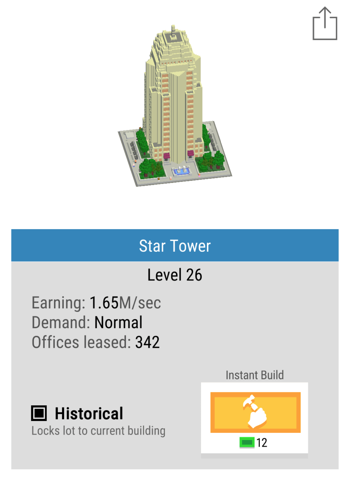
The core mechanic of tapping furiously on the screen has been removed in favour of the idea of building. One must purchase and classify lots so that buildings of specific type are built. Buildings then fill each lot and the large Build button upgrades and refreshes the building on each lot for a small increase in coins per second earning power. The upgrading of buildings is endless and rather than getting stuck in a content farm black hole, the buildings are upgraded at random. Every upgrade levels up the block and each subsequent upgrade adds 1 second to the total time required to build the next block, leading in the later game to upgrades take minutes. Choice of which block to upgrade is removed from the player through randomisation and the player is taught very quickly that every upgrade is beneficial.
This is a very strong mechanic for a number of reasons:
- Thematically it makes sense. Your city changes with time and you can position blocks in certain areas to make your city look beautiful
- You may also lock in place any buildings you particularly like allowing the creatives build beautiful masterpieces of a modern renaissance!
- Choice paralysis is removed because you don’t need to choose what to upgrade and all upgrades are beneficial.
- Build timers slow down sessions giving people incentive to leave.
As a pacing mechanic, it continues to engage at all stages of the game. This is often one area that other clickers loose me on as in the mid-late game, I simply stop clicking…
City Planning
Simplicity and clarity are always key design decisions for mobile game developers. People spend a few minutes at a time with your game and so everything needs to be clear and make sense in an instant. The choices available to a player in Bit City always relate to upgrades. The most profitable upgrade you can do is buying a new building for your city as each building provides a larger base earning rate. A really nice design feature is the idea of city zoning. There are 3 zones, Residential, Industrial and Commercial. Within this feature is a lot of shallow depth, that is there are a very large number of options and possibilities but as a player, the way they affect the game is incredibly minor. They do not affect the core in any way, they simply provide a route to micro-optimisation, reinforcing the fun of clickers.
Each building zone is balanced by providing a 10% bonus or 10% deficit depending on the overall % of zones, this promotes people to build in an ordered manner. At certain times you may want to opt for larger investments in certain zones because both the Mission system and the City Bonus system provide bonus’ specifically based on type of building built. This is a good use of shallow depth again. Most people would not obsess over the minutiae of which building to build, but to really get the most optimisation at each minute of gameplay it might be valuable to invest in specific zones at specific times.
Missions with increasing reward
Another clever design decision is to reward ever increasing premium currency (Bux) by completing missions. Missions usually revolve around building, improving or owning some upgrade or building.
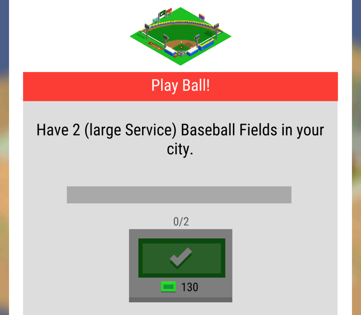
There is only one mission available at a time and they seem to be structured to appear in a specific order. Rather than having a small payout with lots of quick missions to teach people the mechanics, Nimblebit have used missions to give players a longer term goal. The cleverest of these is the ownership of 2 of the same building types i.e (2 Baseball Fields).
Mission systems are one of the classic mid-term progression systems. They provide a steadying hand and a focus for players when options of what to do open up. The best mission systems are usually curated or at least missions are grouped and then provided based on XP level.
The Premium Currency (Bux) are gifted in 10 bux increasing increments. This is risky, as it becomes a significant source of Bux in the mid game. I think the progression is a nice touch but the size of the progression is too high, it would have worked just as well say, 10,12,14 etc. At mission 13 I’m on 130 Bux which is equivalent to $0.13. Each mission can take an hour or more, but sometimes you might complete 2 or 3 in a few minutes. Although it might not seem a lot it lessens the requirement to spend. In the mid-game, it’s most profitable to focus on and perform the mission at hand. Balancing the rewards and spend of the premium currency is definitely one area that Bit City could improve on.
Progress, Profits, Prestige
Modern clickers increase the gameplay depth over time in a number of ways. These usually either increase the speed of clicks (Faster), the value of a click (More) or automating the clicking process entirely (auto). Each of these upgrades has a clear and tangible benefit, they help you gain more currency quicker, give your players a choice: do you invest in yourself being active in the game, or invest in the time you’re inactive?
Each city comes with a set number of plots. 4 for a level 1 city, 8 for a level 2 city etc. As you build more buildings you start to max out your plots. As soon as you have maxed your plots a new city unlocks and you sacrifice all of your upgrades and buildings to start again. This creates a clear goal for gamers and eases gamers into the game via small cities. As you progress the cost of each new building starts to become prohibitively expensive which encourages you to want to sacrifice everything in order to prestige to obtain Keys which will speed up everything in your game for the entirety of your play time.

System diagram of Nimblebit Bit City
What’s very pleasing compared to other clicker games is that the speed of progress is managed by a multiple limiting factors. Limits by multiple sources feel elegant rather than a strong single limiting factor. First, the coins themselves slow progress as you can’t build enough buildings, then the plots limit progress on one city as you max them out and finally the cities themselves become prohibitively expensive unless the global tap multiplier is improved by prestiging.
Prestige is very important as it adds ebbs and flows to an otherwise linear progression. Every time you do prestige you suddenly feel incredibly powerful as you race through early content, this is important as rather than having to create more complexity players are re-engaging with the game and reinforcing the simple systems of the game and progressing incredibly quickly. Bit City has created “mini- prestige’s” every time you upgrade to a new city once you have maxed out your plots. With every reset there is a sense of loss but also a sense of growth, getting your players used to this feeling helps them engage with the main Prestige mode.

In the mid to late game idle games, prestige currencies become the main goal in Bit City these are Keys. It’s very important to get the balance and the feel of Keys right. In Bit City, Keys feel underpowered as the quantity of keys provided when you prestige is too small. A user wants to feel progress at close to double the previous rate when they sacrifice all of their upgrades. Doubling up whilst keeping a logarithmic increase in the power curve of costs equates to half the time spent getting back to where you previously were. One you reach your old position the logarithmic power curve kicks back in and really winds back a player’s progress to a snail’s pace forcing them to prestige again.
A player chooses when to jump to the next prestige level and effectively picking at the right time can jump you onto a much more powerful curve. Great game design in this area wouldn’t use perfect logarithmic numbers but would add some randomness and inconsistencies to make it a guessing game for the player to find out if they are maxed out at an inefficient area of the curve.

Time taken to reach a city in bit city. Prestige levels and number of hours are representative and not factually correct.
UI / UX
It’s not mentioned in mobile how important the user interface is for a game. Especially in these management style games with large amounts of details, getting information across clearly and concisely is a challenge on a small screen. Nimblebit do a number of great reinforcements.

- Your key measure of progress is represented as a large central number of coins per second present on every screen.
- The build button (the button you click the most) is larger, more centralised and stands out from the rest.
- The subtle nuances of the game such as plot size, or building type are reiterated to you when you need the information, such as the quest system (large service)
- Before you make a large choice there is always a confirmation screen ensuring you are happy with your decision.
This attention to detail of the user’s journey removes frustration from the game. It allows you to choose where to focus your attention on to complete one or two of the tasks at a time and speed up your progress. A nice font and simple language make it enjoyable to read.
Monetising – Keep a tight grip
I’ve spent $10 so far in Bit City. For that, I got 10,000 bux. Bux are the only premium currency and are used to speedup progress, buy city upgrades that persist through prestige mode as well as unlocking certain famous buildings that provide enhanced bonus’. I feel that this was the point where the game design suffered.
- Bux are not a rare currency within the game. You can get 10s if not 100s of bux by completing missions or taping on vehicles that randomly drop bux, as a free player you can often buy a few persistent upgrades. When purchasing these upgrades there is no delight, magic or drama and as a player, all you see is your bux amount slowly draining. Purchasing the unlock of rare buildings was also much the same with a simple UI transition from locked to unlocked within the building card screen.
- No early conversion purchase. The Builder in Clash of Clans or World Multipliers in Adventure Capitalist, which immediately are the best bang for your bux! *pun intended…
- Gauging the value of upgrades is difficult. For instance, Market Gains for 1000+ bux increases your Bank Savings rate by 1%. This feels minor but would have a huge effect on the earning power itself. Rather than so clearly affecting such a powerful rate, investing in 20% cheaper bank upgrades would have had a similar effect to the player but would be immediately noticeable.
- No sense of mystery or delight when spending bux at any point. All bux are spent with a simple click and a UI change.
- No random drops. With it’s huge array of buildings creating a clear building rarity scale and then having a random drop element would make every bux much more exciting to spend. Random rewards have spikes of joy, rather than a focussed
I suspect the number of people purchasing bux will be low, simply because the number given out in-game is very high and people can immediately get a sense of what it would be like to have 1000s of them by spending a few hundred that they got for free. Games with great conversion rates keep the pressure on players to want to spend by constantly showing the value of having premium currency to progress. Bit City treats bux too loosely and as such the pressure to get my wallet out is low.
Video Ads – Double Time
I suspect that the game’s primary monetization route would be video ads. There is currently only one method to engage with a video ad through the opt-in button called “Double Time”. The value proposition here is strong, for a short period of time, double everything. Directly doubling the speed of progression is the best feeling for a player because it directly contributes to that core loop. Things that feel great in-game are strongest when they contribute to your progression directly. Clickers, by their very nature, are all about progress and so the reward is clear and easy to feel.
Unlocks happen more regularly I can build more buildings and progress shows a real gain. The upgrade itself is time limited to 10 minutes but with bux can be upgraded to 15 or more minutes. This again is a clever gamble as by getting people to potentially invest in an IAP they then encourage more video views, which if you remember is a key KPI for increasing monetization from video ads.
The major issue here is that there are not more ways to engage with video to improve those views per DAU that lead to more revenue. The 10-minute bonus is strong, but what about a 4h increase in the Bank Savings rate? Watch a video ad to upgrade a building directly would provide so many more places that a user could click the Watch button, increasing its adoption. The classic Double Up bonus for all returning players could be run once every 24 hours in order to highly incentivize at least one valuable video view per day. There is huge scope for expanding video ads integration.
Conclusion – Great Core, Monetization need Tightening
Bit City is a great example of expanding clicker mechanics into new genres. City Building and Clickers make a great match because of the depth in buildings and environment that are available to the team. Nimblebit have done a really good job of pacing the game across multiple cities causing you to have clear evolutions in your progress as well as allowing you to prestige at any time, making it your own decision. The type of upgrades and the thematic choice of upgrades fit nicely, all contributing to a busy and bustling city experience. The UI and UX of the game itself is also neat, simple and clear making playing the game an enjoyable experience.
The game’s biggest weakness will be its monetization. It’s very loose usage of Bux as a reward currency and the fact that players can only interact with video once per session without enough cues from the UI. The value of that video view is high so it should see good usage, but providing your most engaged and active players with more ways to watch would see many more views per DAU.
The games a great addition for the Bitizens and well worth a play!
Big Fish, Small Pond: Surviving in a Maturing Market
Last week I attend Quo Vadis in Berlin and gave a talk on how to survive in a maturing mobile market. The slides are below.
[slideshare id=47449929&doc=2015-04-23-quovadisedbiden-150427033201-conversion-gate02]
My main take away was that companies need to set themselves smart constraints within which to be creative.
The four ideas I gave for setting yourself smart constraints were:
1. Know your strengths
Whatever your strengths are, be that an existing audience, particular technical expertise, or genre knowledge, you have to build on that. The market is tough enough without you giving yourself the best chance.
2. Find your pond
Incumbent games have too much market presence and content and too many systems and players to go head to head with. Define your market as a niche that is small enough for you to dominate (though big enough to pay the bills).
3. Manage the Risk
All game production is risk management – no one knows for sure if a game will be a success or not before it launches. Make sure that you manage the risk in production as well as possible. Do a risk assessment as you start out a project to get an objective feel for the number and scale of risks involved, and an idea of when they can be addressed (sooner is better!). This will also help you tackle the biggest risks first wherever possible.
4. Stick to the plan
It’s very easy half way through production, when things aren’t going well, to convince yourself that you just need a couple more months to fix things. Set yourself some fixed targets at the start of the project that trigger a full scale review of the project if they are missed. That way you will waste the least amount of time on projects that are doomed.
Why you should care about Idle Games
Idle games are an exciting new genre that I expect to expand greatly in the coming years on mobile. Idle games, Clicker games, or “games that play themselves” is a baffling genre. Inexplicably these games are dominating many of the popular flash portals and shooting up the charts on mobile. Make it Rain by 337 Games, Tap Titans by Game Hive and now AdVenture Capitalist by Kongregate have all shown that this genre has a rightful place on the AppStore.
But why is this genre so popular? Why does this genre even exist? Why even discuss games that people don’t really play?
Idle games have risen on mobile because this is a genre that is perfect for modern mobile free-to-play design. The mechanics of idle games create perfect mobile sessions and drive strong long term retention.
What is an Idle Game?
Idle games, sometimes called Clicker or Incremental games, are games which are all about management of revenue streams. Similar to simulation games, their main differentiator is the focus on revenue growth decisions.
For some examples:
Cookie Clicker is the best example of an idle game. Each time you tap the cookie, you gain 1 cookie. You use cookies to purchase upgrades. Upgrades increase either the rate of tapping the cookie (now you get 2 cookies per click!) or increases the rate of cookies generated automatically (Grandmas will make 1 cookie per second). These automatic cookies are generated whether you are tapping or not. They are generated even if you’re away from the game.
On paper this sounds too simple to be fun. But try for yourself. The simple act of purchasing an upgrade always feels great. The growth curve is so fast it gets very addictive, very quickly.
Progress just for the sake of progress is fun. Even if it only means a virtual number increases faster.
Rate of resource generation is the core of the game. But an economy that inflates so quickly with a single currency has flaws. Very quickly, the game’s upgrade costs skyrocket. Starting off with nice low numbers the game quickly skyrockets into costs of trillions just a few sessions in. Most designers would cringe at this type of growth curve. What kind of player wants to worry about numbers in the trillions? In AdVenture Capitalist, your costs will eventually reach more than 1 Tretrigintillion (10 to the power of 102). Yet, players love this. Progress always feels good. Players playing for long enough to reach these ridiculous numbers feel like it is a real accomplishment.
As a result, Idle games have claimed 3 of the top 10 most played games on Kongregate (source: here). There are even Twitch channels dedicated to watching a computer play a game itself. Inexplicably, this genre has seen incredible growth.
Regardless of your stance of whether or not this is a “real” game genre, the mechanics in Idle games are perfectly realized for mobile. Idle games can teach mobile game designers a lot about creating a game that has strong session design. Idle games are so strong because:
- It always feels good to come back.
- Sessions naturally ease the player to leave
- The mechanics ease the player from micro to macro gameplay
#1: It always feels good to come back
Many mobile games suffer gameplay mechanics that feel punishing on returning to the game after leaving for a few days.
In FarmVille: crops wither. If you do not come back to the game in time, your crops are worthless. In Clash of Clans: resources are stolen. The longer you are away from the game, the more likely a majority of your precious resources are stolen. Your rank on the leaderboard could be lowered. Your Clan becomes upset that you haven’t donated enough troops. These mechanics are all strong at driving reasons to come back, but also creates reasons for players to quit.
Idle games don’t suffer from this problem. Each time the player returns to the game, they are left with a massive stockpile of cash. It always feels like a bonus that they left the game. If a player leaves for a day, a week, or a month it only increases the amount of currency in their stockpile. In most economies this would be troublesome. Not in Idle games. Because the growth curves are exponential, leaving a game to infinitely generate a low income rate is absolutely fine.

Player A grows faster from Day 1. Player B waits until Day 7, but gains a massive stockpile.
For example, lets take 2 players. Player A comes back every day. Player B skips a week of play. Both players are generating 1 million cookies per day at this point in time. Player A, the active player, returns day 2 and receives 1 million cookies. Player B, who skipped the week, returns to have 7 million cookies. Player B can clearly purchase far more upgrades than Player A. Player B actually feels very rewarded for leaving for so long — they are rewarded with a very long session which they can purchase many things. However, comparing the growth curves Player A purchased many upgrades on that second day. So Player A by day 2 is already at a new growth rate of 10 million cookies a day. Player A is clearly growing far faster than Player B, but both players (because its a single player game) feel they made a smart choice. Player A is rewarded with faster progression. Player B is rewarded for waiting so long. It always feels good to return, but returning more often gives you faster progression.
Mobile games should strive to create this feeling. It should never feel like a punishment to come back to the game.
Players should be reminded that coming back often is a benefit, but coming back at all is always a bonus.
For this reason most farming games have shifted away from FarmVille’s model. Instead of withered crops, there’s low storage limits. In Clash of Clans, they incorporate shields and enforce looting limits to make sure players dont feel that not coming back feel too badly.
#2: Sessions ease the player away
Coming from my previous post on Flexible Sessions, the perfect mobile session finds a way to naturally push players out of the game. This is necessary for pacing and long term retention. Strong mobile games give strong reasons to come back (see above!) and strong reasons to leave the game. Idle games have mastered this natural prod of players out of the game.

Offering lots of purchasing options creates the session design. There is always something to purchase, but eventually the smart choice is the one where the player must wait.
As Idle games push players to invest in automatic revenue generators (ex. Grandmas in Cookie Clicker) over manual revenue generators (manually tapping on the cookie), players inevitably will reach a point in the game when they just have to wait. The player can purchase small upgrades fairly rapidly, but they know to make the next big leap of progression its smarter to purchase the more expensive upgrades. So, they leave the game feeling smart about their decision.
This is the exact point which the player, themselves, have opted-in to leaving the game. Naturally, the game has prodded the player to leave. Mobile games must strive for this. Create a situation which the player feels smart about leaving your game. Idle games have even managed to do this without timers, without social appointments or any other tacked on system as discussed in Player Commitments.
Create a situation which the player feels smart about leaving your game.
#3: It eases the player from core to meta gameplay
The first experience of a new player is very simple. In Clicker Heroes: A player just madly taps an enemy monster. In Make it rain: A player flicks heaps of money into the air. The first experience is addictive and immediately fun. Its obvious how to get better – tap or swipe faster. Players quickly master this mechanic and it feels natural. However, this mechanic’s interest quickly burns out. After the first few sessions, players are quickly tired of having to manually collect.
This is when the game offers a bait and switch. You came for the simplicty of tapping, but what you’ve been given is a game that is all about managing resources and upgrades. Players shift from tapping to managing which upgrade to purchase next. This clever switch means players that would have been burnt out from the simple mechanic are now thinking about long term decisions in the game. Which upgrade is the best value? How do I optimize my growth?
Mobile games must master this bait and switch. Players expecting to come into any mobile game will expect some core gameplay that mimics what they’ve played in the past. Playing bejeweled for Candy Crush, playing command and conquer for Clash of Clans, or platforming for King of Thieves. However, as a free-to-play designer your job isn’t to just hook these players with fun intial mechanics. You need to find ways to retain these players for years. The best way to do this is to switch the player from focusing on second-to-second core gameplay (tapping cookies) into longer term decisions (optimizing progression). Idle games clearly show a blueprint of how to accomplish this, regardless of the core gameplay.
Looking to the Future
Idle games are big and going to get bigger.
Anthony Pecorella gave an excellent talk at GDC 2015 on Idle Games summarized here. Clearly with the success of AdVenture Capitalist, Tap Titans and Make it Rain, more developers are taking notice.
The genre is ripe for innovation. Recently CivCrafter came out. A take on the idle genre with multiple resources and battles. Tap Titans has shown that the genre can apply to the auto-rpg genre. I believe that the progression systems in these games can really be applied to any genre. Replacing the core game play with a puzzle mechanic, an RPG battle mechanic, a Simulation theme, Arcade gameplay are all possible angles.
The key is to design the bait and switch: give the players the game play that is addictive and fun in the beginning, but eventually nudge them into purchasing the automatic resource generators. Players can then make the choice between grinding the core gameplay, or leaving and gaining the benefit just by waiting.
Get ready: the future will be all about games you don’t play.
Content Hunger: How to avoid the content mill in gaming
Games are content, and so the economics of games are largely the economics of content. Content is what players pay for, and content is what takes time and money to build, with both the quality and amount of content increasing production costs. I’ve been playing a lot of Dragon Age: Inquisition recently, and having a great time. I’ve already sunk just over 20 hours into it, and if friends and reviews are to be believed, I have at least another 30 to go before I finish the main storyline.

Dragon Age Inquisition has a huge amount of high quality content to explore
The world you can explore is vast, filled with scripted missions, side quests, wild beasts, roaming bandits and hidden secrets. Romping across the landscape from rocky deserts to dank marshes I am both awestruck at the variety and volume of content in the game, and slightly sickened by it. Sickened, because now I work in the industry I know how much time will have been invested into producing everything I see, and how countless days must have been put into dark corridors, rock formations and other mundane details that give the world authenticity, but will be largely forgotten and ignored by players.
Mobile is some way behind the production values of consoles. Partly the hardware isn’t as good yet, and so cannot support such high end graphics. Partly developers have not needed to deliver such high quality games to win customers. But mobile is rapidly catching up, and whilst the quality of content may not be as high, the amount of content needed is already probably larger. The F2P business model dominates mobile, and success here is highly dependent on retaining your players for months or even years. Having something for players to do a year after they start playing your game is no mean feat. Wooga’s hidden object game Pearl’s Peril has 90 weeks of content – something that few if any console games can match, and as a result of this the retention in the game is phenomenal.
Content is a key competitive angle
It’s clear on both console and mobile that the amount of content you can deliver, and its quality are key factors for success. It’s hard to imagine an RPG without the amount and quality of content that Skyrim or Dragon Age has being a success. For a competitive HOG you need to deliver a similar amount of content as in Pearl’s Peril – something that only one or two developers apart from Wooga can hope to do. One of the reasons that World of Warcraft has become so entrenched is the amount of content that it has built up over the past decade is now almost impossible for other MMOs to replicate.

Pearl’s Peril has 90 weeks of content, each with 5 hidden object scenes and a point-and-click adventure scene
For many games the number of man-hours that have been put into content determines the production quality and amount, together with the efficiency that this time is converted into content, given the tools utilized. The older a genre is, the higher the production values are – by pushing the content bar ever higher, developers shut out competition and establish themselves in franchises for the long term. With each game developers up the stakes, both because they can due to improving tools and existing assets to start from, and because they must to continue attracting players.
Maximizing content
To be successful developers must therefore invest in their tools and production pipeline to match the incumbents in the genre they are going head-to-head with. Failure to do this sort of preparation can only result in failure. Indies and smaller developers that cannot match the content output of bigger companies must innovate on the gameplay mechanics more to succeed. By innovating they can produce a new experience that players will not directly compare with established games. No one compares Realm of the Mad God to World of Warcraft, or Faster than Light to Mass Effect. There are also a number of techniques that can be used to stretch content for as long as possible, and all developers, regardless of their content output are wise to use as many of these as possible.
Randomness: Games with randomness are far more playable than those without some element of randomness. In Candy Crush Saga, levels are different each time they are played due to the random way that gems drop into the board. Players replay levels effectively waiting for the right combination of gems to drop. Imagine the game without this randomness and each level has a solution that can be found by trial and error relatively quickly, and the levels become boring.
Alternative choices: Allowing players to customize their play experience in different ways allows them to go back and replay the same content to explore how their decisions influenced the game. Whilst this requires some additional content that not all players may see, it allows die hard fans to play through most of the same content several times with minor variations. A good example here is how Telltale games allow you to replay episodes making different decisions each time. These decisions allow you see how the other characters react and the story pans out. In Dishonored the skills you upgrade give you different ways to complete each level, and the amount of violence that you employ throughout the game affects the way the story pans out to give replayability significant appeal.

The way you play Dishonored affects how characters interact with you, the overall ending and even the weather in levels.
Events: Most successful mobile games run timed events of some form. Often the mechanics of the event are very similar, but the appearance of exclusive content that is only available for a limited period engages players extremely well. For the chance of getting a new unit, building or item players will happily grind through a lot of content that they have already seen before, and the most active players will often only be playing for the events schedule, having already exhausted the other content in the game.
Difficulty levels: In games where the difficulty of levels can be increased, then replaying the same content is fun because it requires players to master a higher skill threshold than before to complete. Changes in difficulty can often be made with config changes that are cheap to implement, and the players will still enjoy the content. Guitar Hero or Rock Band use this mechanic to allow you to replay the same tracks again and again at a level that is always challenging.

Rock Band lets you play through the same songs at several different difficulty levels
User Generated Content: In Clash of Clans, players spend most of their time attacking the bases of other players. As the layout of each base is set by the defending player then an incredible amount of variation is generated by the players. All Supercell needed to do was to give players the tools reason to vary their base layout and the players take care of the rest. Different bases require different tactics to attack and so even though additional buildings and units are released only very slowly, players stay engaged in the game.
Conclusion
In any genre, games compete on the amount of content offered and its quality, both of which drive up the cost of production. It is important to recognize the demands of producing this content before starting production and only choose genres where you can compete. Having chosen a genre it is vital that developers build the tools and pipeline to deliver the required content, as well stretch the playtime from their content however possible.
How to start a new game
Starting a new game is a daunting task. You operate in a design vacuum. The possibilities are nearly endless. The chance of failure incredibly high. Logic and reason of what games make it to the top is alchemy, and mostly just biased observations. Coming up with what the next hit game will be is a bit like throwing darts while blind.
From years of starting projects from square one, I’ve found a process that works for me. A process that helps me get off the ground quickly and moving on an idea that can work in the market. The process is mostly adapted from “The new business model canvas” as well as many Lean and Agile Product Vision processes.
Creating a new game is about firstly identifying a potential market, then building empathy for that target audience, using the empathy to design a concrete definition of your product, and then testing this vision as quickly as possible with real end customers. This vision will drive the development of your game.
To even begin, you have to start from some inspiration.
Step 1: Find your Blue Ocean

Natural Motion’s “My Horse”. A game that is targetted towards fans of horse fans of all ages. A blue ocean for the App Store.
My strategy is to find a blue ocean. Find a market, a niche, a genre, a player type that is currently under-serviced by the top grossing games.
Natural Motion has spoken multiple times about this approach to their games. My Horse, CSR Racing and Clumsy Ninja are all masterful games that were targeted at blue oceans. When My Horse was released, many of the games that were targeted towards horse fans on mobile were unpolished, 2D, and a terrible experience. Natural Motion came out with a product that really hit what this market wanted: realistic 3D horses. Players can pet them and watch the horse react realistically. They could care for them, and even pick up their shit. Exactly what fans of horses wanted!
When working out of XMG Studio in Toronto we were a very small, indie developer. We knew that we couldn’t fight for market share against the larger developers in crowded genres. Instead, we chose to focus on niches that we felt we could hold on to : Car fanatics and Fashion. We created Drag Racer which held the mobile racing market very well from 2009 – 2012 as well as Fashion Star Boutique which remains one of XMG’s top grossing hits. They were hits because we operated in spaces that many of the bigger developers wouldn’t. We could sit on these games and carve a large market share for the small niche with ease. Aiming for these blue oceans is a viable strategy, especially for indie developers.

Magazine racks are excellent spots to do research. What niches are here that current games aren’t targetting?
Blue Oceans can be found everywhere. Even in this crowded mobile space, looking down at the Top Grossing try to identify genres, themes and playing styles that are currently not serviced by these games. Can you create a mobile game that services this genre?
Step 2: Build Empathy
After you’ve selected a genre, It’s about getting into the mindset of the customer. Understand why certain games in the genre failed, and why others succeeded. Play a ton of games. Write everything down. Plot points of reference on a graph and truly understand what defines this genre. Define what base feature set customers need in order for the game to be successful. Research how some games have exceeded player expectation and some games that failed to meet it.

The Kano plot is excellent for plotting features and figuring out the minimum requirements for a genre. As well as brainstorming how you can exceed their expectations.
Most likely, this genre isn’t your personal first choice. Some independent or successful game designers can design games that are essentially for themselves. They use their own experience and knowledge of the genre to design the game. This isn’t possible for all developers. When the target audience is not yourself, you need to do effective market research to truly know how to design for them.
In the early days of Zynga, it was customary that new hires would work in the customer care area of the company. For their first weeks, they would be answering phone calls from disgruntled customers. Whether intentional or not, this gave many designers a stronger backbone in designing games for this audience. Listening and hearing the wants and desires of their players allowed them to build empathy and step into the mindset of the players they would be designing for.
That is why it is important to have conversations with your target players. Understand why they play the way they play. Understand what they enjoy about the genre, but more importantly — discover why they don’t play. Why do they churn from games. What would it take for these players to leave the top grossing games? Even the most popular ones — whats the reasons why players leave this game? Identifying the chinks the armour — the areas which players hate about that game is your first order.
In the beginnings of Style Studio and Fashion Star Boutique, two games in the Fashion Design genre, it was important that we went out and talk to actual players/fans. In the case of Fashion Star Boutique, we even hired a full time Fashion Designer to help with designing the gameplay, designing the UI, and picking out all the items that players could customize. In the end the product really showed its authenticity.
Step 3: Define Your Pillars
After many, many conversations with players of your game you’ll start to notice patterns. Players of the genre will be demanding certain things about their next game. They will have annoyances, certain aspects that they don’t like, or just general fatigue in the way things have always been done.
To start creating pillars, take some of this feedback and focus on a few points you feel the audience would really be excited about. What if Clash of Clans had more depth in the battle? What if Candy Crush had alternate methods so you could get past those levels when you were stuck?

Endless Runner genre is full of design decisions that player’s don’t like.
For example, after interviewing a ton of fans of the Endless Runner genre (Temple Run, Subway Surfers), we started to see patterns about why many players dropped out. Many players complained because the beginning of the round always felt slow and the same. Advanced players would have to wait until the game got fast enough before they were challenged. Other players complained of seeing the same level over and over again. Players that left the genre complained that the game was too punishing: hitting one obstacle and getting knocked out was exciting, but felt like they got knocked out before they could understand the game.
Taking these 3 points of feedback, and playing a lot of OutRun 2, we decided that maybe we could take a different approach to the Endless Runner market. We transformed the game into an endless racer instead of a endless platformer. We focused on speed, not on avoidance. The game became about optimizing your speed to get to the next checkpoint (like OutRun 2) instead of just staying alive for as long as you can. We added mechanics like a close call system, which gave advanced users reasons to push their luck throughout the whole round. The beginnings were no longer boring, players no longer felt as punished, and we cycled new backgrounds in as the player upgraded to show progress and ensure players felt like the game was always new.

Our racer game came from focusing on addressing 3 key pain points players had from Endless Runners.
These innovations were created as pillars right from the beginning. We developed the game specifically to hit this points of feedback. This drove us through production and kept everyone on the same alignment.
Hearthstone is the great example of excellent pillar creation. In this GDC Vault talk by Eric Dodds, he articulates the importance of Pillars in Hearthstone’s creation. Specifically, he mentions certain pillars that you can really see came across in the design :
- “Immediate fun for the new player”
- “Allow non-competitive players to thrive”
- “Simple Cards, Complex Interactions”

Hearthstone created pillars that focused on players that left the TCG genre. Aiming for simple cards with deep interactions pushed Hearthstone & TCGs to a whole new audience.
Hearthstone serviced a need of Trading Card Game (TCG) fans. They focused on “fringe” card game players that love playing TCG, but could never handle the complexity of Magic. With this focus, they managed to captivate a crowd that has always been turned away by games like Magic. These pillars defined what exactly the final game must feel like in order to be successful. They succeeded, and according to Eric, it had a lot to do with sticking with these guiding pillars throughout production.
Step 4: Fake it ’til you make it
When you have pillars, you have a strong vision for the game. Now you need to create a working prototype as quickly as possible.
You can start on developing a prototype, but this takes too long. Instead, focus on creating simple sketch mockups of key screens in your game as quickly as possible. Do whatever you can to articulate the exact vision you have for hitting those pillars.
How will the game look on device?
Can you articulate the unique aspects of the game in just a few screens?
Are the changes you are making exciting enough to your target audience?
If People aren’t excited when they’ve seen your sketches and discussed the product, they never will be. So iterate on the sketches, brainstorm about more innovations and get more feedback. Many times this will take weeks before an idea really fleshes out, and more often then not, your first idea sucks. That’s fine!
In Summary
The key to building a hit game is very similar to building an app or a business. It comes down to identifying a market need and servicing that need with a new game design. Even in games players have needs (or maybe wants) about what a new game they would be willing to play would be. Identifying large or small blue oceans is the first step. Making sure that there’s a market gap wide enough that by the time you get the game finished — the competition won’t be already swallowing up all of the market share. From here its about truly empathizing with this audience — recognizing what needs this audience currently does not have serviced. I
s it that the current genre options are polished or aesthetically pleasing like CSR or My Horse’s path to success?
Is it that the game design is just too complex for mobile gamers to get into like Hearthstone’s path?
Or maybe its as simple as the current offering just doesn’t have systems that draw players in for the long run, like Endless Runners.
Recognizing these needs, then solidifying them into pillars is the best way to start a new project.


 But besides engagement events, Peak Games’ prominent form of revenue growth comes from competitive events within the game. Events which pull players together and ask them to compete against each other for prizes. This is usually just reinforcing the core loop: asking players to progress as fast as they can within a limited time for access to great prizes. Best shown in games like Gardenscapes’ Fireworks Festival:


 These games were incredibly simple. They drew huge numbers of returning users every day as the objective of “having the highest number” is so clear and powerful for players.

